Kyung won Baek
Graphic Design BFA
ArtCenter College of Design
Specialisms: Graphic Design / Interaction Design / Typography
Location: Los Angeles, United States
Kyung won Baek
First Name: Kyung won
Last Name: Baek
Specialisms: Graphic Design / Interaction Design / Typography
Sectors:
My Location: Los Angeles, United States
University / College: ArtCenter College of Design
Course / Program Title: Graphic Design BFA
About
Shopping is more than a hobby for me because it is a constant source of inspiration. Whether I’m scrolling through apps or wandering through physical stores, I find joy in the act of exploration. While I often leave empty-handed, I never leave empty-minded. Being surrounded by a variety of products and thoughtfully designed spaces allows me to observe how design is woven into our daily lives. This habit of observation has trained my eye to notice the subtle details that make a product clear, approachable, and easy to connect with. Curious about the work that came from these experiences? Let’s take a closer look at Wonny’s work.
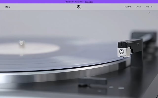
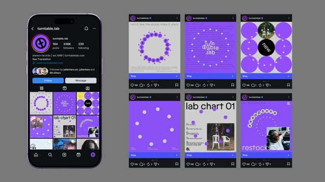
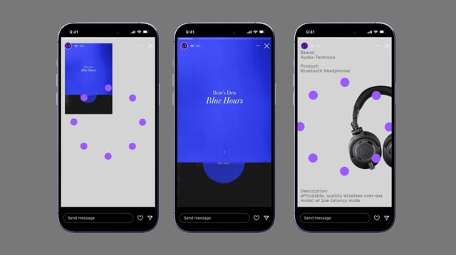
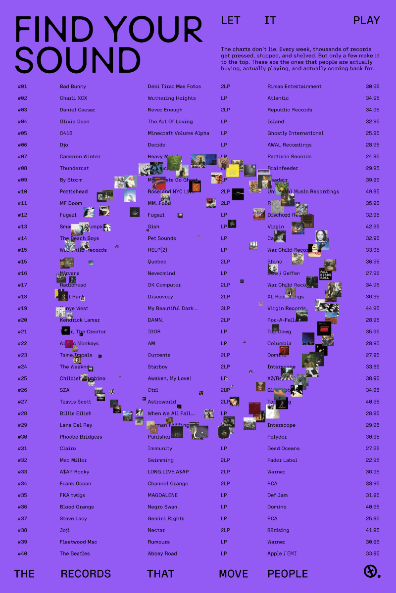
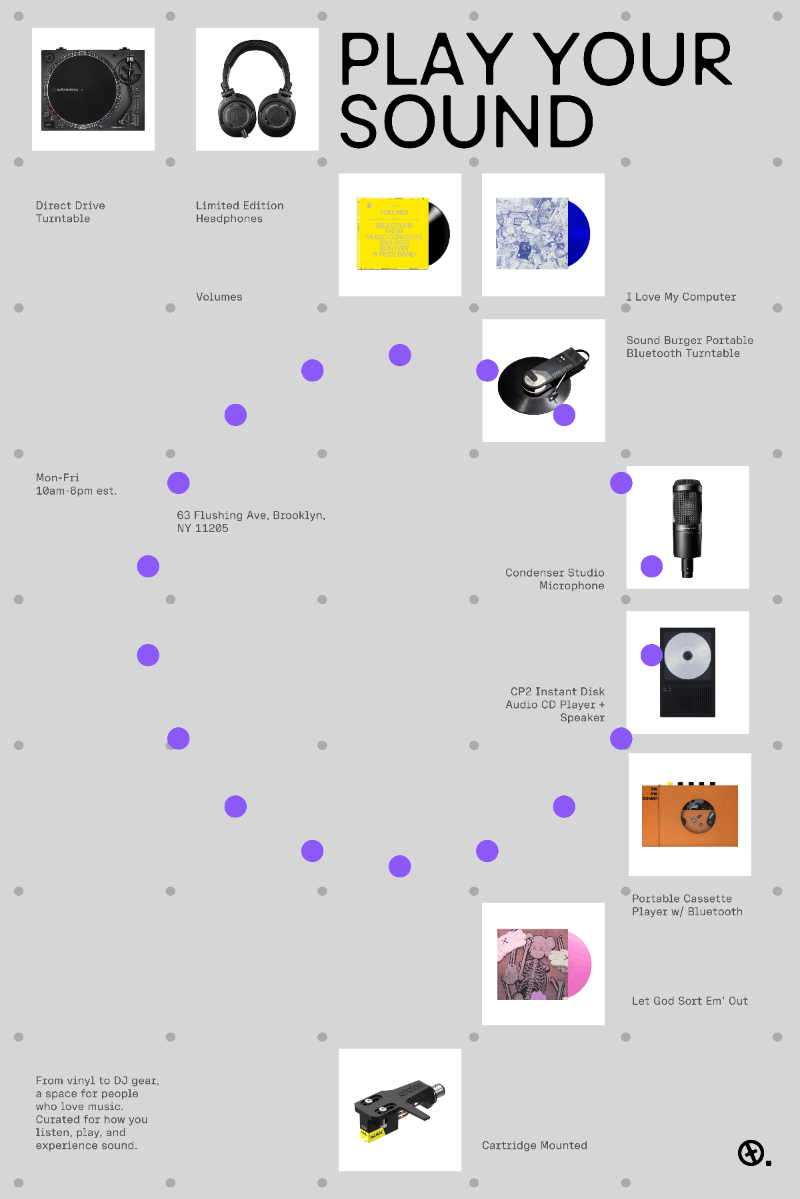
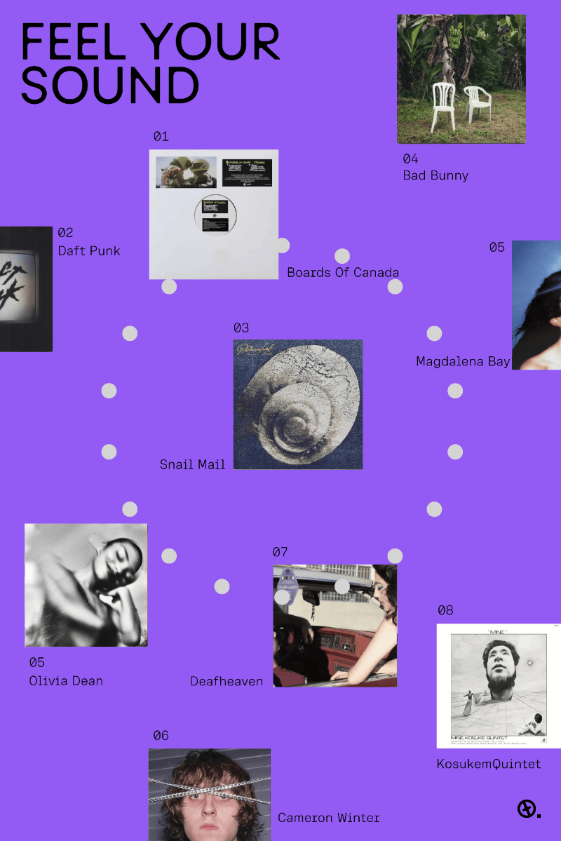
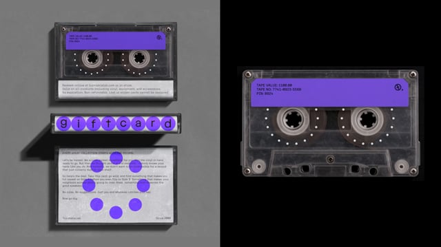
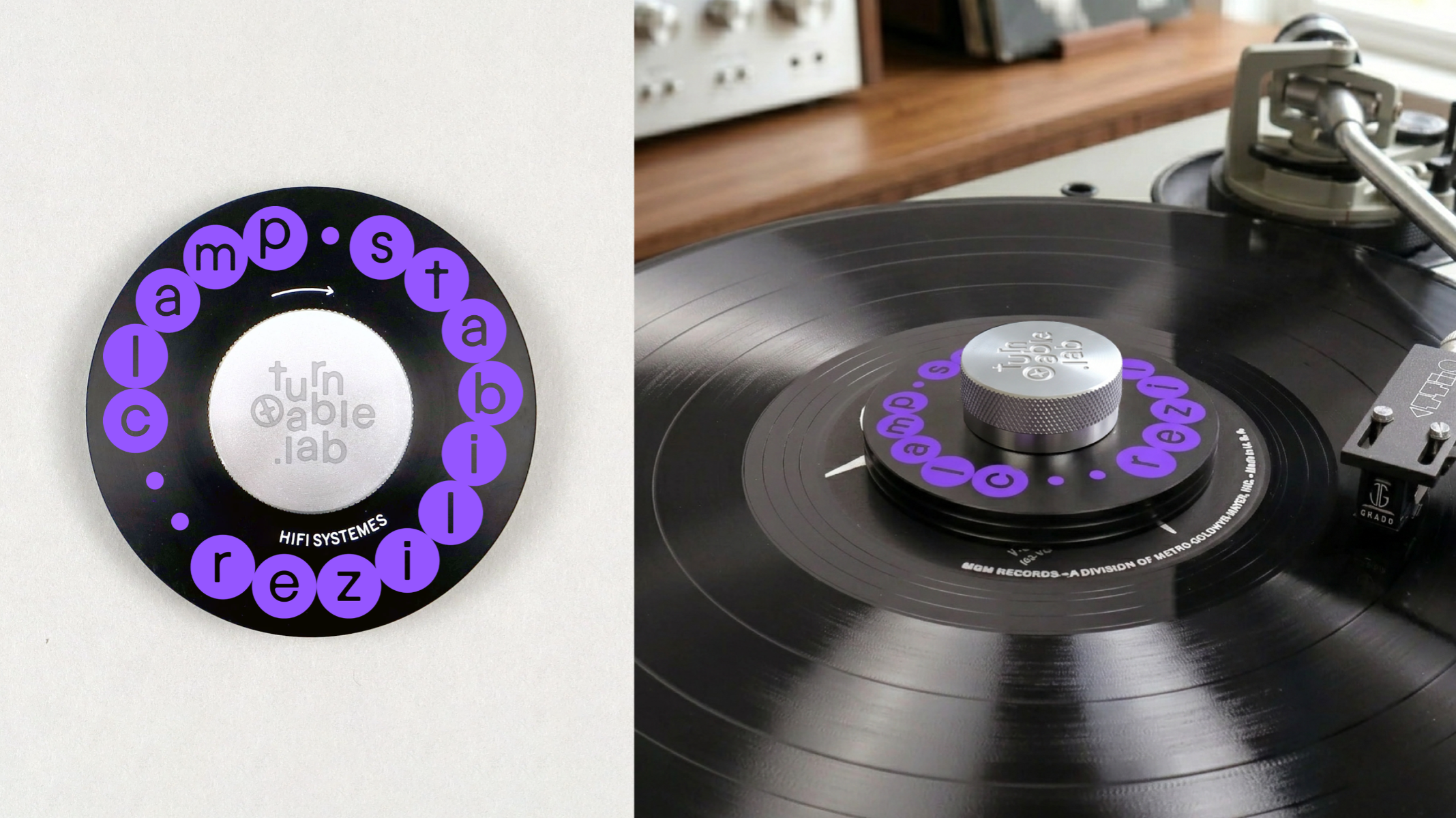
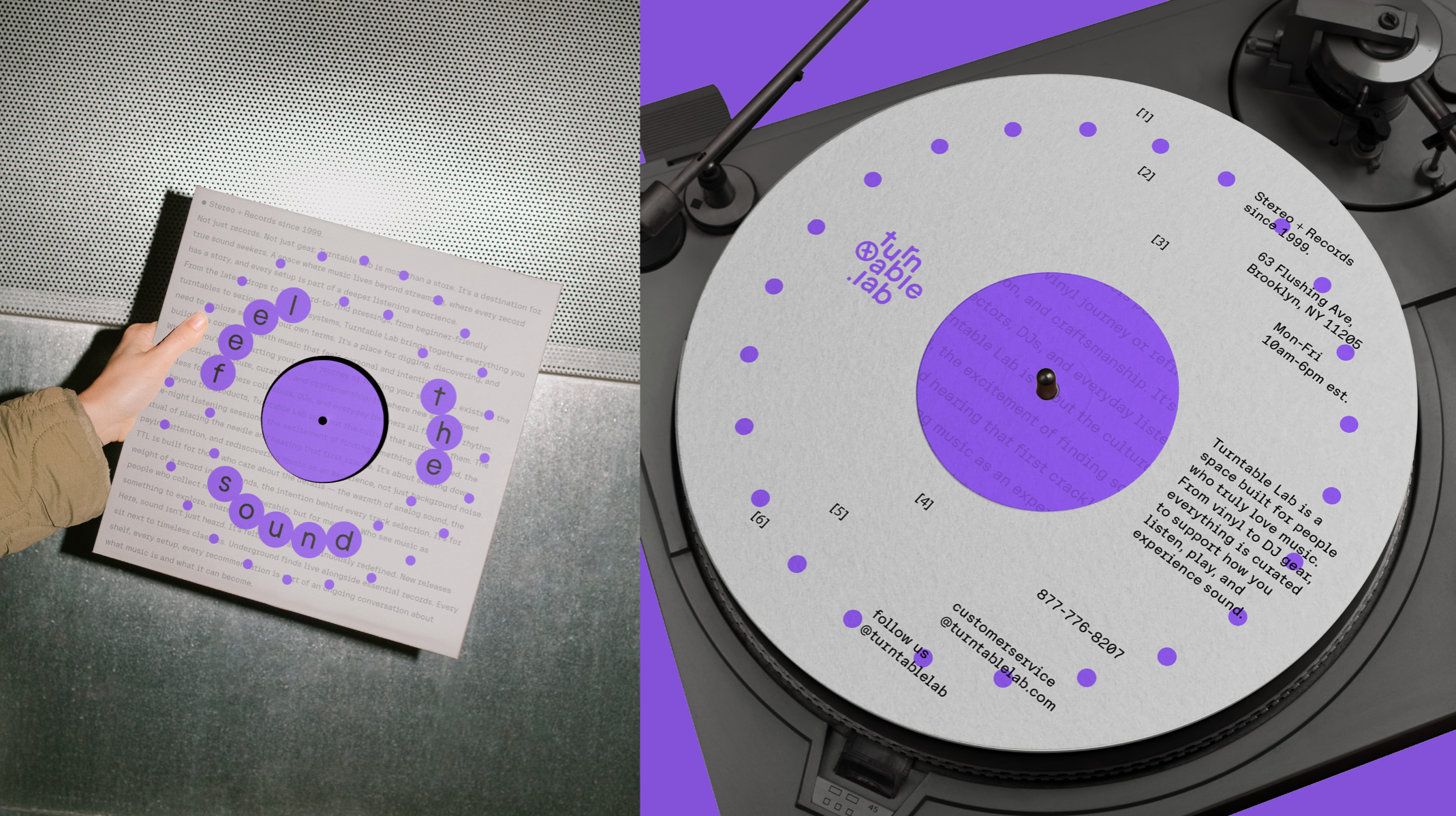
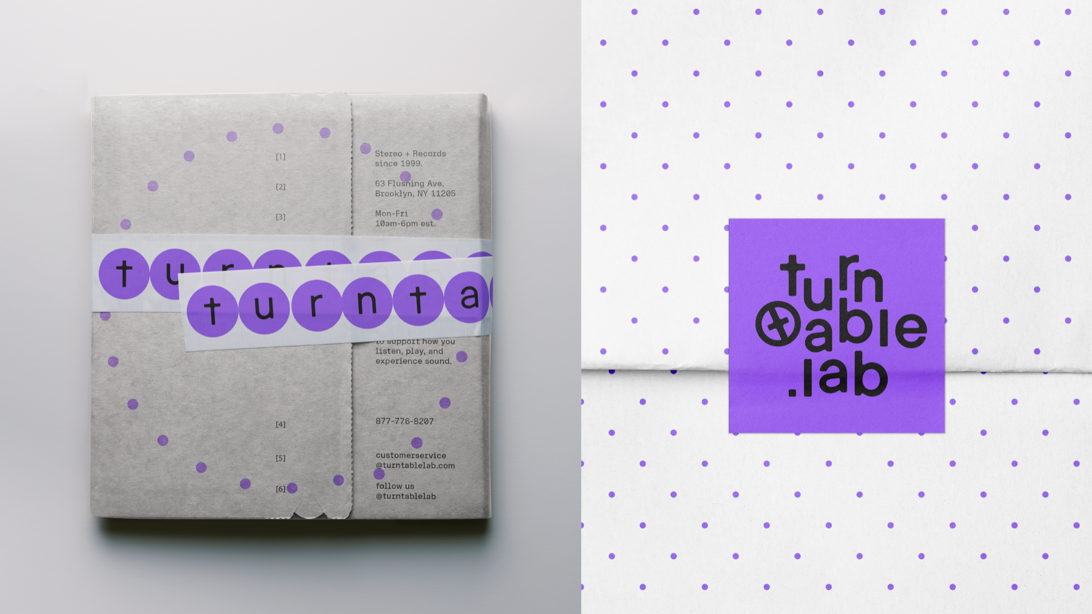
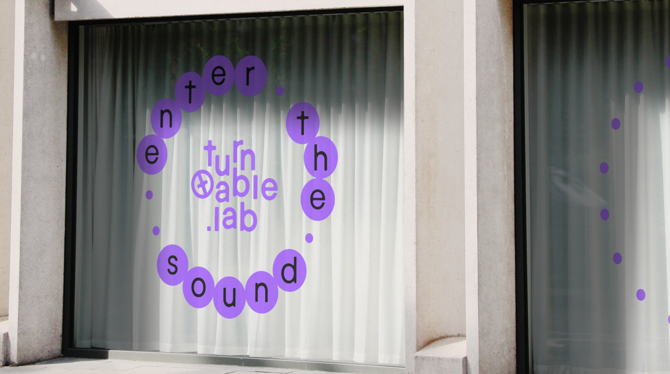
Turntable Lab is a brand focused on vinyl, music, and analog culture. It offers records, turntables, and audio gear, connecting the physical experience of music with a modern lifestyle. This project explores the movement and rhythm of a turntable as the core of the visual identity. Inspired by the spinning motion of vinyl records and the rhythm of music, the visual system creates a sense of continuous movement and energy. By translating the spirit of analog culture into a modern visual language, the identity creates a fresh expression of vinyl and music culture.
Competitions
Global Creative Graduate Showcase 2026
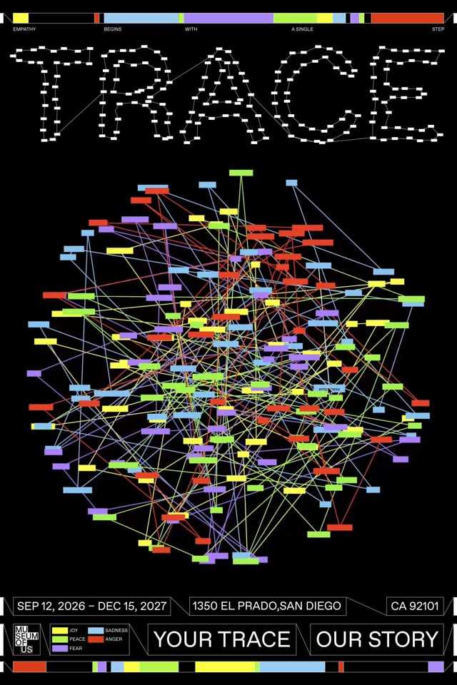
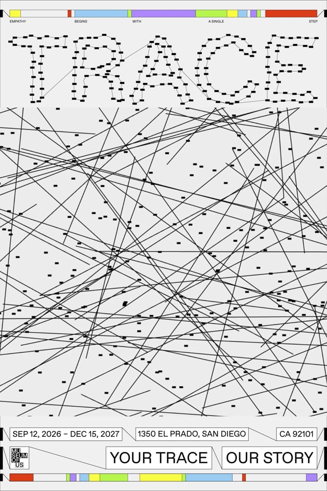
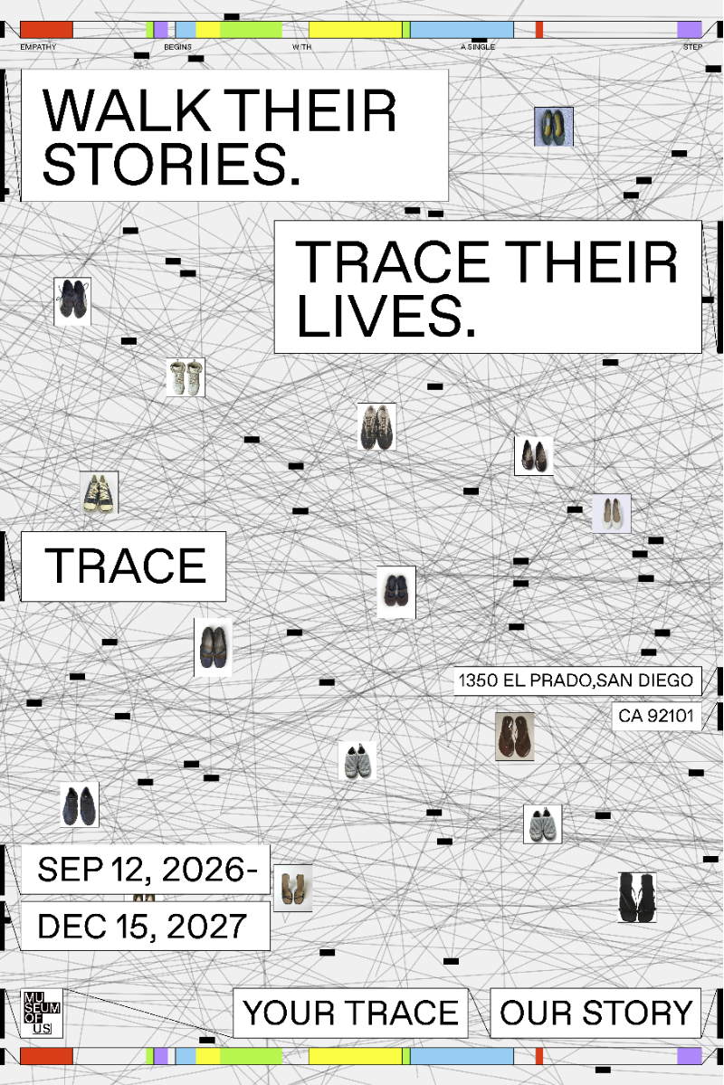
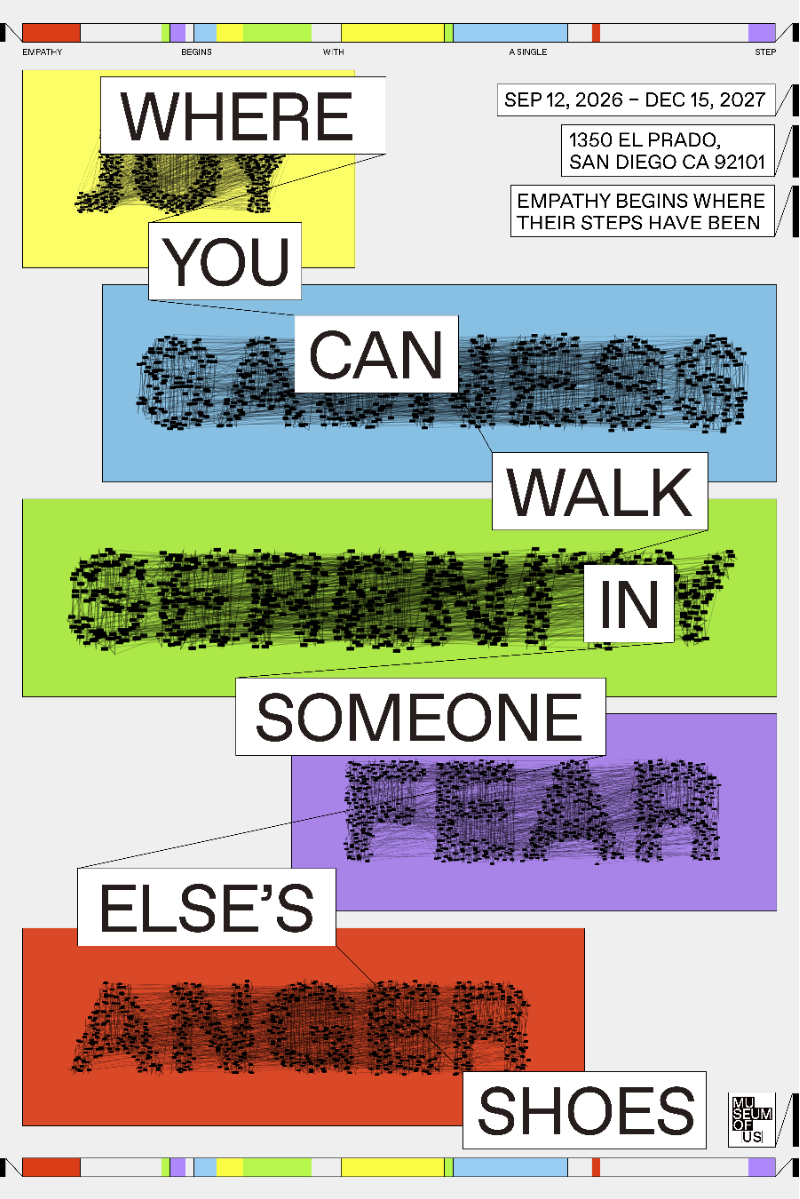
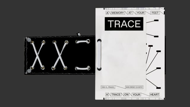
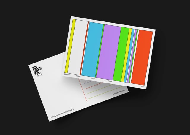
TRACE is an interactive exhibition where visitors wear a pair of shoes and listen to personal stories through audio. By literally stepping into someone else’s shoes, visitors can experience different perspectives and build empathy and understanding for others. The visual system was designed to make the exhibition more engaging and interactive. Inspired by threads that connect different stories and experiences, the line-based graphics attract attention, encourage participation, and guide visitors through the space. The goal was to create curiosity and connection through visual interaction, helping visitors engage more deeply with each story and develop empathy for others. 1~2: Moving Posters 3~4: Posters 5: Brochure Video 6: Postcard Video
Competitions
Global Creative Graduate Showcase 2026
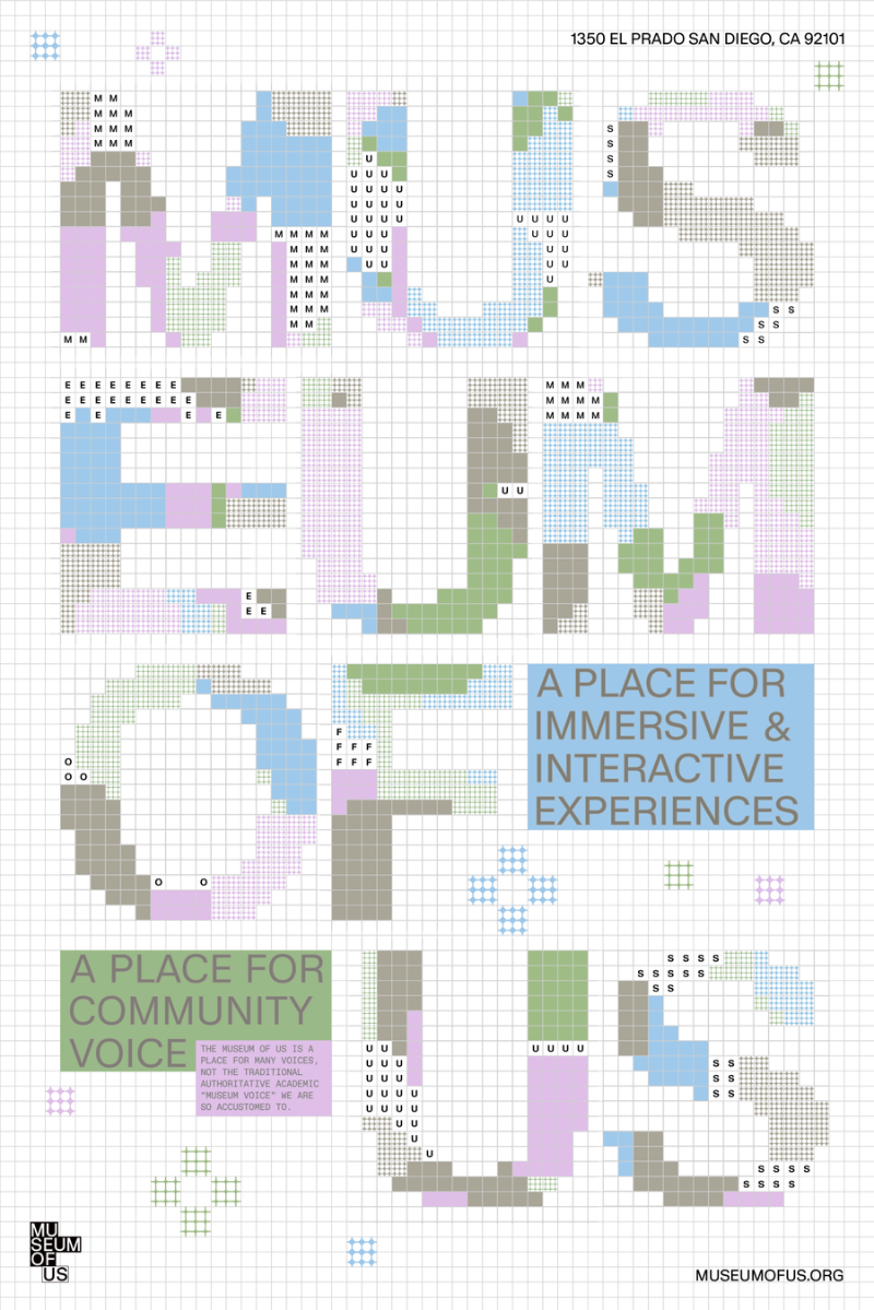
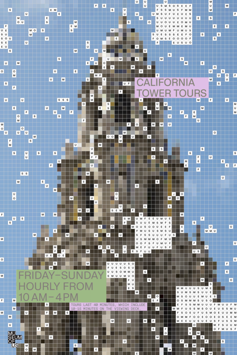
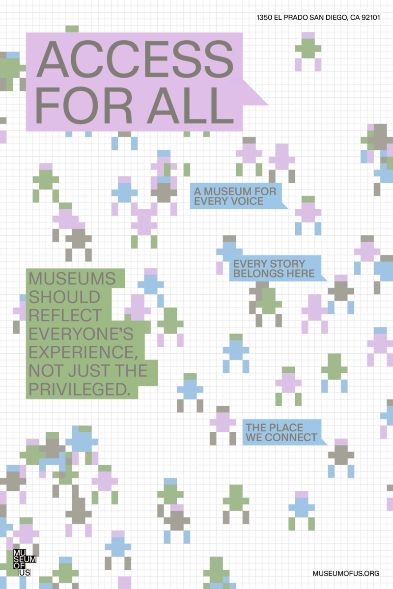
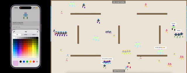
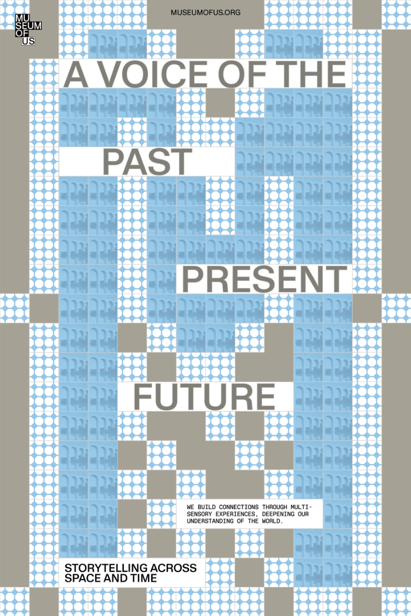
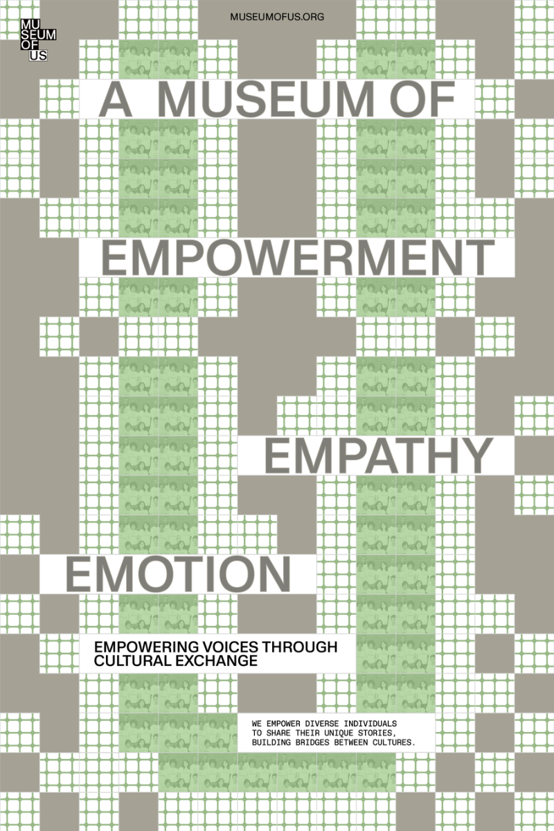
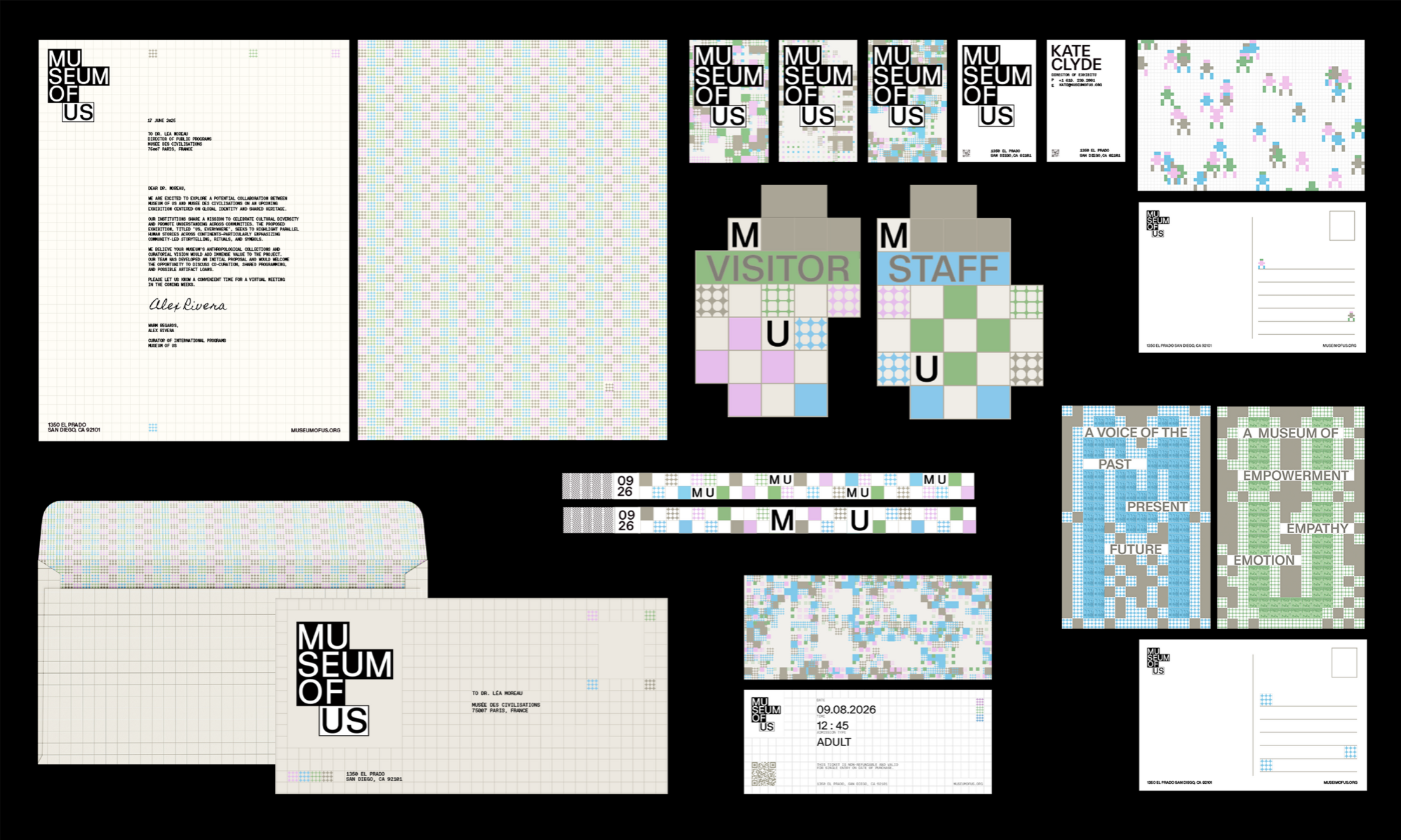
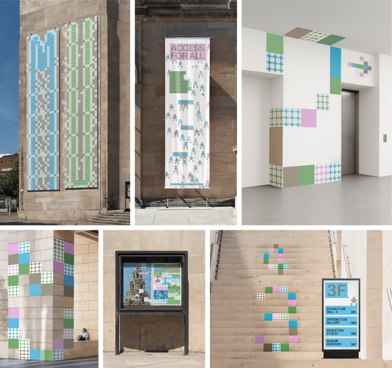
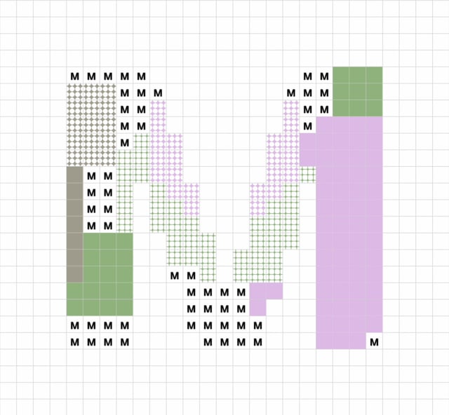
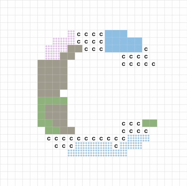
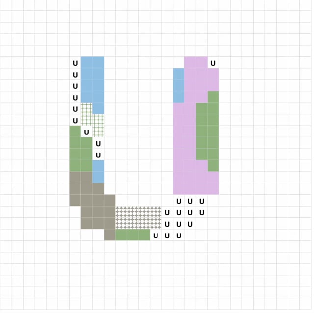
This project is a rebranding of the Museum of Us. The concept started with the idea that a museum is shaped not only by its collections, but also by the people who visit and experience it. In the visual identity, each pixel represents a different person. Every person has their own background, perspective, and experience, just like each pixel exists as an individual unit. When the pixels come together, they create different patterns and shapes. These forms can change depending on how the pixels come together, but every pixel is still an important part of the larger image. This represents how different people come together to create the Museum of Us. Visitors are not just people who come to see the museum. Through their experiences and participation, they become part of the museum and help shape what it is. Generative typography and interactive systems bring this idea into the visual identity. The visuals can change and grow through participation, showing how many different individuals can come together and become part of something bigger.
Competitions
Global Creative Graduate Showcase 2026
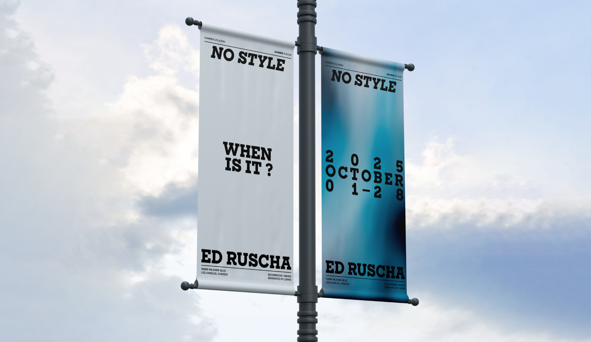
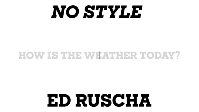
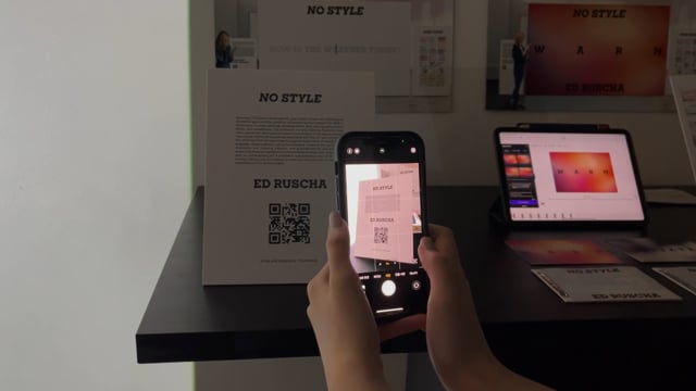
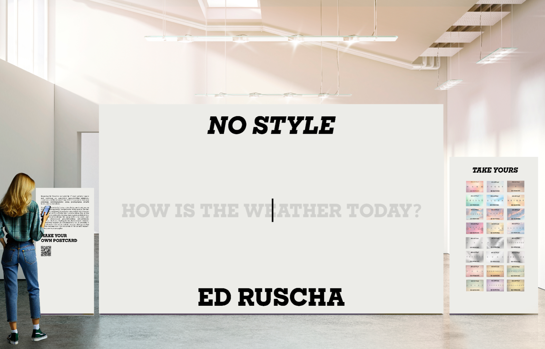
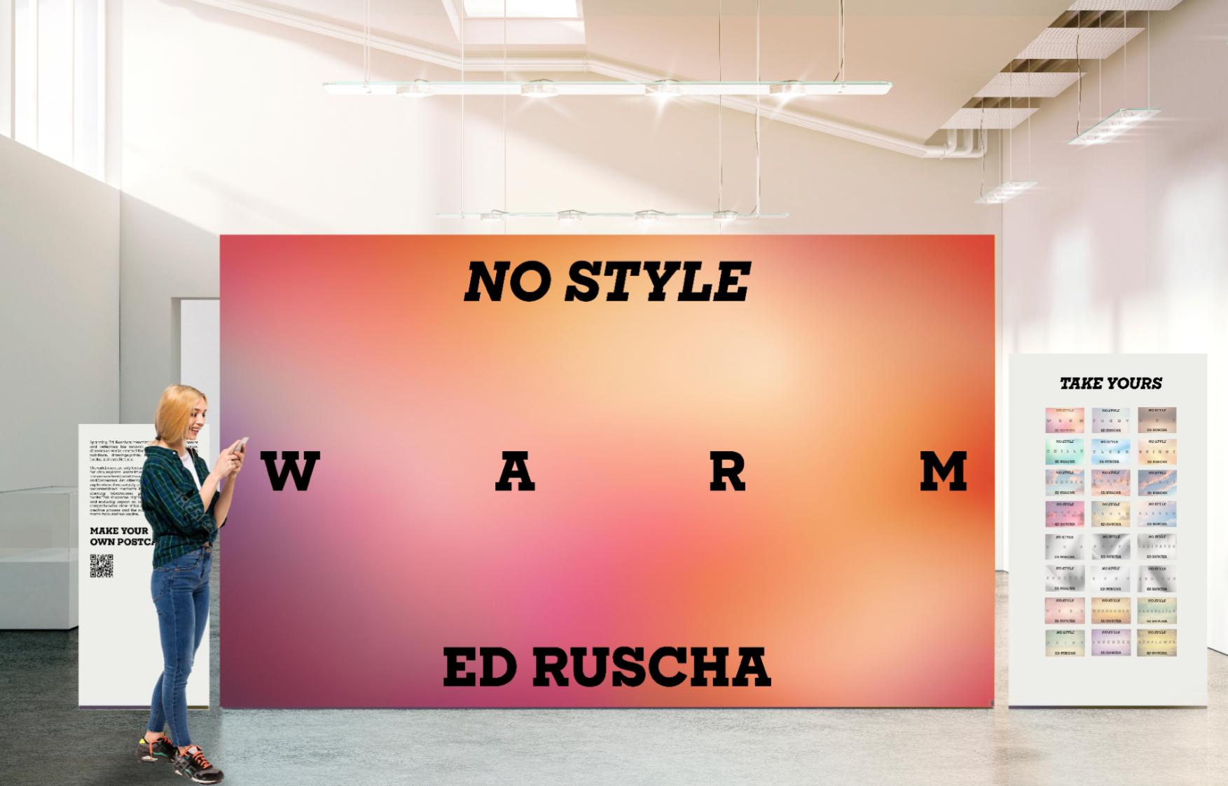
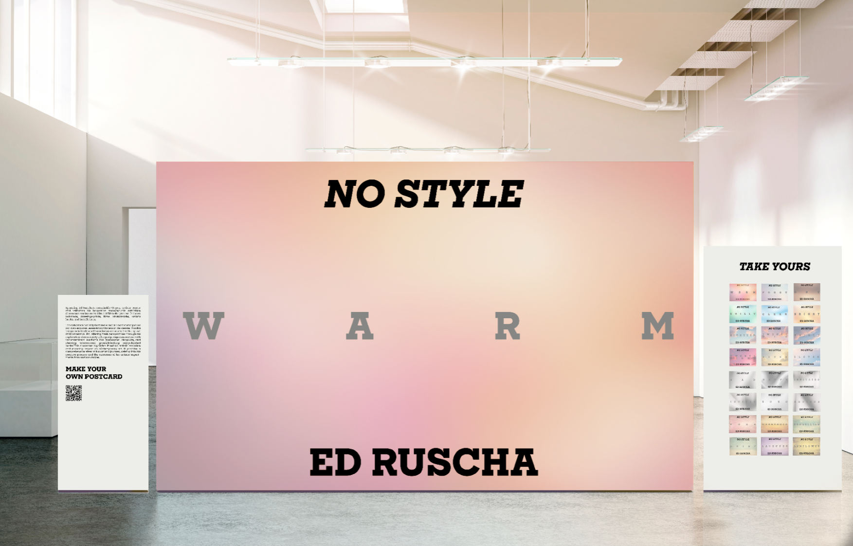
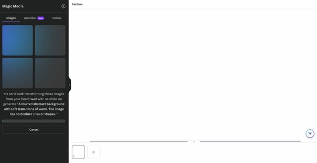
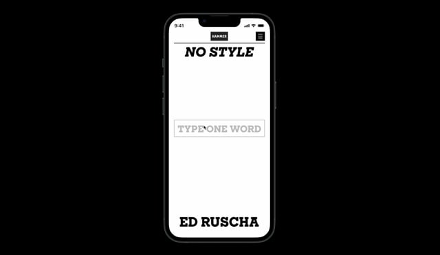
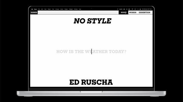
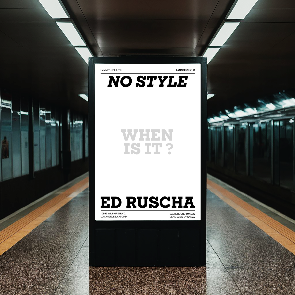
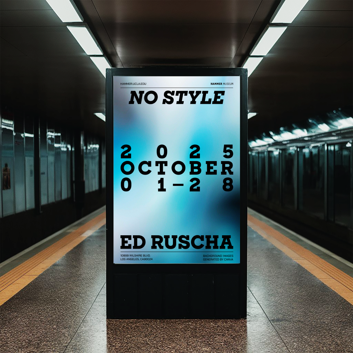
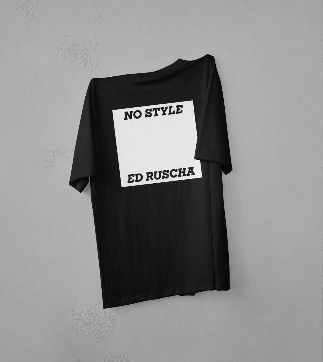
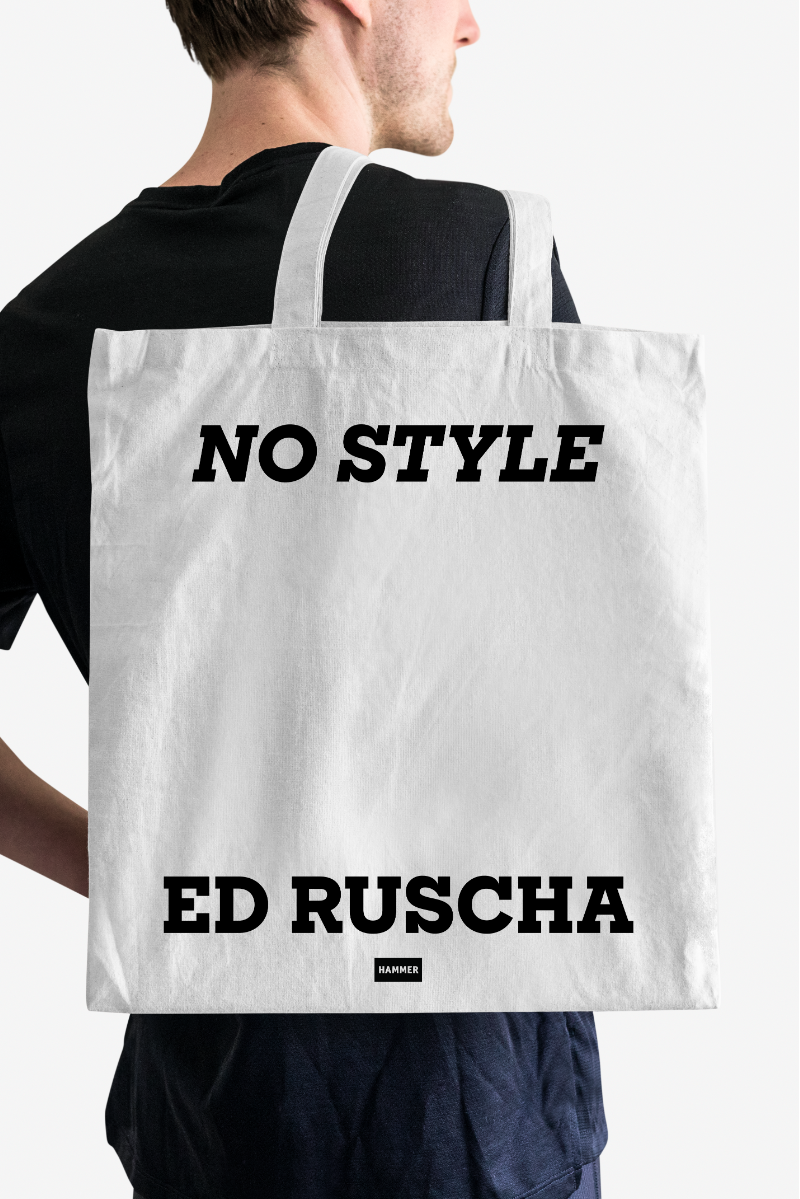
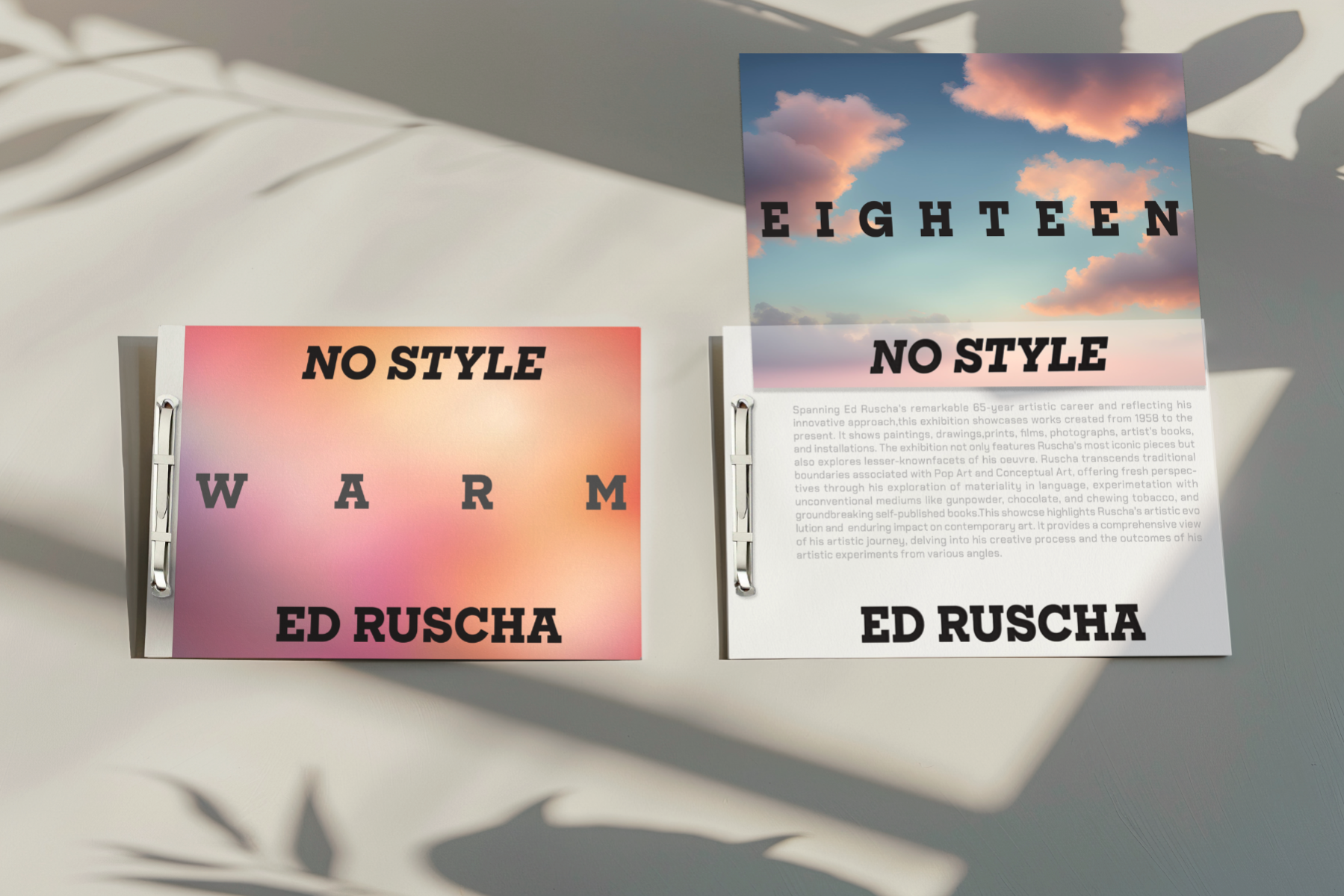
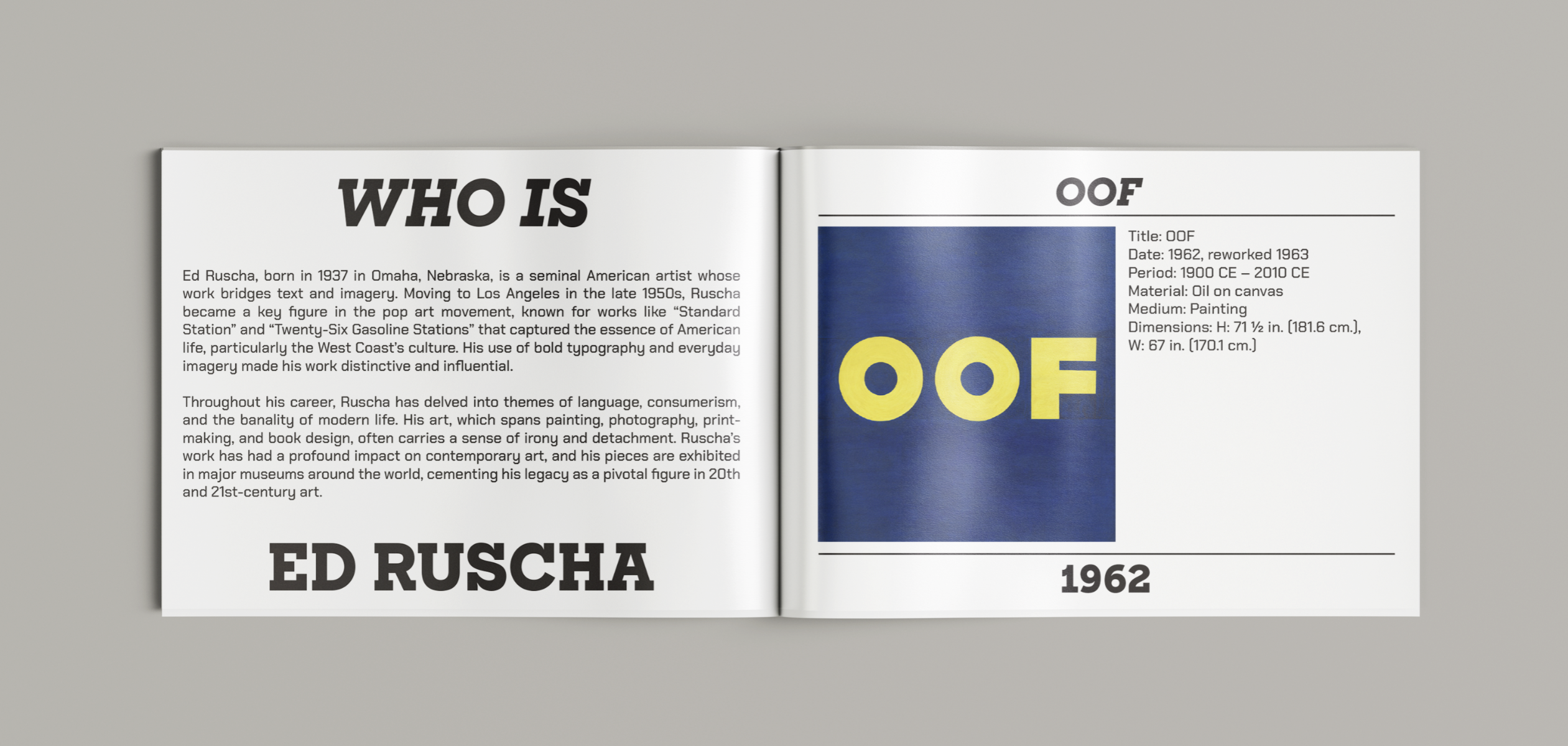
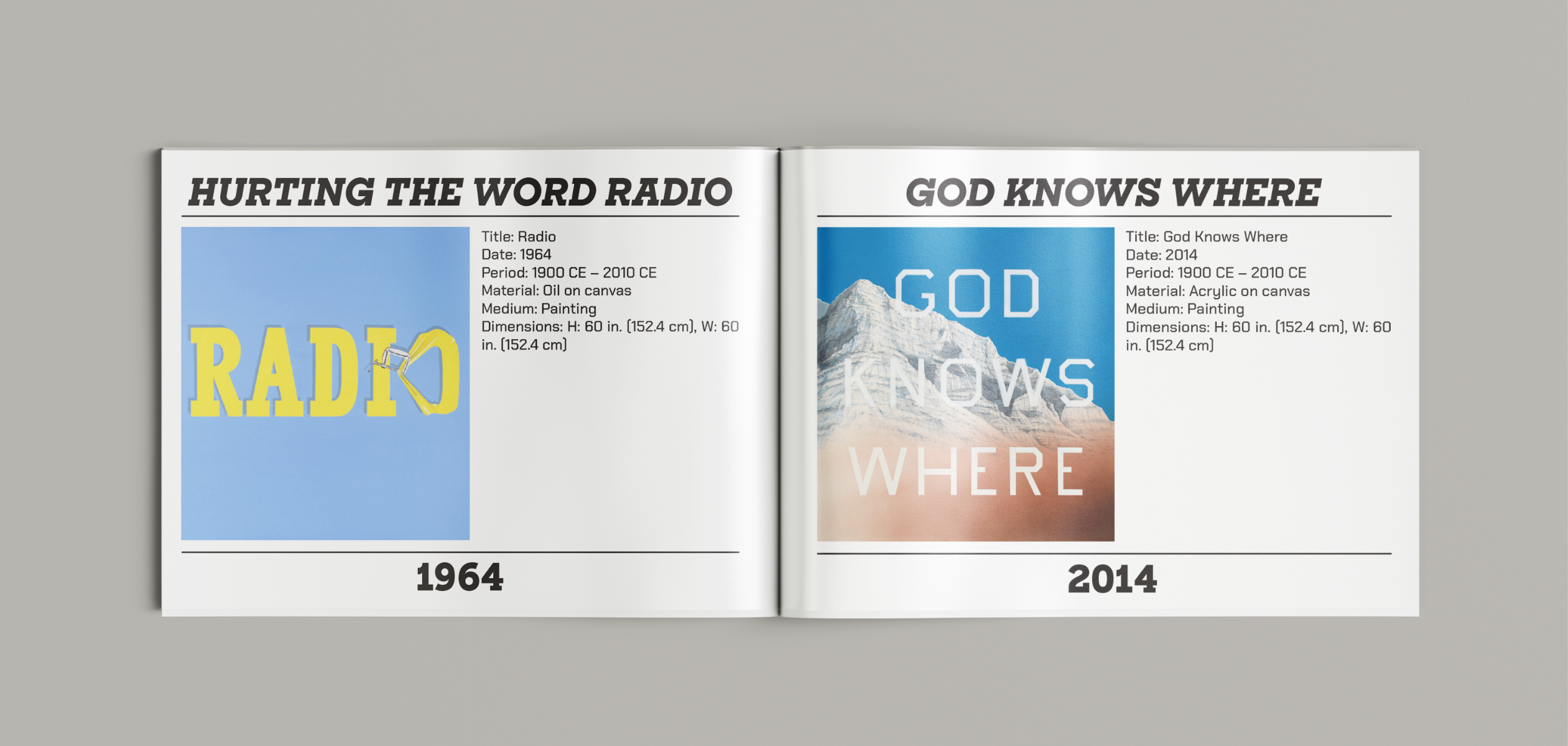
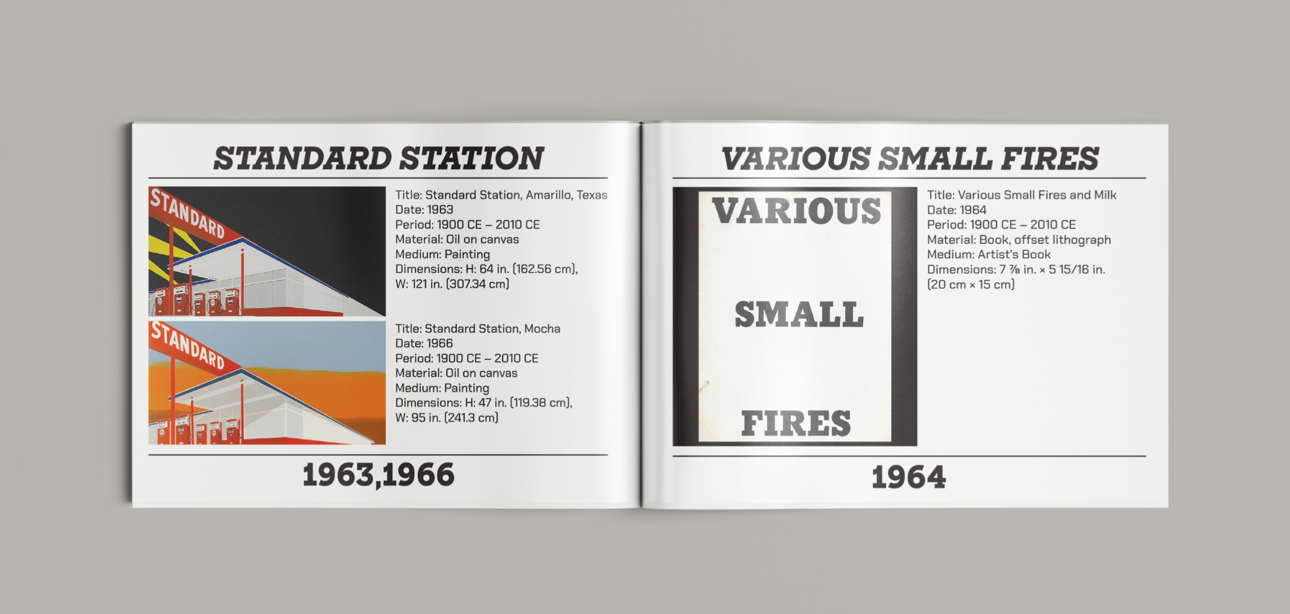
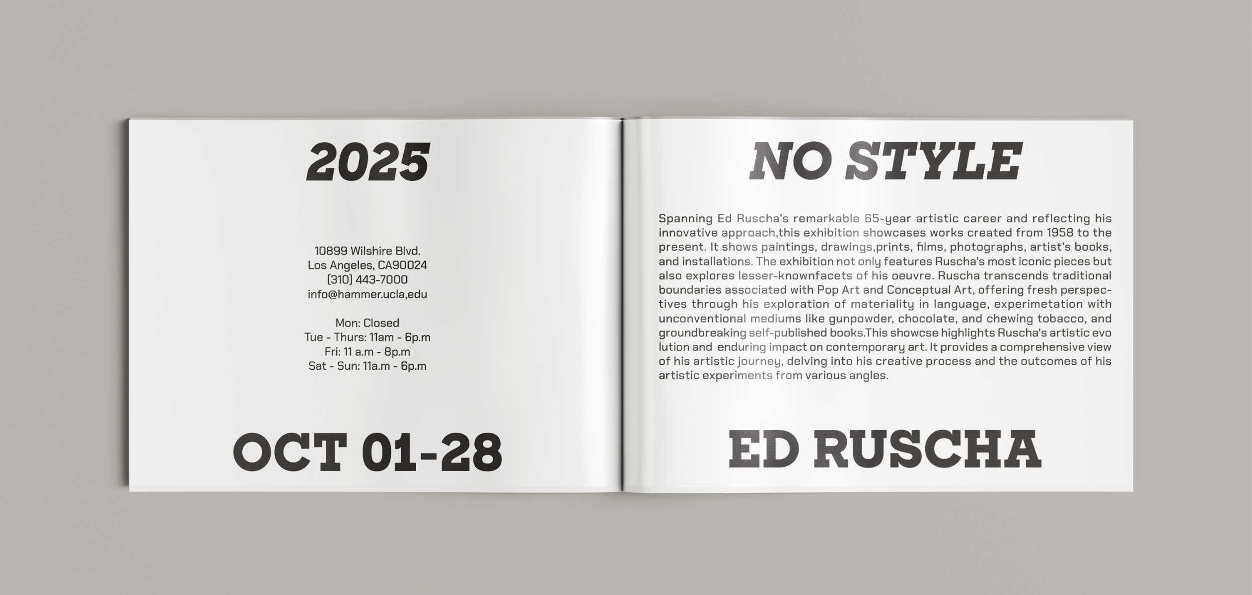
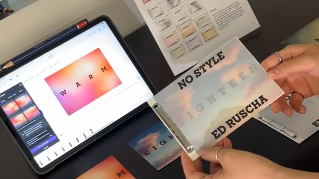
The identity of this Ed Ruscha exhibition is built around his philosophy, "It's better to have no style than any style." Rather than pushing a specific visual direction, the design begins from his belief that the background is simply a stage for the words, carrying mood. That idea of quietly capturing atmosphere without forcing a style became the foundation for every decision. The title wall features AI-generated background images inspired by his work. At the center, a single everyday question reflects how he found material in the ordinary. Visitors submit answers on their phones, and AI generates images from each response. These words and visuals appear in real time, turning the wall into a living, constantly shifting space shaped by participation. All background images were created using Canva, with prompts carefully designed to match the mood of each question. Each prompt was written to produce a soft and abstract background, where the color and texture shift subtly depending on the visitor's answer, so no two generated images ever look quite the same. The questions range from everyday topics like weather and favorite flowers to more personal ones like how you feel today. For each category, a different visual style was applied drawing from Ed Ruscha's own ways of working, making sure the background always stays as a quiet stage for the words.
Competitions