tze ching clarice lam
MA data visualisation
London College of Communication UAL
Specialisms: Digital / Visual Comm / Film / Graphic Design / Design Research
Location: London, United Kingdom


tze ching clarice lam
First Name: tze ching clarice
Last Name: lam
Specialisms: Digital / Visual Comm / Film / Graphic Design / Design Research
Sectors:
My Location: London, United Kingdom
University / College: London College of Communication UAL
Course / Program Title: MA data visualisation
About
Specialising in promotion design and cultural-socio design, Clarice is avid at interpreting and observing the daily surroundings, combined with a keen eye for detail, allowing her to infuse a humanistic touch into her works. The designer believes data reflects our every bit of life and can turn into a new visual language essential to creating impactful design.
When generalisation and impersonality promote holistic pictures and technical approaches in data visualisation, the designer explores small but significant data related to everyday life.

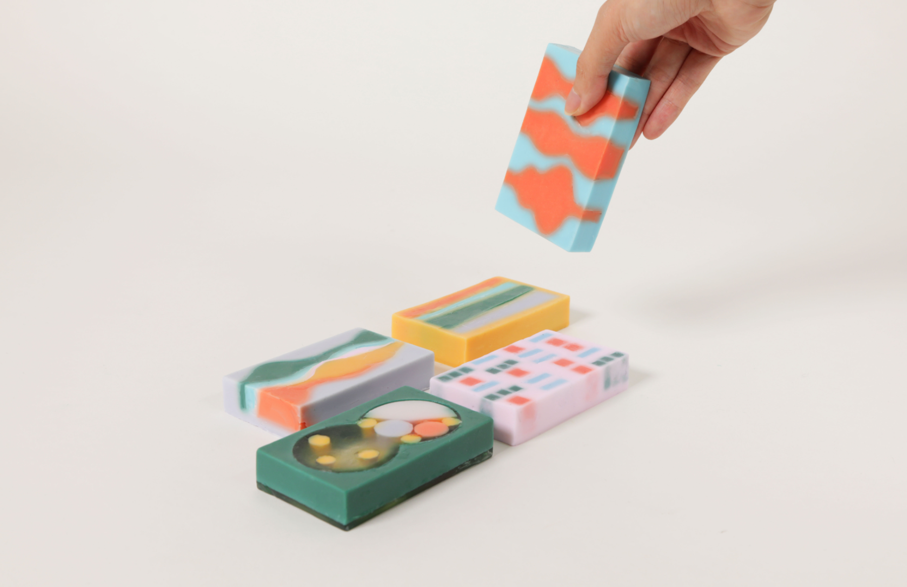


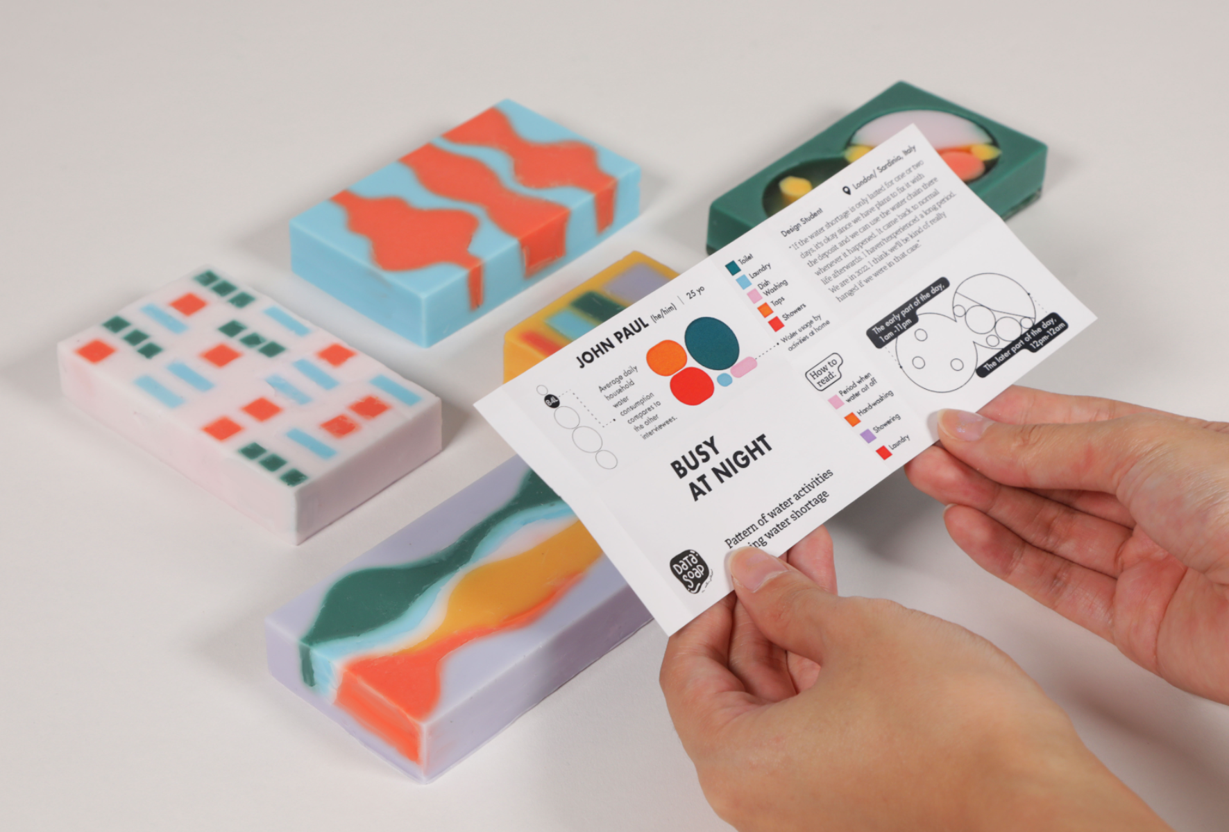


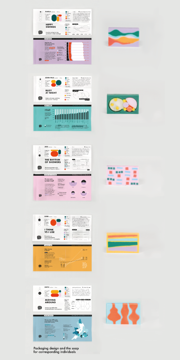


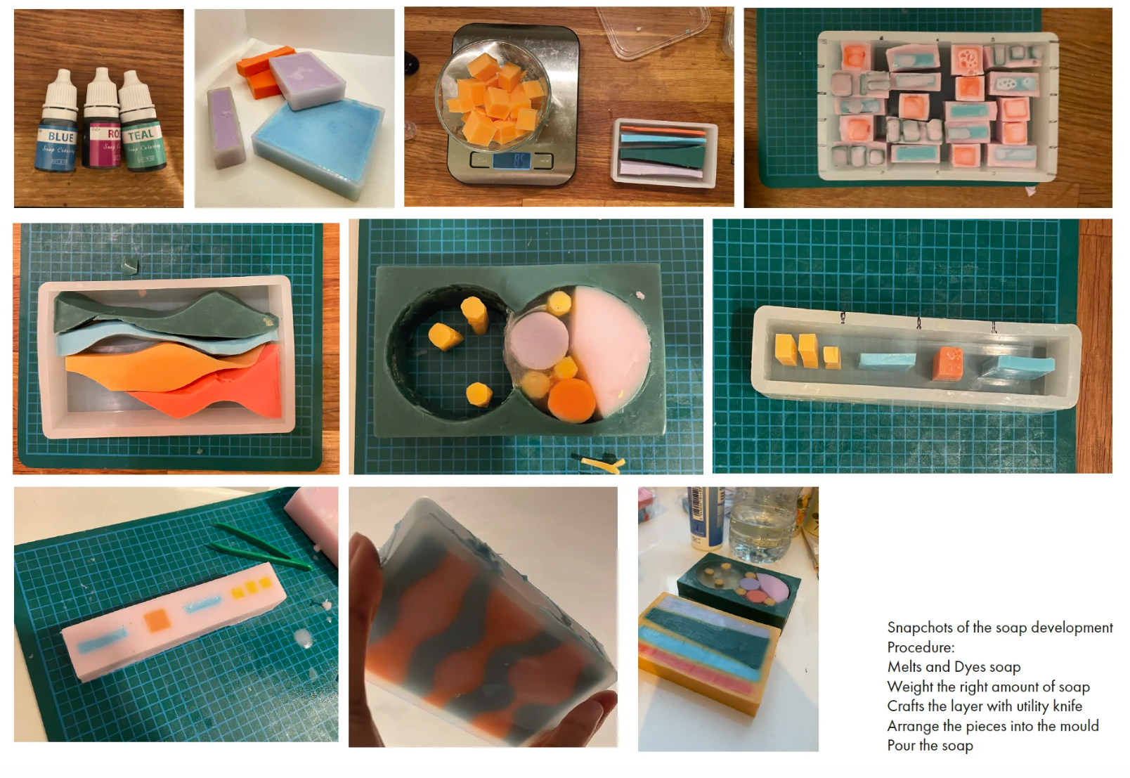
Data Soap is a personal documentary project presenting individuals’ household water stories with data and emotion. It allows the audience to glimpse people’s lives. The data is transformed into an object frequently used in our daily water activities, a soap bar that can act as a reminder whenever people use it. The project aims to celebrate natural resources by examining the relationship between water and human beings and seeing the opportunities to seek a new visual language to promote domestic water conservation. By examining individuals’ perceptions about UK-based domestic water consumption through interviews and secondary desk-based research, I observed several misconceptions about water stress and water inequality. I have also examined the relationship between emotional design and personalisation in data visualisation, which has led me to attempt to establish a positive narrative to promote water conservation with this output, which is arguably more effective as a prompt for behaviour change than an emotional deterrence (Beaudry & Pinsonneault, 2010). For more to follow: https://www.instagram.com/data.soap/
Competitions

Global Design Graduate Show 2023


SDG 14: Marine Acidity in Australia
The interactive project displays the Marine Acidity condition in Australia throughout the years and aims to reveal that threatened marine life is closely linked with marine acidification. Inspired by the organic and colourful coral reef system under the sea, I tend to present the data in the form of irregular shapes. Moreover, colour plays an important role in this project. Research has shown that marine acidity will lead to the bleaching of the colourful coral reefs. Inspired by such a concept, I decided to select a set of gradient colours. The more vibrant the colour, it represents the higher the pH value in the dataset. In contrast, the paler and brighter the colour, the lower pH value is represented. As the end product, the data flows and moves when dragging the timeline bar, creating an illusion of how the marine acidity changes over time. prototype here: https://xd.adobe.com/view/4ef7ab08-10a6-412f-b249-5150188e2314-1ba4/?fullscreen&hints=off Data sources from SDG14.