Eleanor Pike
Graphic Communication BA Hons
Norwich University of the Arts
Specialisms: Graphic Design / Art Direction / Interactive / Motion
Location: London, United Kingdom

Eleanor Pike
First Name: Eleanor
Last Name: Pike
Specialisms: Graphic Design / Art Direction / Interactive / Motion
Sectors:
My Location: London, United Kingdom
University / College: Norwich University of the Arts
Course / Program Title: Graphic Communication BA Hons
About
I'm a Graphic Communications Graduate at Norwich University of the Arts with a passion for analogue design processes and concept-led work. I love experimenting with techniques such as cyanotype and printmaking, using them to create outcomes that feel unique and unexpected.
My work is driven by curiosity and a desire to think differently. While I use digital tools when needed, I find that hands-on processes allow me to be more creative, explore ideas more freely, and bring a distinctive character to my projects.
My work is driven by curiosity and a desire to think differently. While I use digital tools when needed, I find that hands-on processes allow me to be more creative, explore ideas more freely, and bring a distinctive character to my projects.
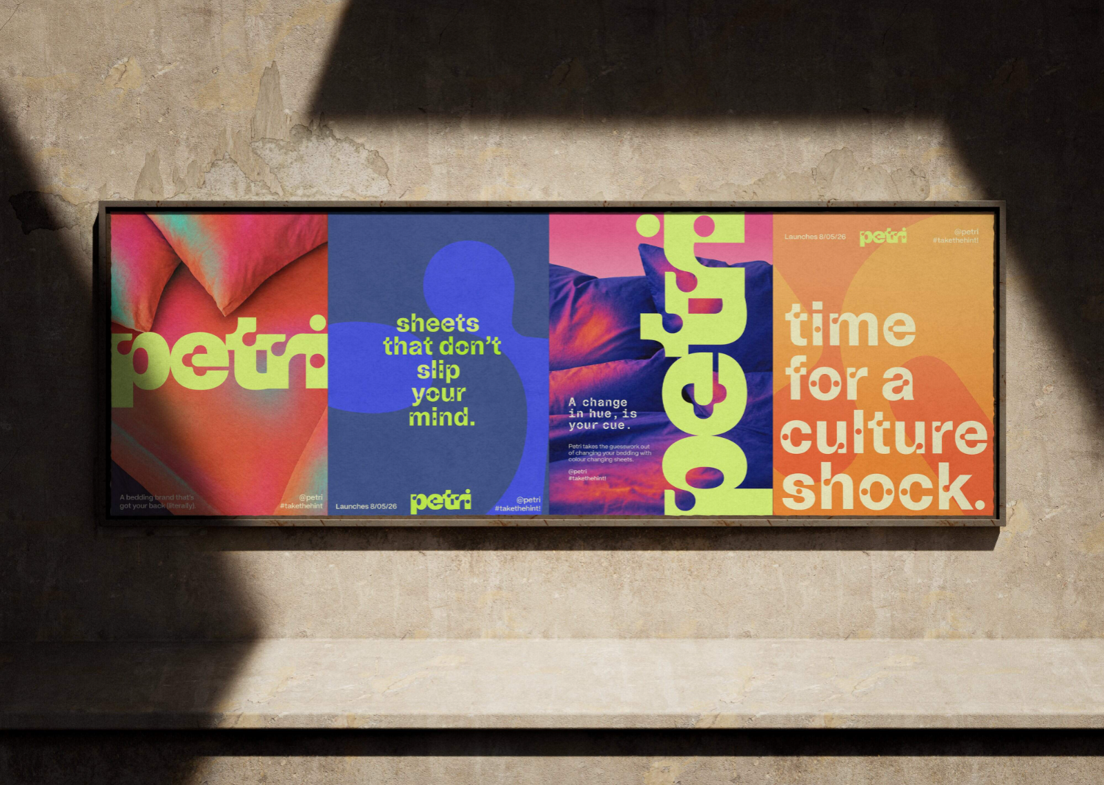

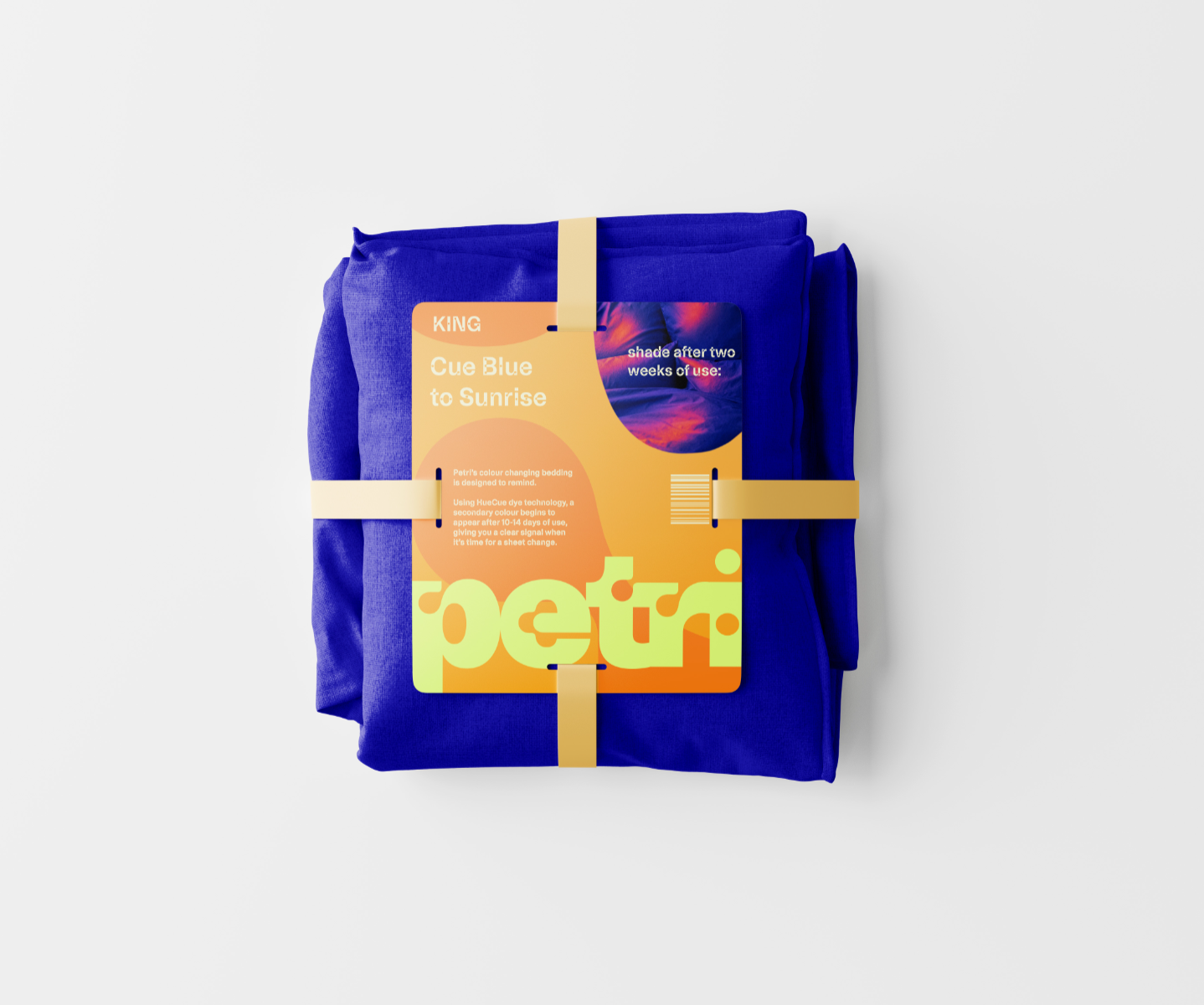
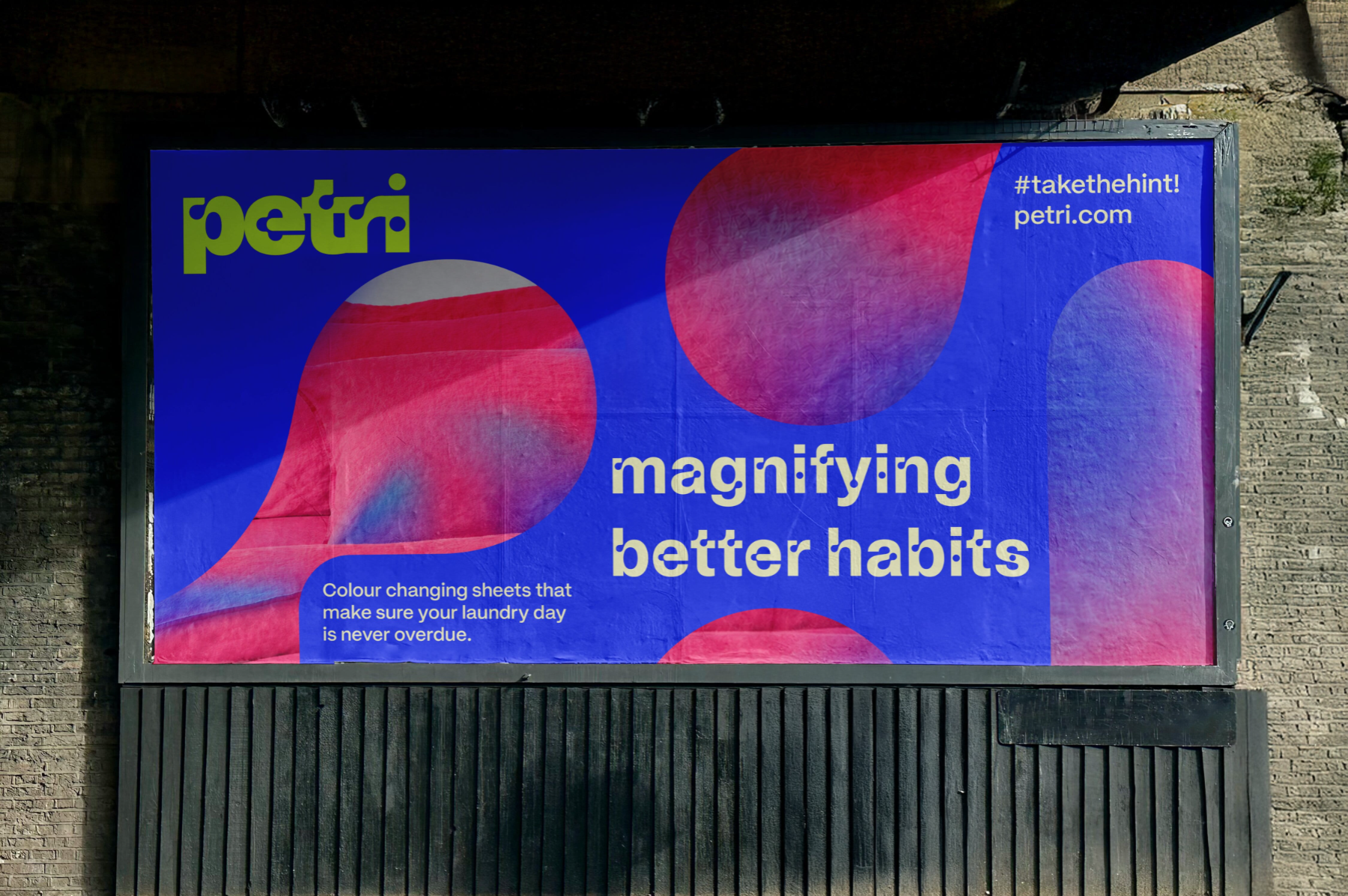
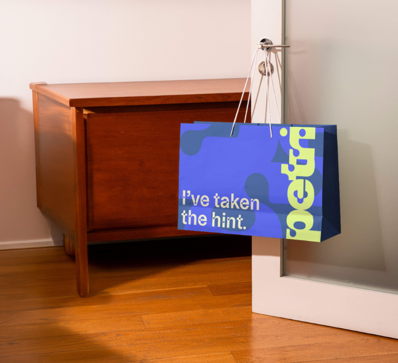
Experts suggest that people should wash their bedsheets once a week. In reality, most people don’t. The number one reason why people don’t wash their bedsheets as often as they should is forgetfulness. This is where Petri comes in. Petri takes the guesswork out of changing your bedding with colour changing sheets using microencapsulated dye technology. For this project I used a typeface called ABC Camera by Dinamo type studio. The typeface is a reinterpretation of light traps, similar in logic to ink traps. I used this typeface to communicate the idea of growth, working in harmony with the name Petri, as well as using the typeface traps as framing devices throughout my brand rollout.
Competitions
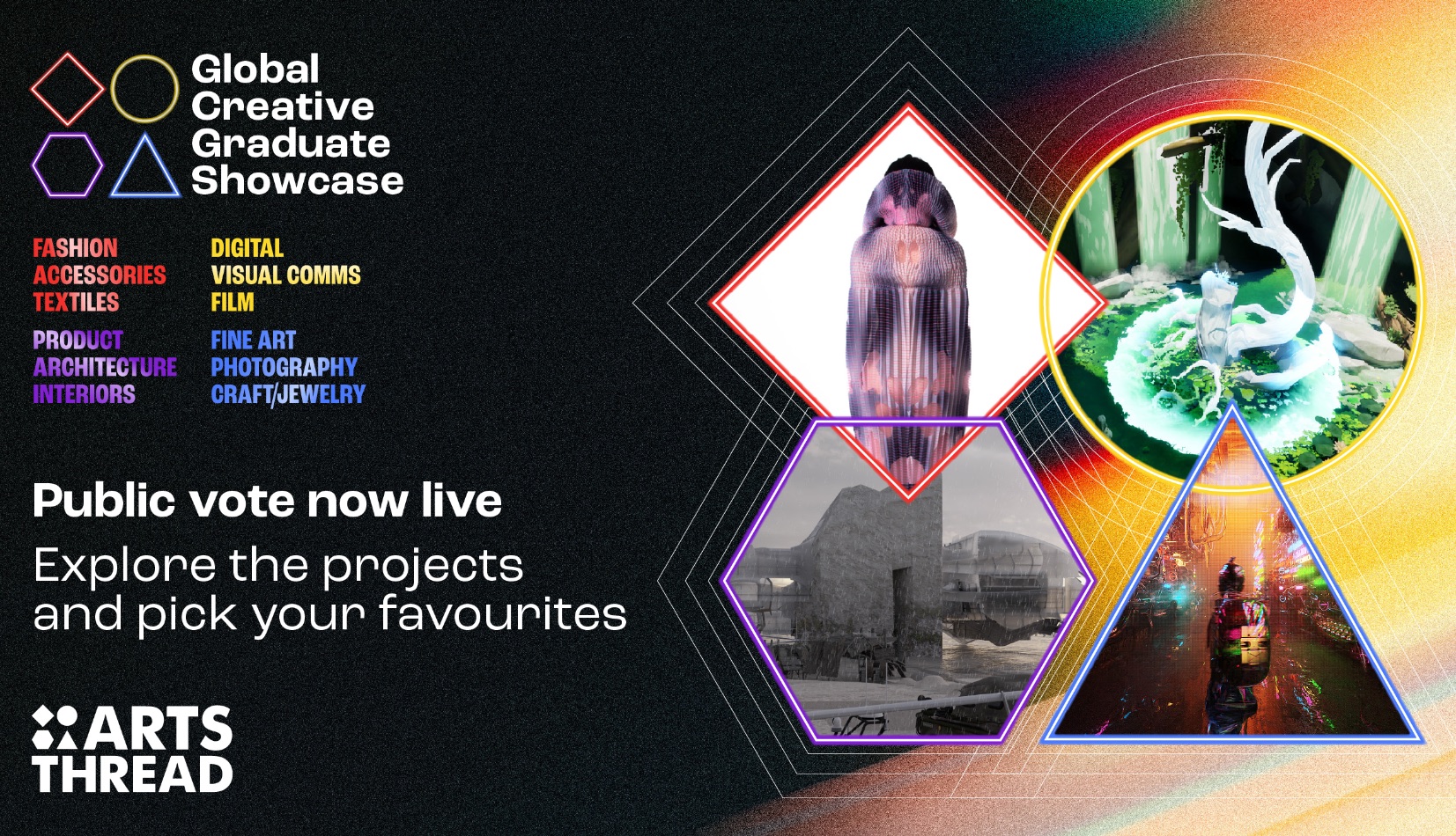
Global Creative Graduate Showcase 2026
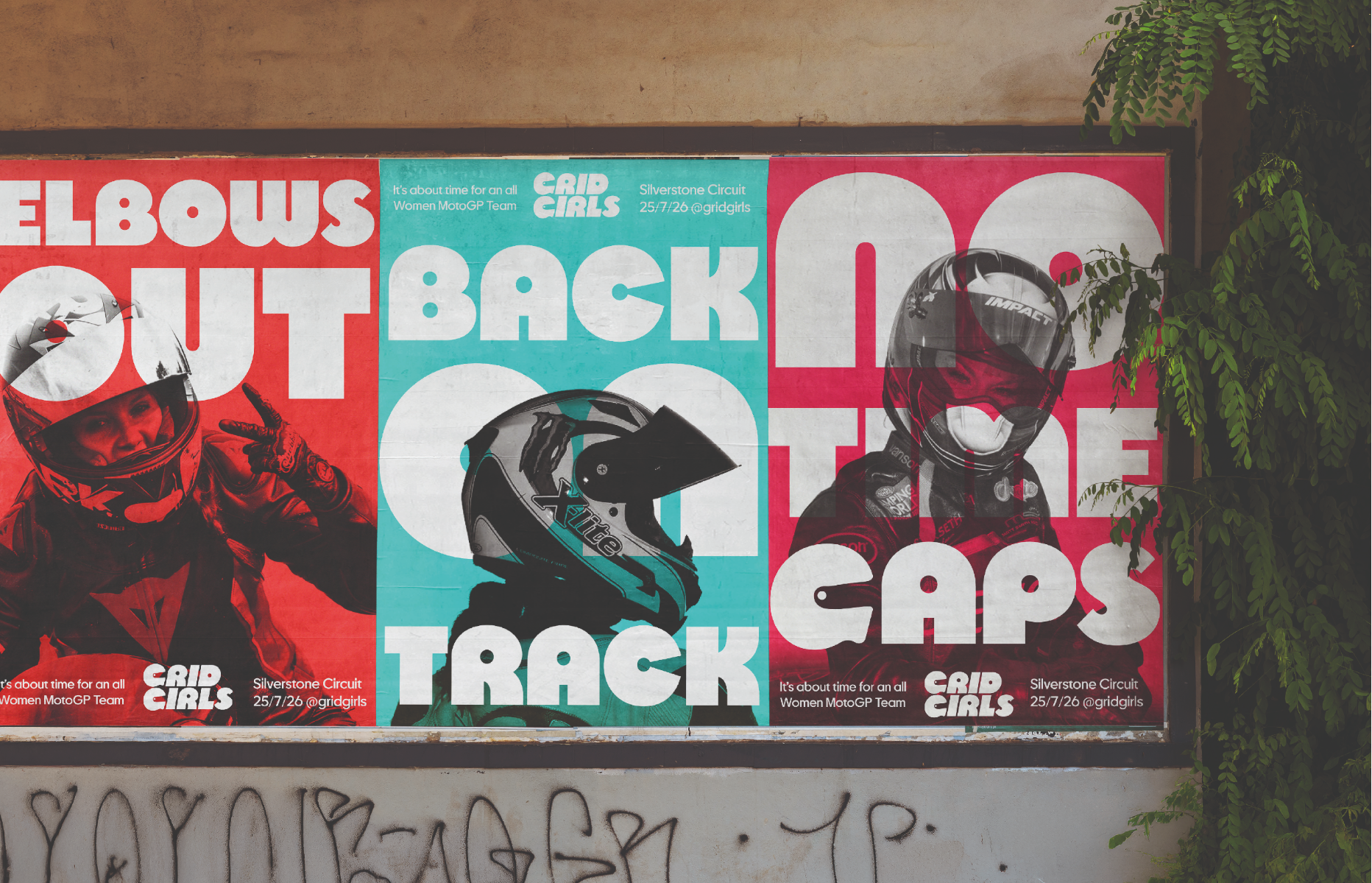
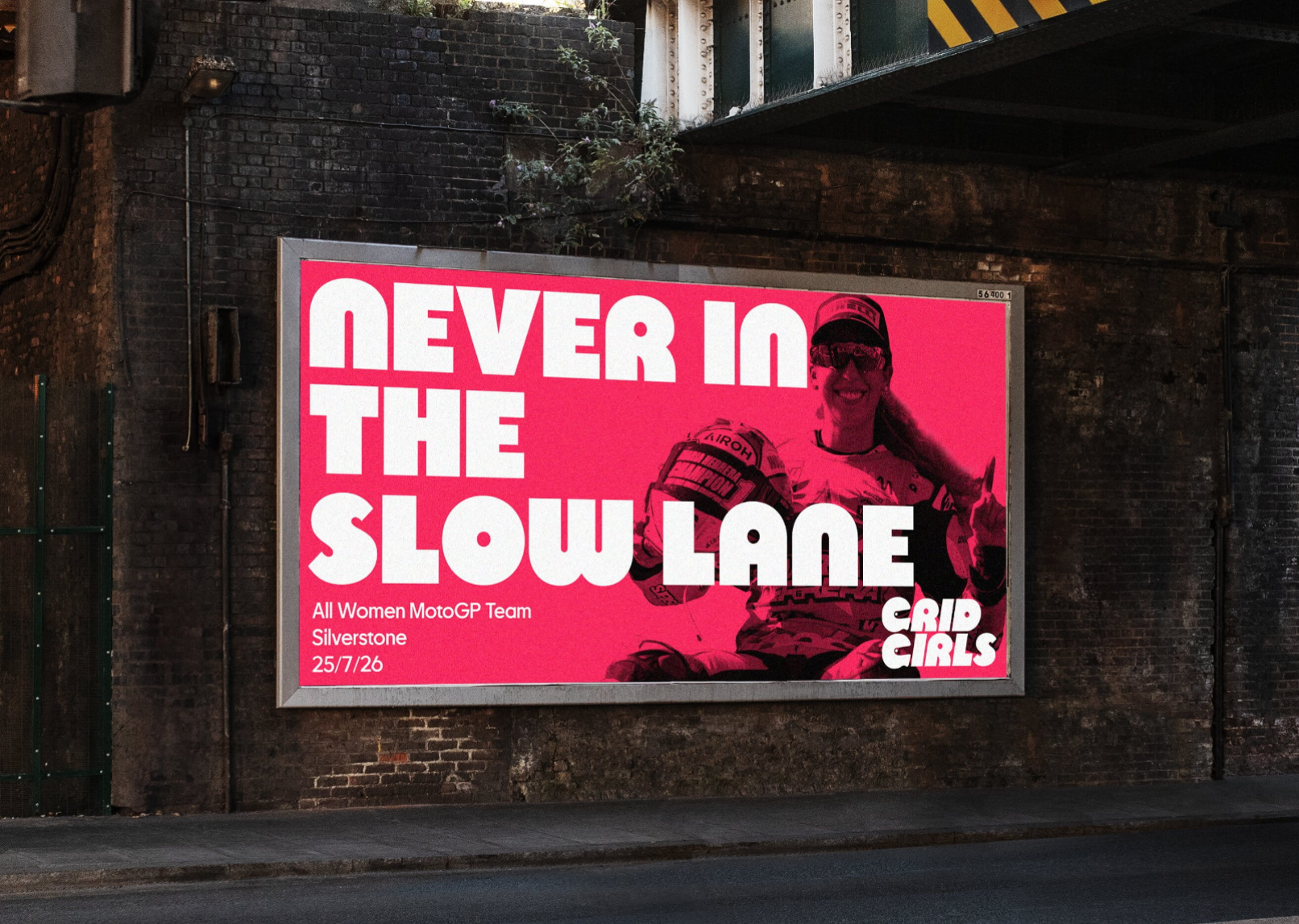
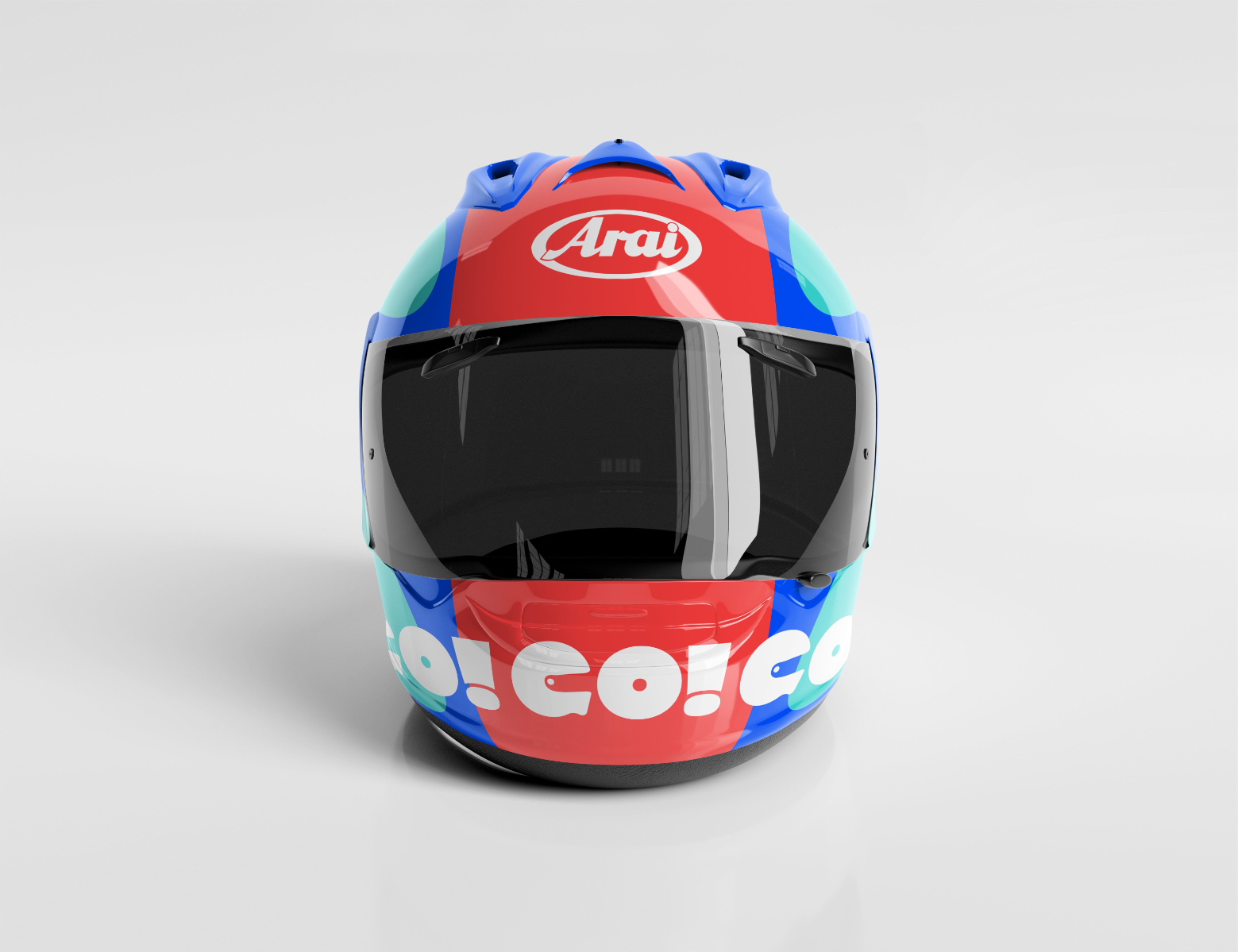
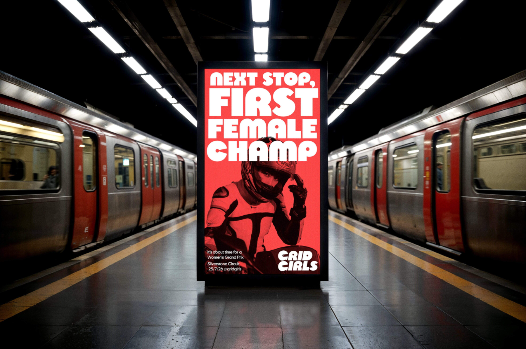
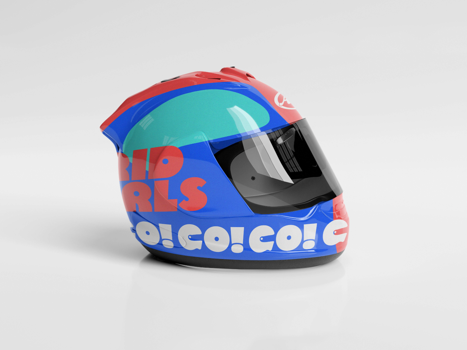

This project, based on the dragon rouge protest brand brief, aims to celebrate women in MotoGP, as no woman has ever competed in the race to this day. This brief asked for a series of outcomes that is based on a passionate personal belief, which I answered with a brand rollout based on classic 70s/80s racing. Using a bold retro typeface inspired by this era, as well as impactful image treatment, this project brings women to the front and centre of motorsport. These visuals, as well as the unapologetic copy, mean that women will always stand out on the start line.
Competitions