Zoë Scutts
Ceramics and Glass ma
Royal College of Art
Specialisms: Ceramics / Graphic Design / Design and Technology
Location: London, United Kingdom


Zoë Scutts
First Name: Zoë
Last Name: Scutts
Specialisms: Ceramics / Graphic Design / Design and Technology
Sectors:
My Location: London, United Kingdom
University / College: Royal College of Art
Course / Program Title: Ceramics and Glass ma
About
As a designer and maker who focuses on the synergy of 2 dimensional and 3 dimensional media. Zoë explores the intersection of words through the lens of materiality. Her fascination with linguistics through materials processes show typography as both medium and message, deconstructing and liberating it from traditional meaning.
Her practice is rooted in minimalist principals which emphasises precision, materiality and composition.


Using quotations by inspirational people that resonate are the basis of this series of pieces. Concrete poetry, Bruno Munari and John Cage deeply influence my thinking and way of making. My fascination with linguistics through material processes show typography as both medium and message. Glass cloches contain quotations. Once extruded the letterforms adapt and contort through pressure and tension creating unique expressive forms from multiple angles. The ceramic typefaces within the cloches were inspired by Paul Renner’s Futura san serif font (1927) with its geometric principles.
Competitions

Global Creative Graduate Showcase 2025


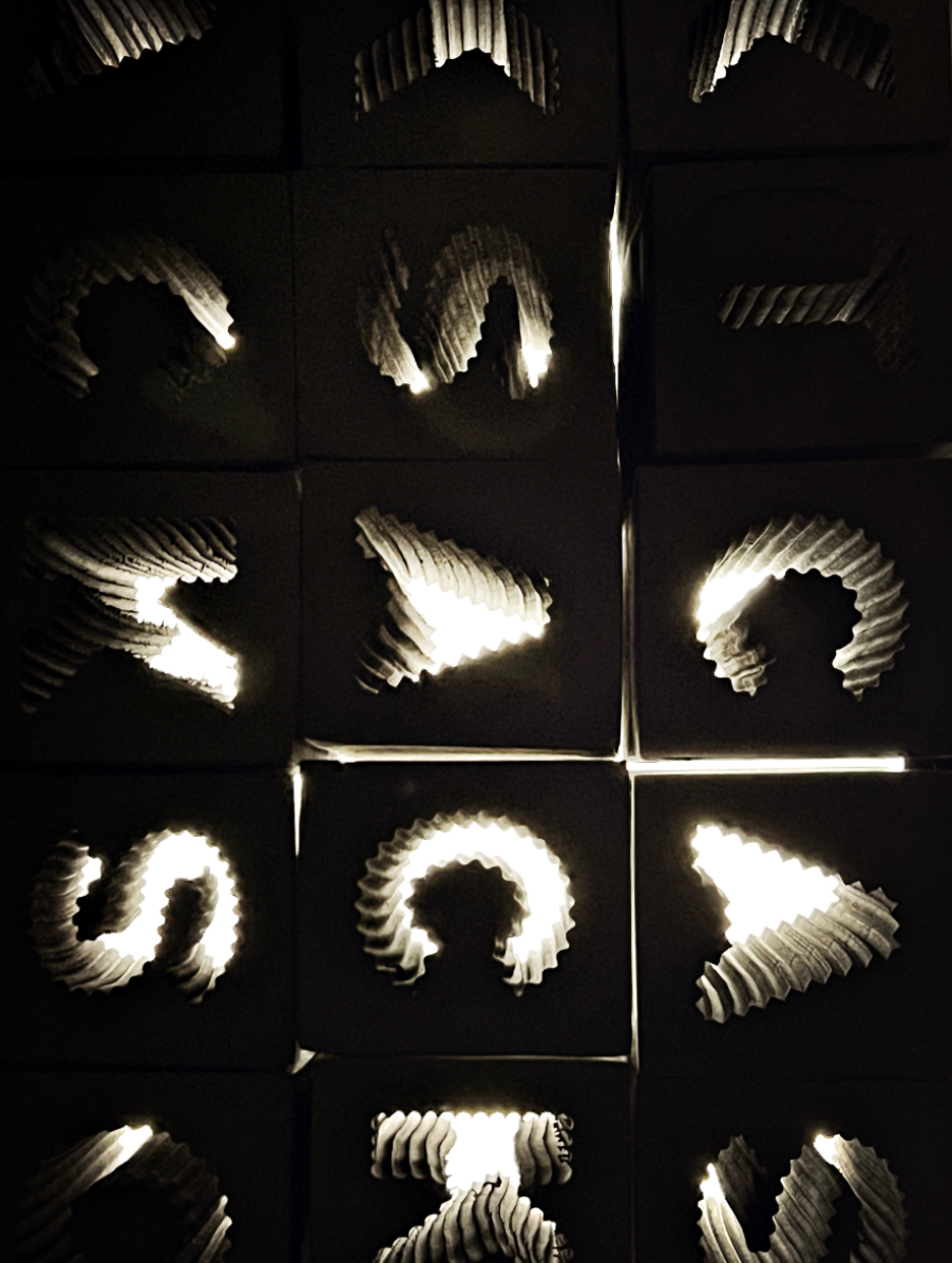
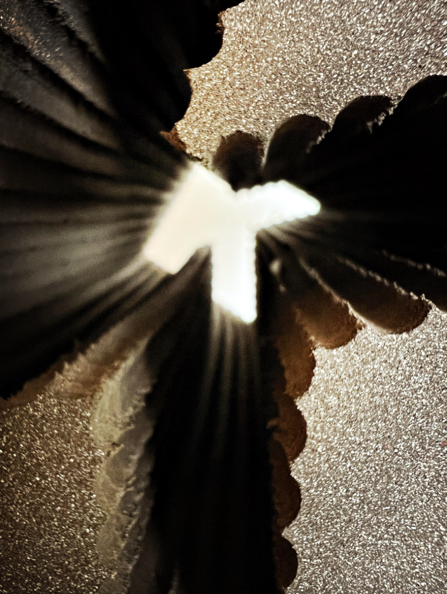
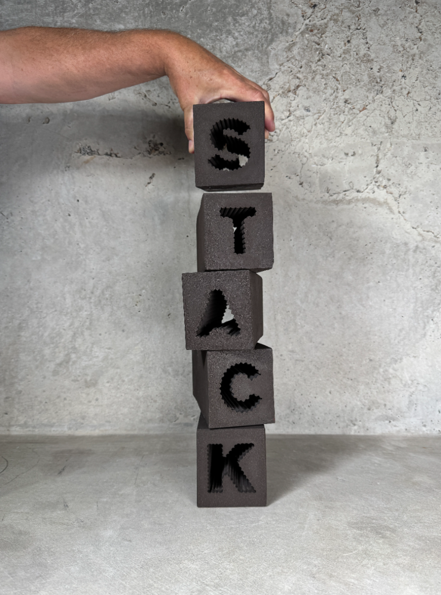
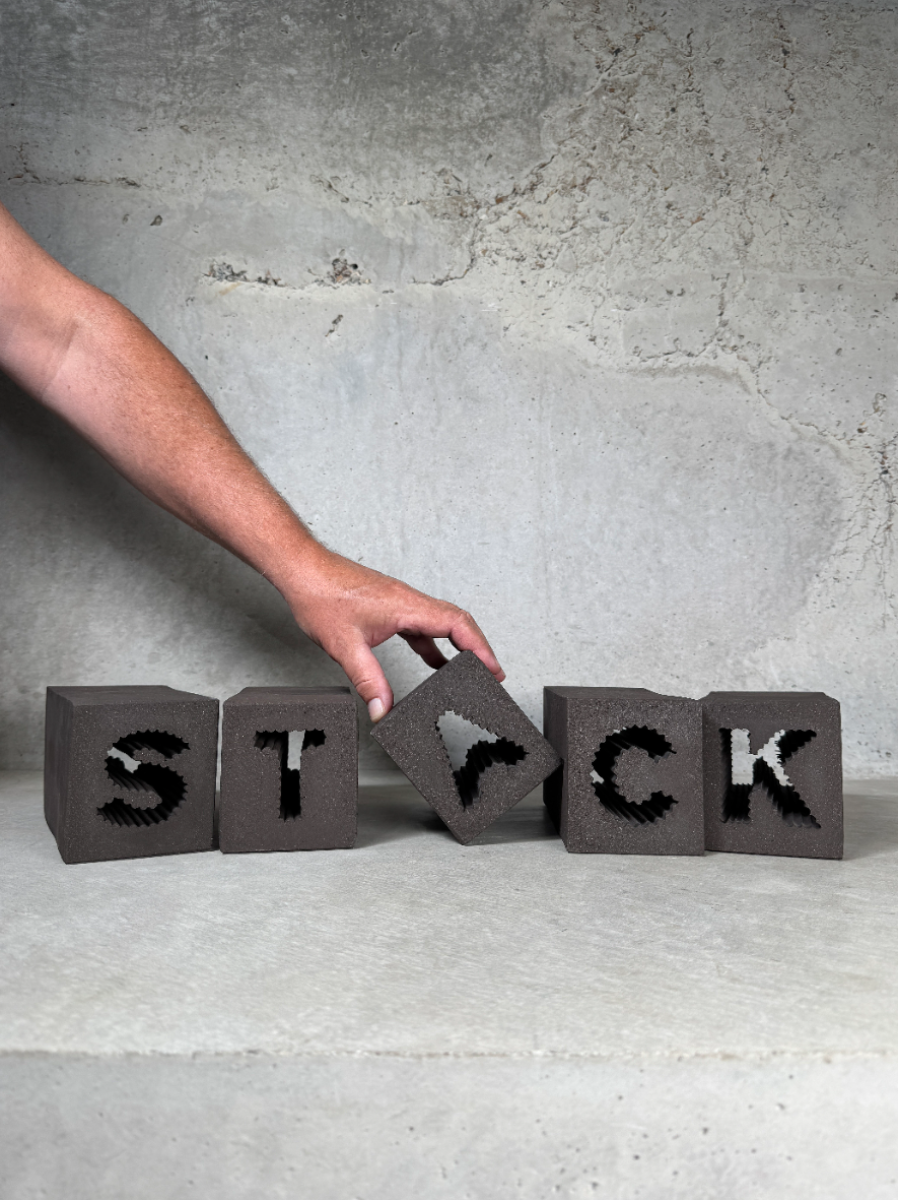
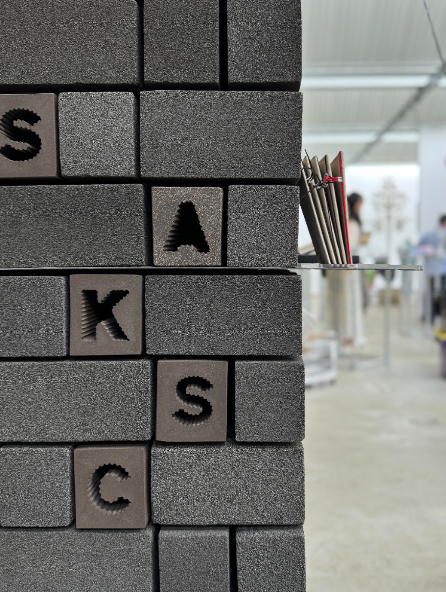
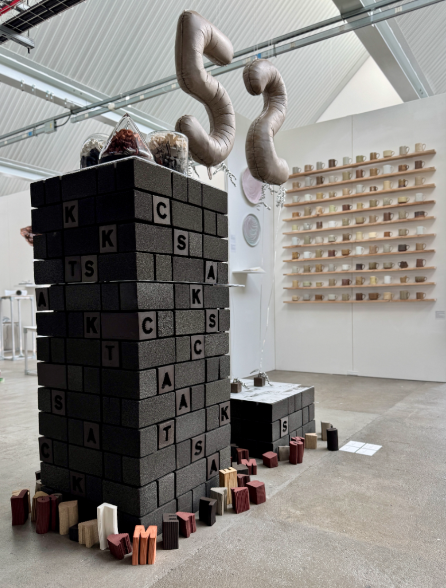

‘Stack’ can be both a noun and a verb. It is a dynamic verb. A doing word. These bricks, each with a letterform cut out from the centre, explore the relationship between structure, language, and play. When stacked together, they form a network of strength and protection, while the negative space, invites interaction and discovery through the letter shaped recess. The carved-out letters preserve the spirit of childhood learning, where curiosity and touch help shape understanding. These forms turn language into something physical and playful. The striated textures highlight the interior contours of each void, allowing viewers to engage with the inner dimensions of the brick without weakening its structure. These letterforms are not added into the bricks, they are embedded in their core.
Competitions
Global Creative Graduate Showcase 2025


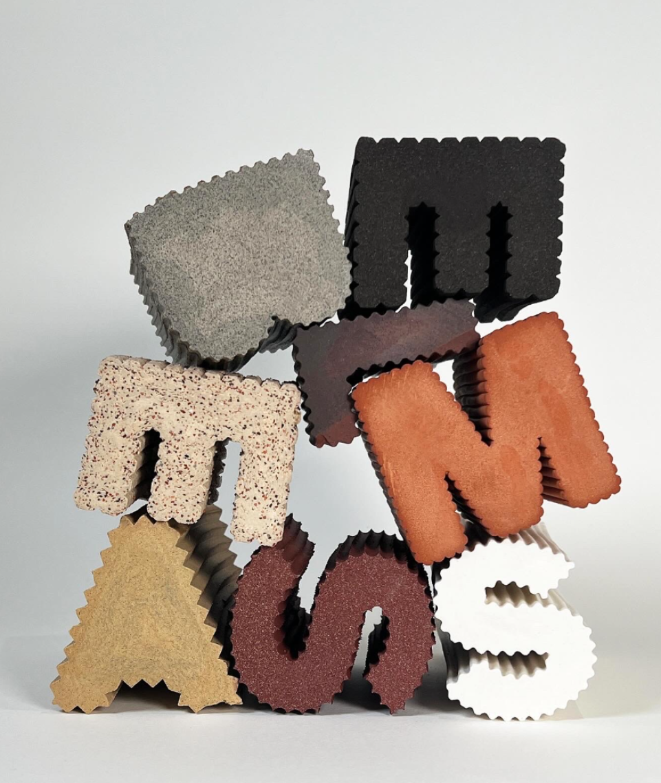

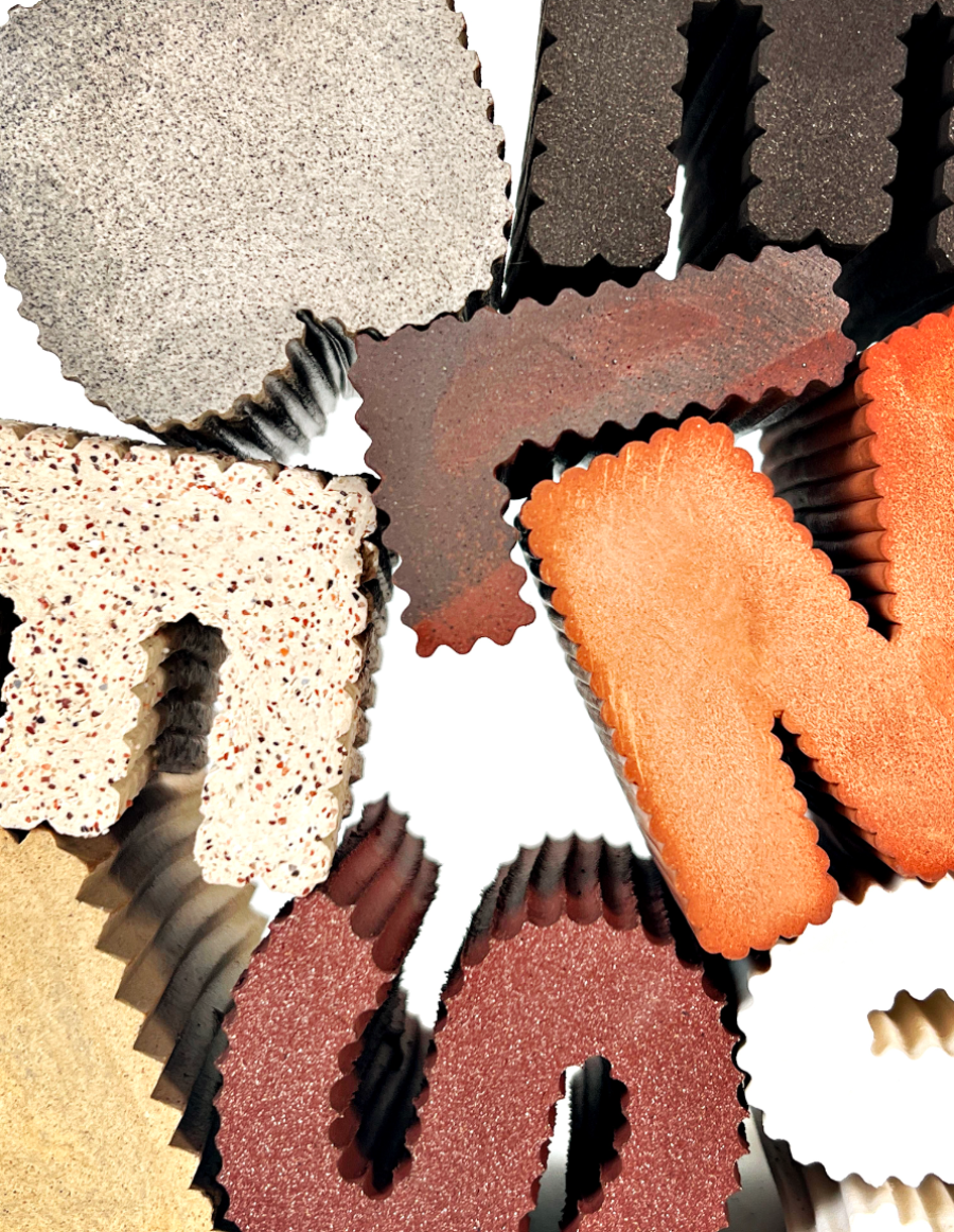

Assemble can function as both a noun and a verb. As a verb, it is dynamic; a doing word. Making with letterforms transported me back to the basics of how we learn as children; through touch and shape, a language formed through building blocks. These forms aren’t just for play; they help us understand the world by encouraging hands-on problem solving. Introducing patterns onto the surfaces of the letters gives them texture and depth, they become familiar and playful. A change of perspective reveals new dimensions. A letter, once flat, now becomes a 3D object. This approach is also influenced by Bruno Munari’s studies of shapes and design. His work, like mine, looks at how simple forms can carry meaning, history, and curiosity. Inspired by Concrete Poetry, I explore how language can be freed from the flat page and turned into physical form. Letters in this work are meant to be touched, the interlocking edges add to their flexibility. Turning type into sculptural objects invites interaction, pillars of sensorial knowledge.
Competitions