SIDDARTH VASHISHT
Graphic Design BA (Hons)
Nottingham Trent University
Specialisms: Graphic Design / Typography / Creative Direction
Location: London, United Kingdom


SIDDARTH VASHISHT
First Name: SIDDARTH
Last Name: VASHISHT
Specialisms: Graphic Design / Typography / Creative Direction
Sectors:
My Location: London, United Kingdom
University / College: Nottingham Trent University
Course / Program Title: Graphic Design BA (Hons)
About
Hi! I’m Siddarth, a designer with an avid interest in learning new skills, with a specialisation in typography, branding and visual identity design. I love talking about film and music, and how the two mediums co-exist and broaden the scope of design. As such, they are my main sources of inspiration while working on projects.
I strongly believe that the key to good design is through meaning and intention and like to explore different themes and concepts in my practice. I'm looking forward to working collaboratively and learning from fellow creatives to become a better designer.
Based in London.
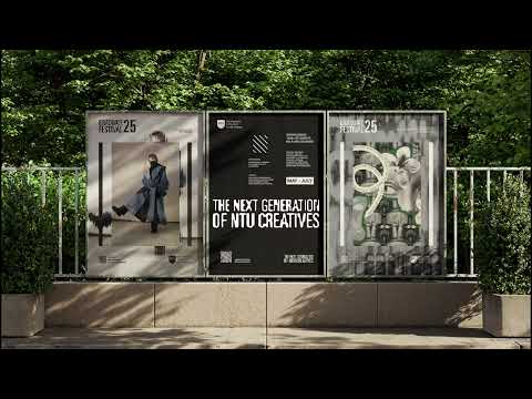


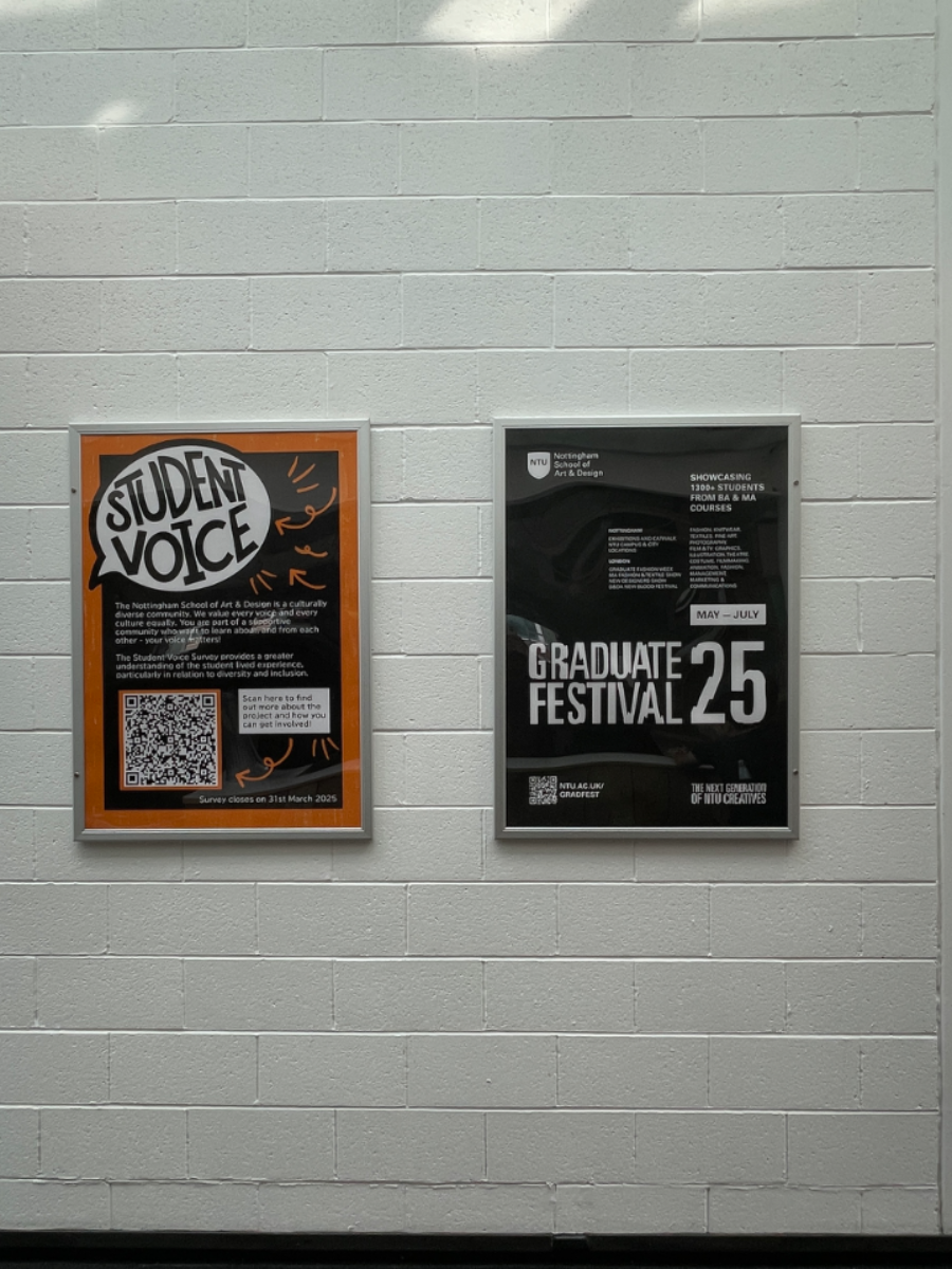
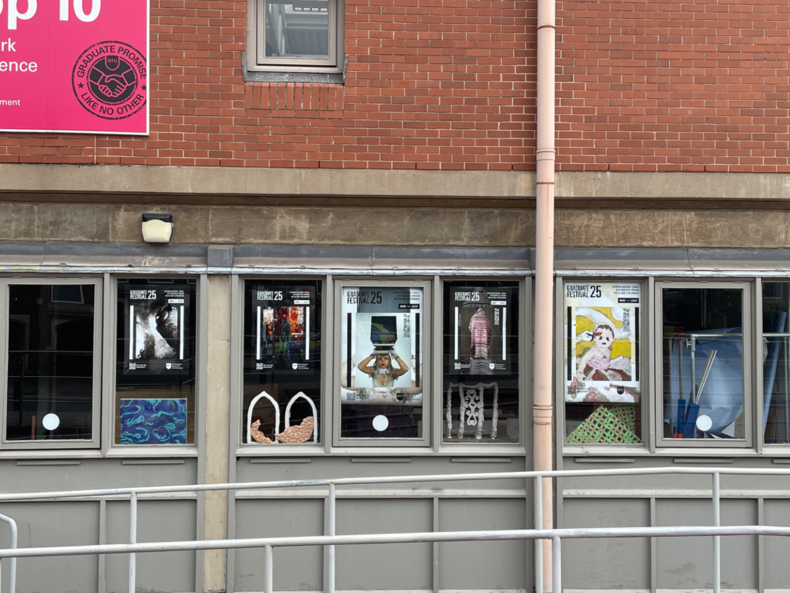
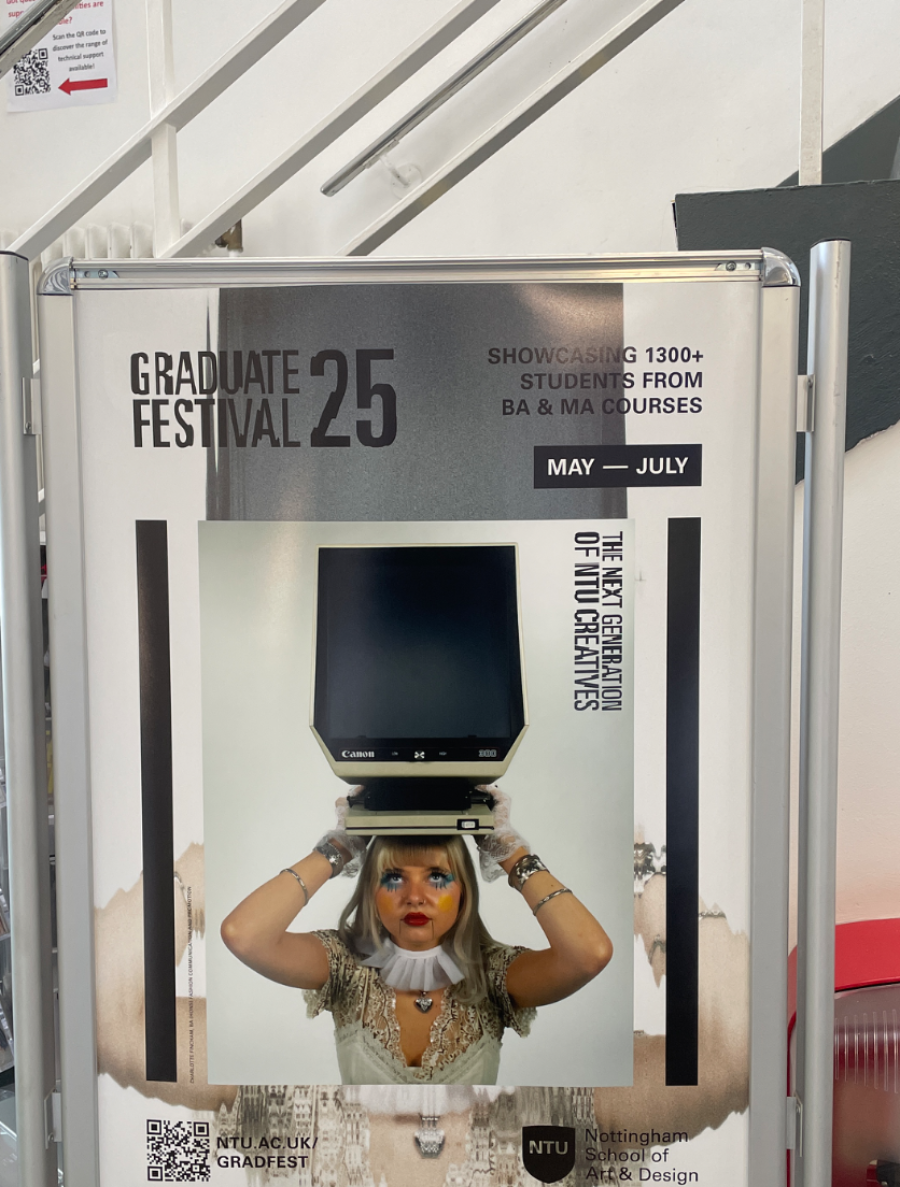
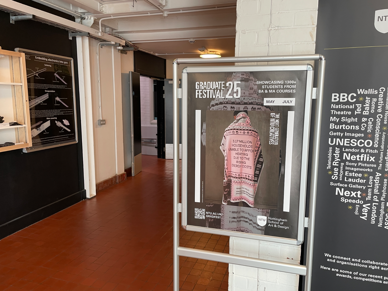
University is a transitional phase in a person's life. Students undergo various changes, learn new things and try to find their identity, much like a cocoon. Graduation signifies the end of one stage and the start of a new one. A metamorphosis. The core of the identity is the morphing typeface and secondary visuals that symbolises transformation. It acts as a visual metaphor for the growth students experience during their time at university – entering with uncertainty and emerging as confident individuals prepared to take on the challenges of the professional world. This identity was selected as the winner of Nottingham Trent University's Graduate Festival Live Brief and implemented during the Graduate Showcase from May – July 2025
Competitions

Global Creative Graduate Showcase 2025
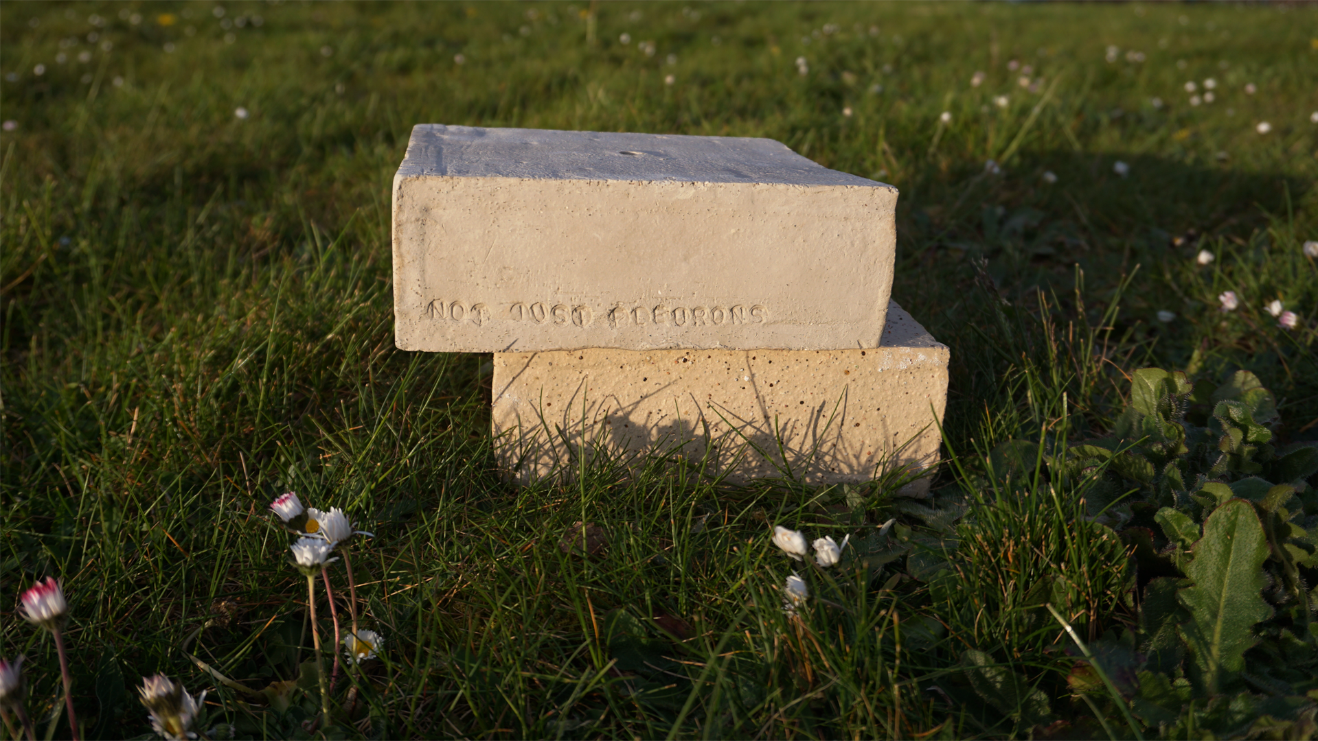
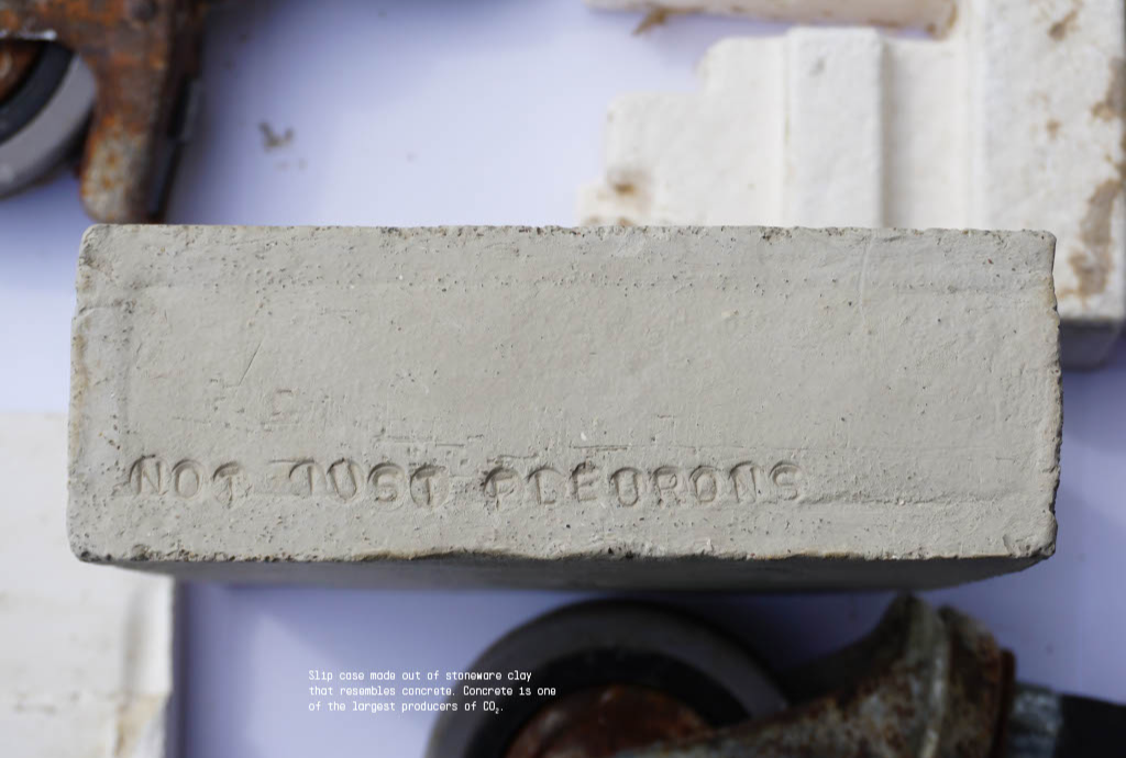
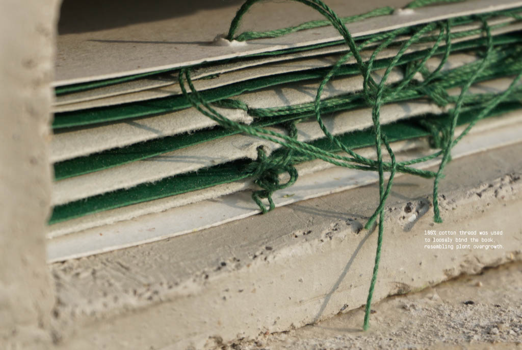
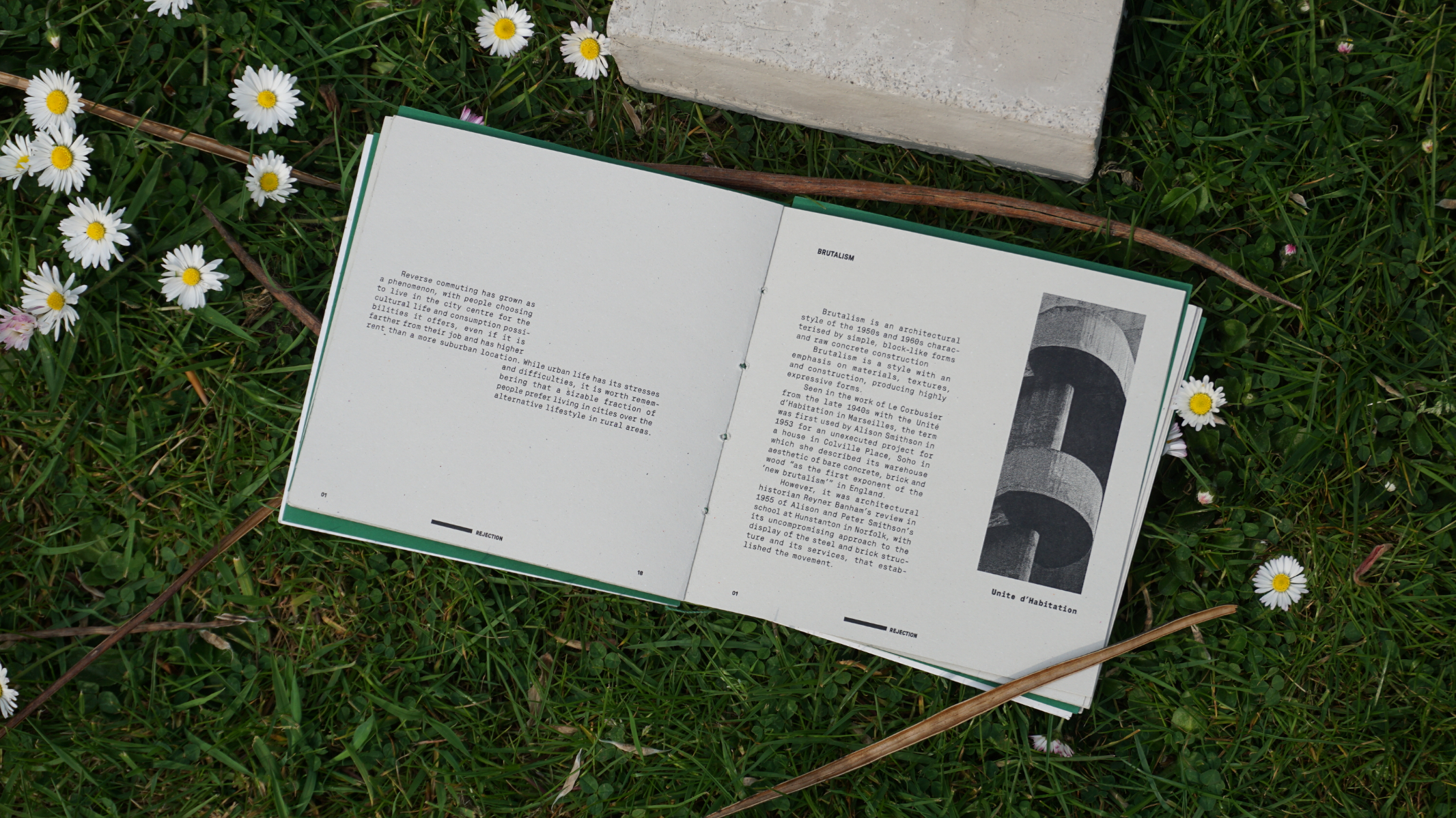
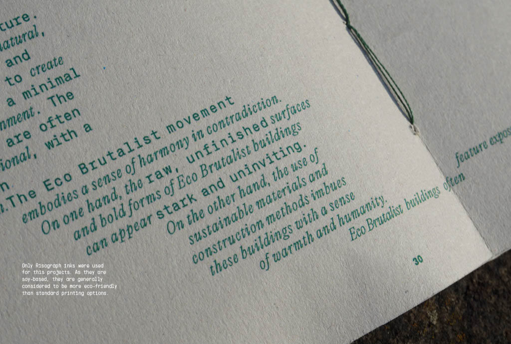
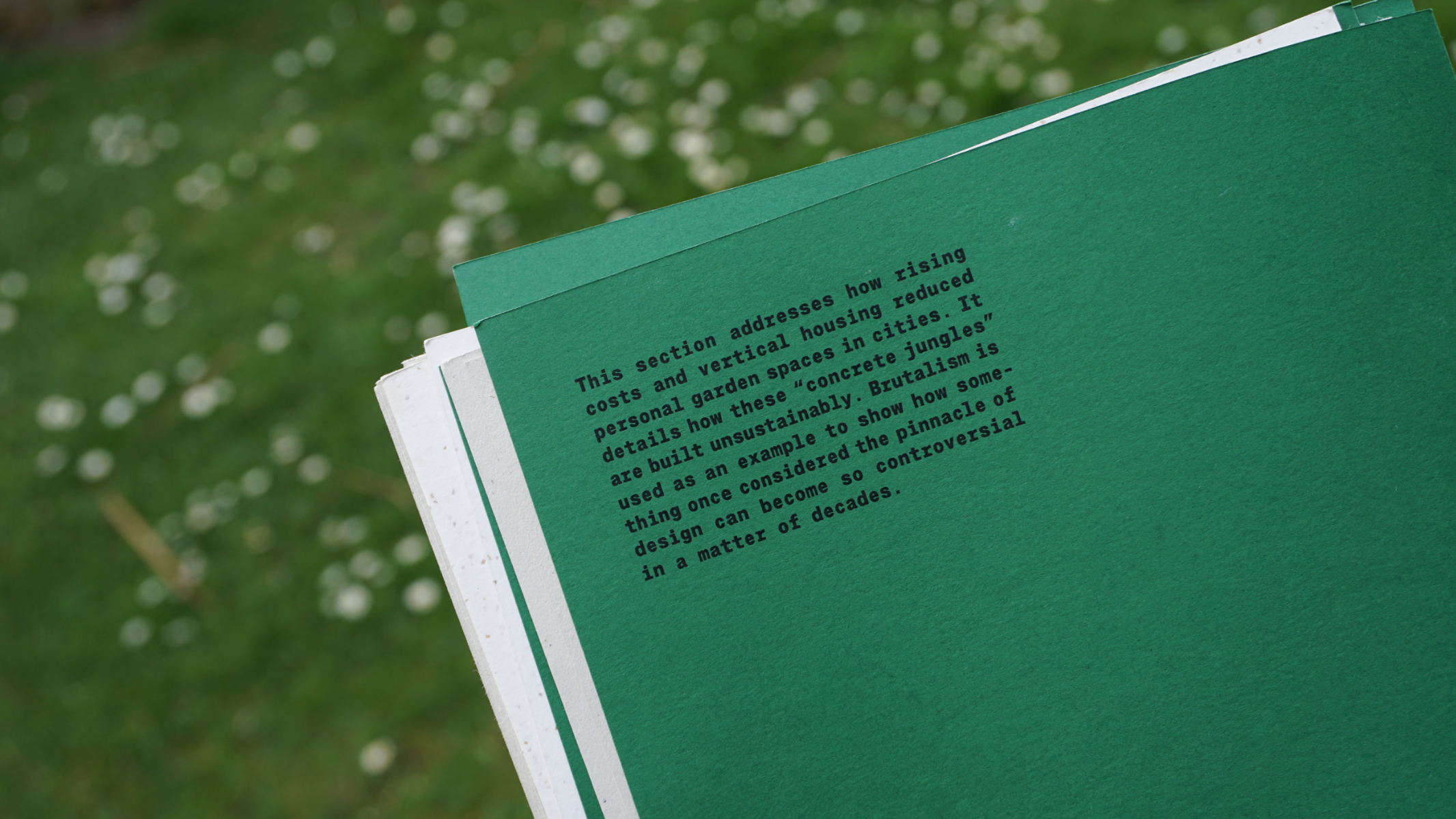
A typographic publication exploring how plants reclaim space and soften Brutalist architecture. Featuring a stoneware clay slipcase and cotton thread binding, it highlights the need for sustainable design – reminding us that we live in a shared garden. Inspired by Olivia Broome's "Brutalist Plants", this was my response to the ISTD Brief, "Not Just Fleurons", which aimed to highlight the importance of plants and gardens in everyday life. This project was awarded with a membership into the International Society of Typographic Designers and also achieved a Creative Conscience Global award.
Competitions
Global Creative Graduate Showcase 2025
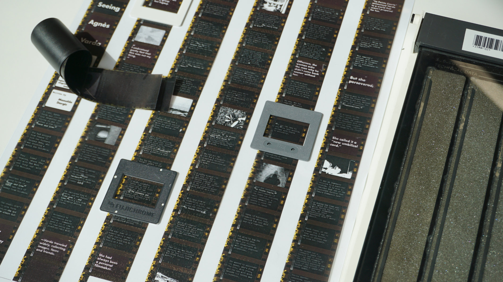
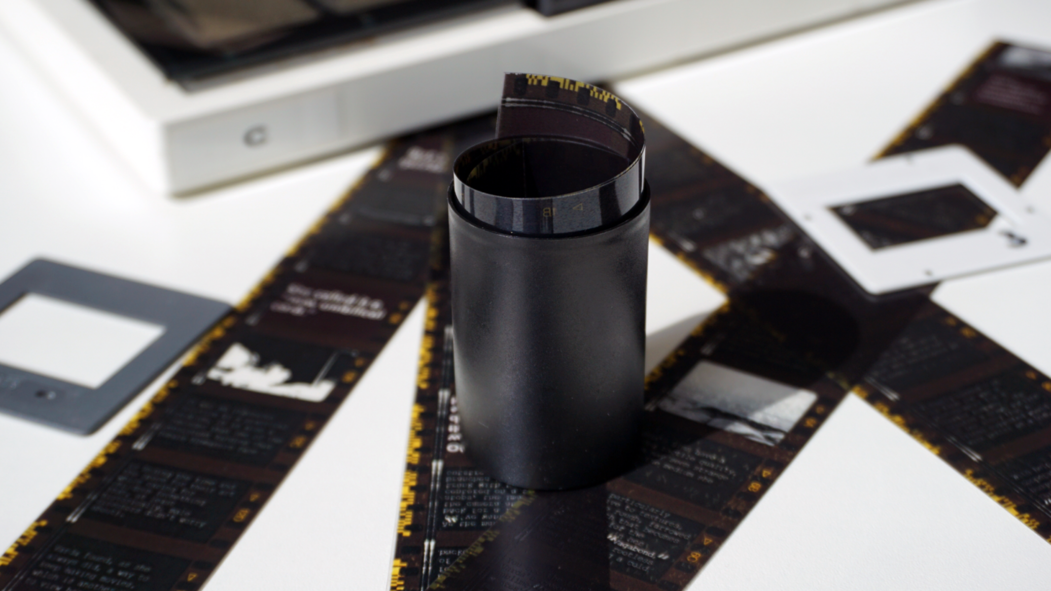
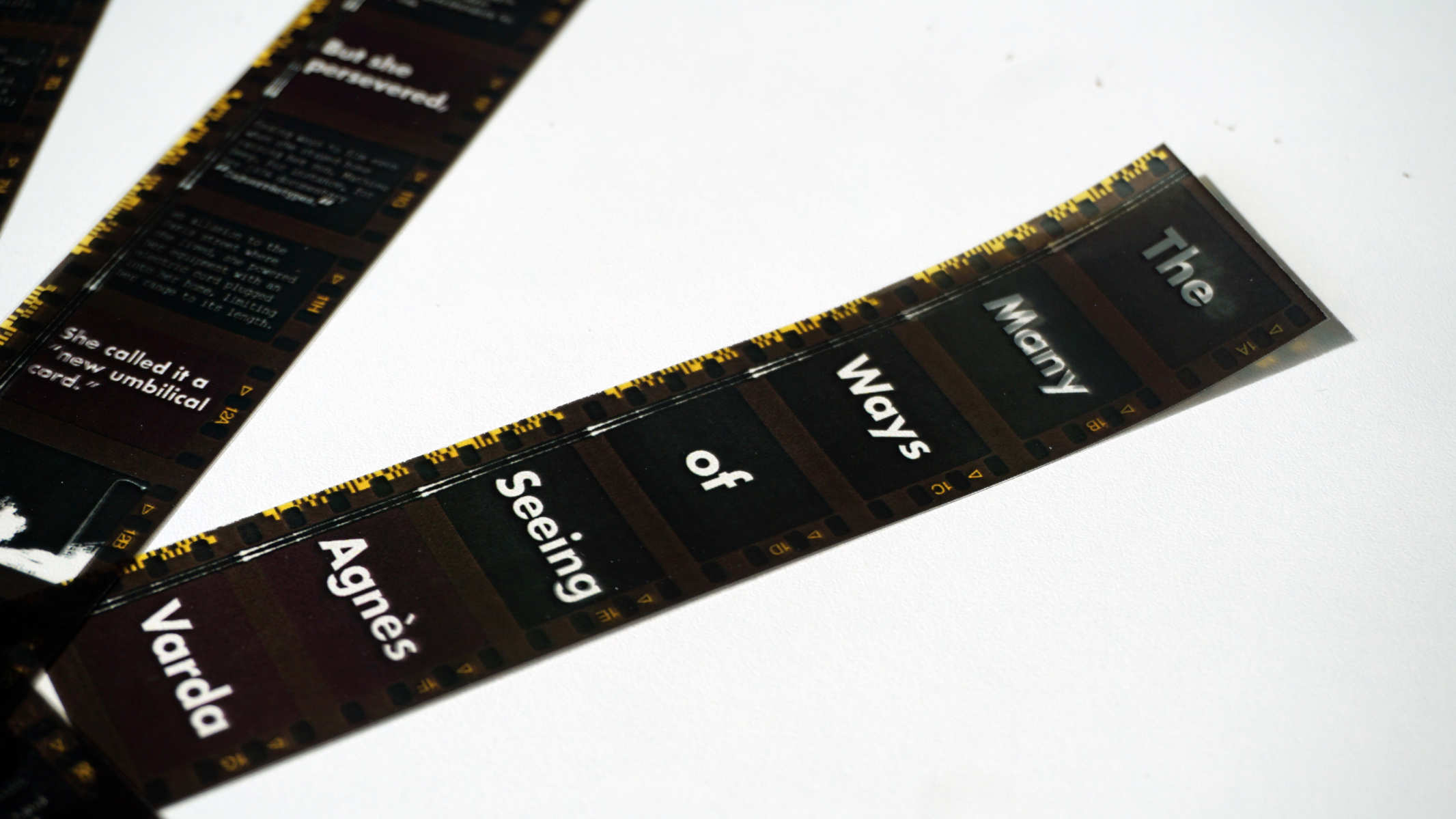
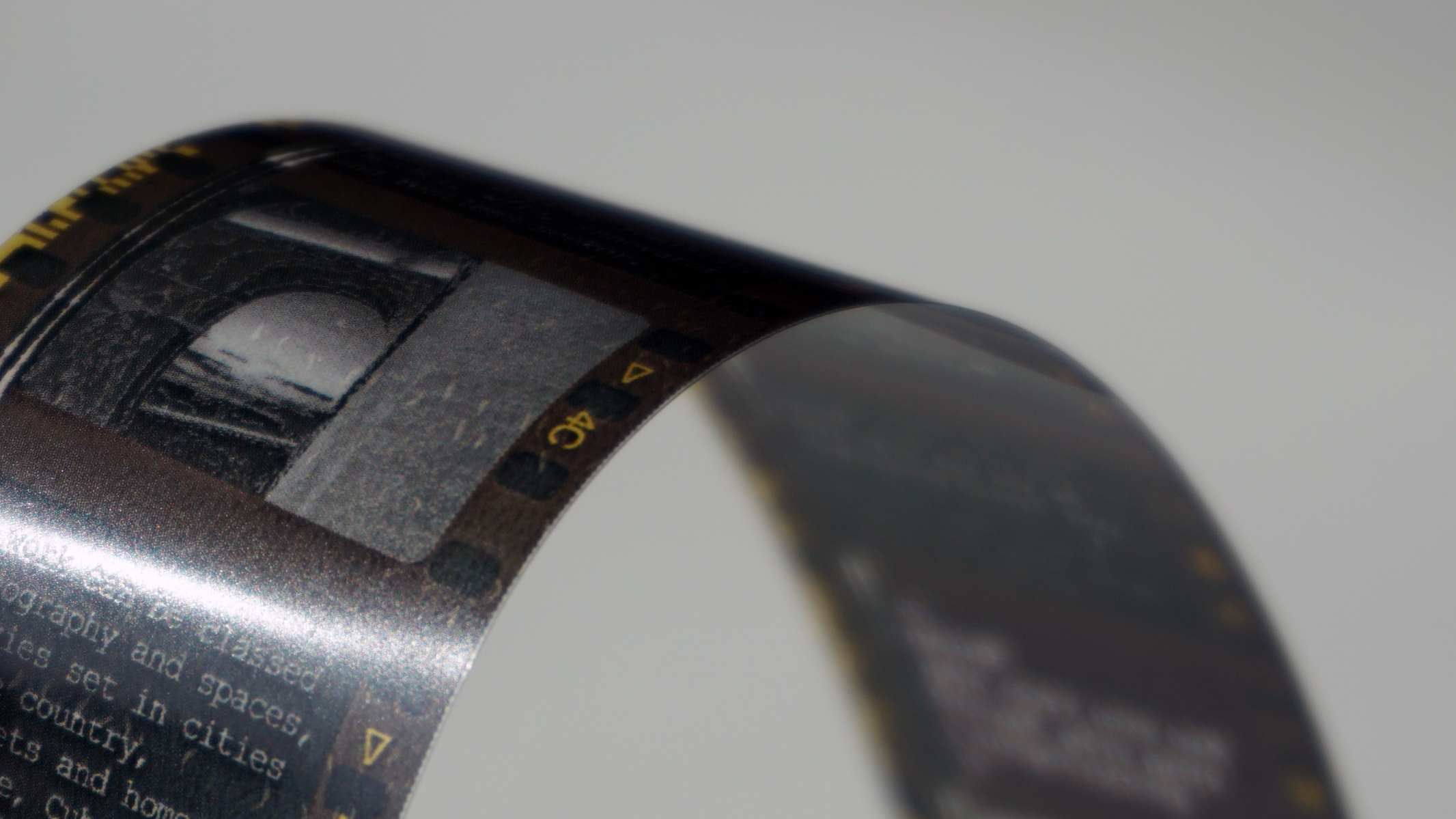
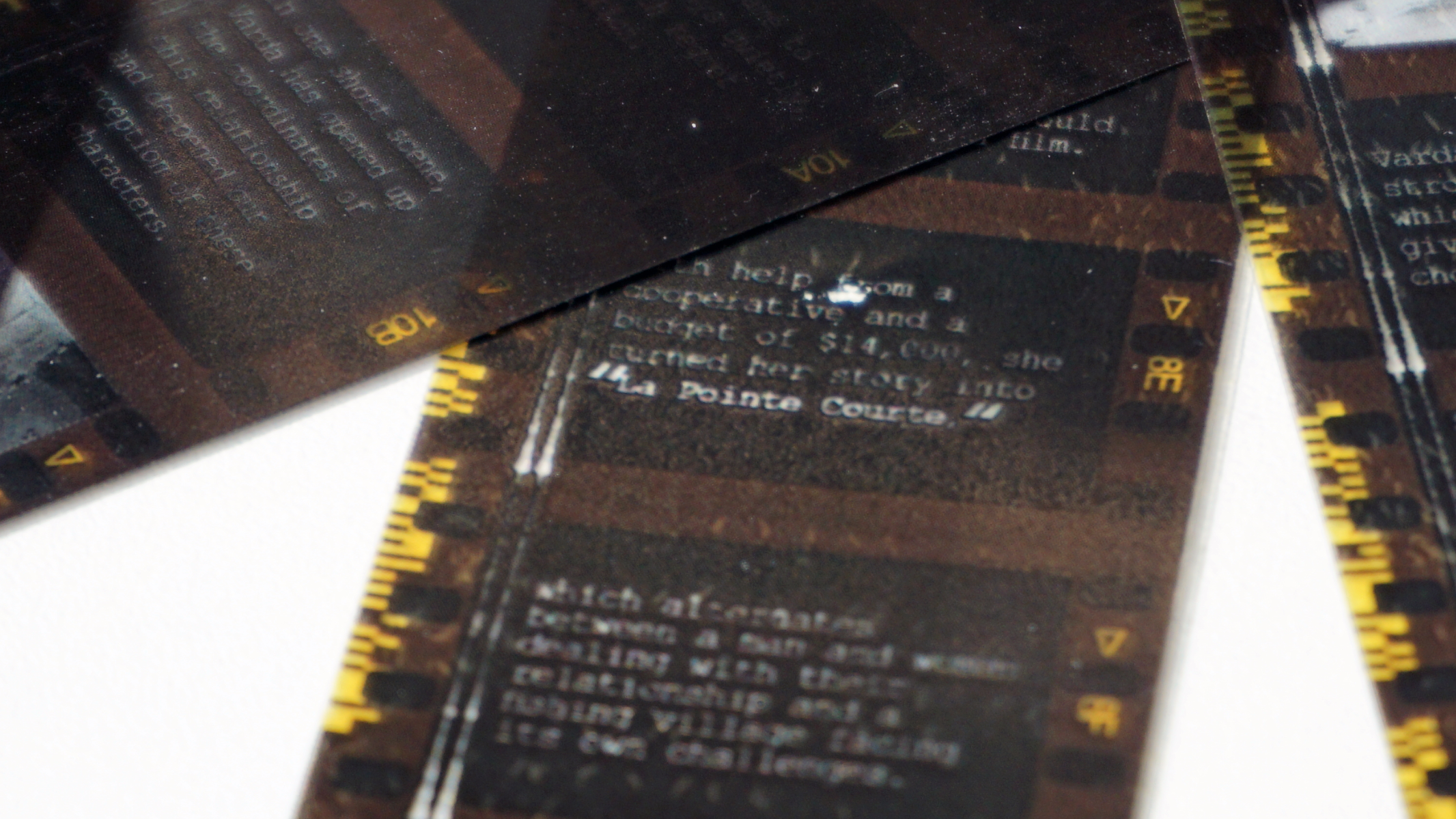
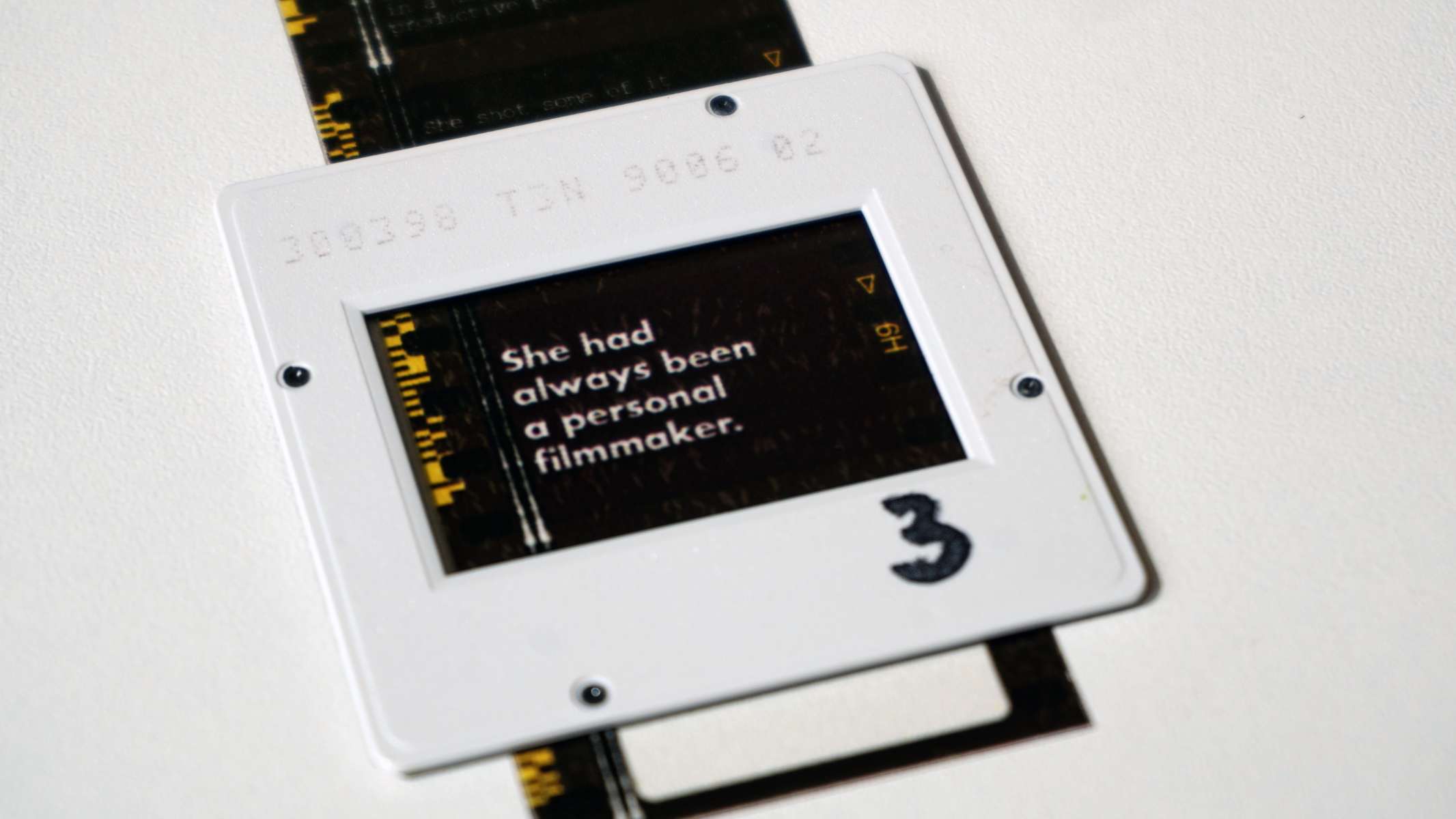
A publication celebrating the legacy of iconic French New Wave filmmaker Agnés Varda. I designed a newspaper supplement that resembled a 35mm film reel, to showcase the deep impact she left on cinema. Printed on acetate, the accent colour is based on Varda's iconic hairstyle. Featured on the @ntugraphics Instagram.
Competitions