Clara Cayosa
MFA Graphic Design
Rhode Island School of Design
Specialisms: Graphic Design / Typography / Art Direction
Location: New York, United States
Clara Cayosa
First Name: Clara
Last Name: Cayosa
Specialisms: Graphic Design / Typography / Art Direction
Sectors:
My Location: New York, United States
University / College: Rhode Island School of Design
Course / Program Title: MFA Graphic Design
About
I’m a graphic designer and creative strategist working in the intersection of systems and culture. My type design practice is treated as cultural work via Tipong Pilipino. I graduated from RISD in 2026 with an MFA in Graphic Design.
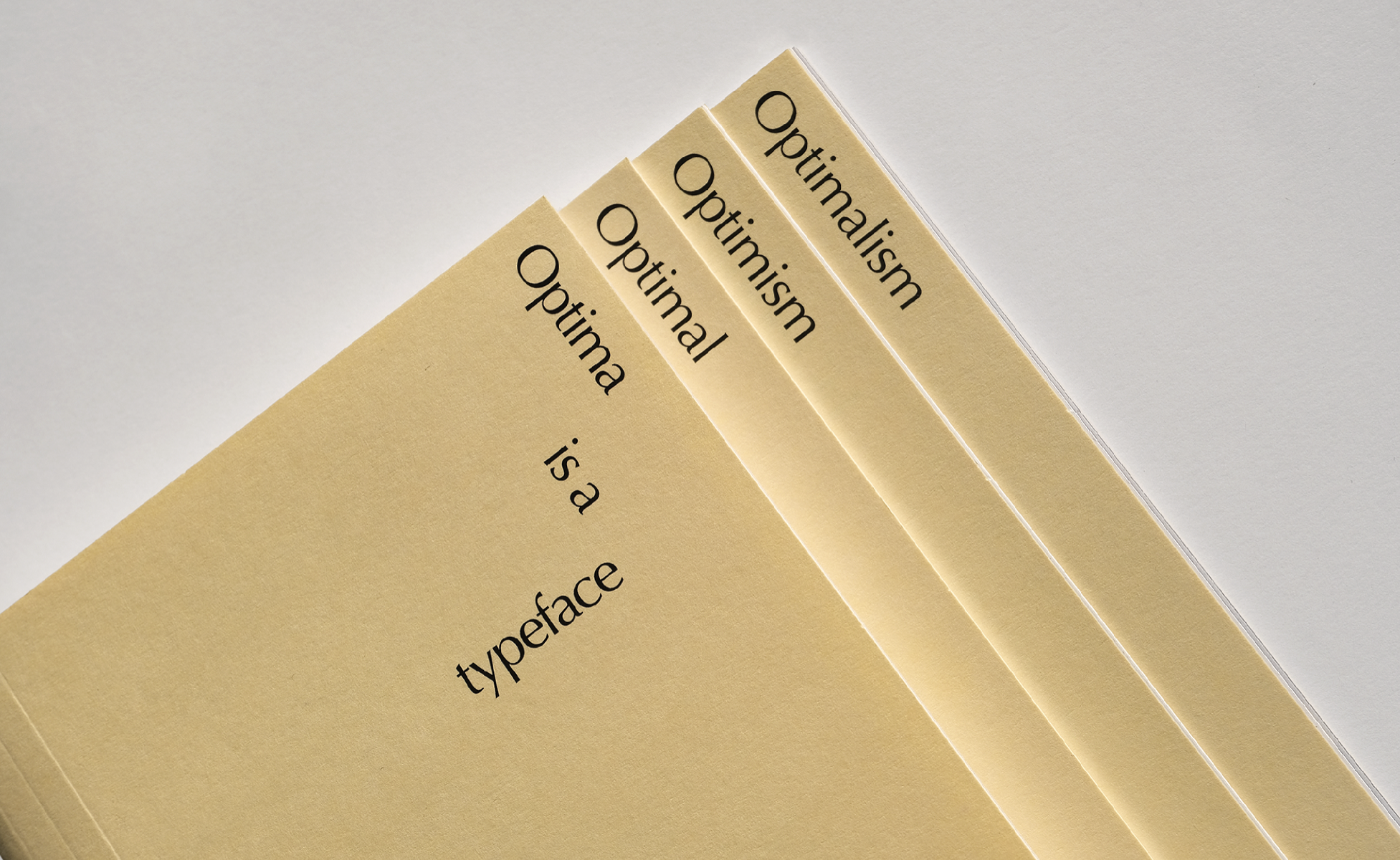
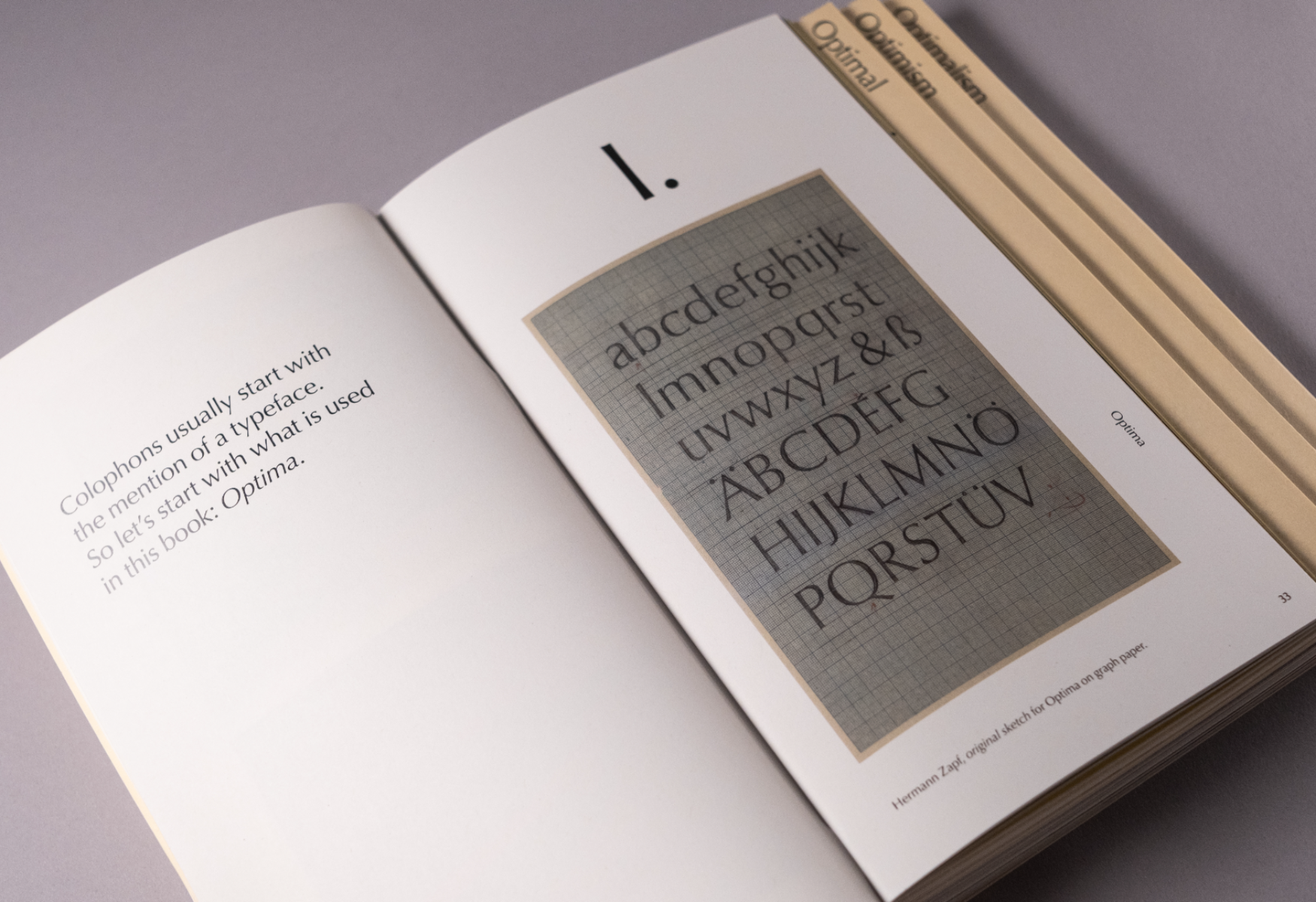
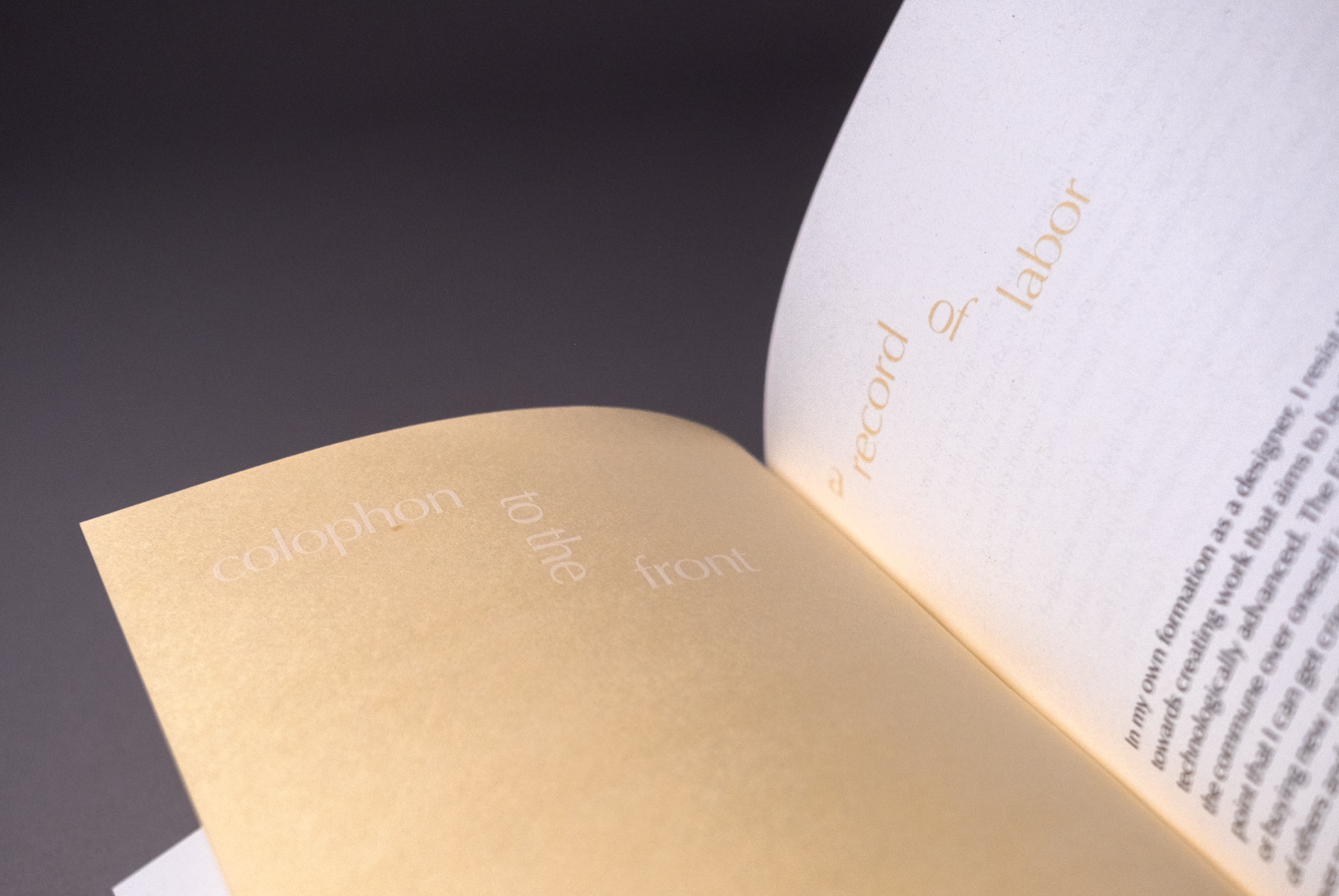
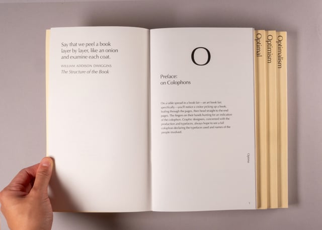
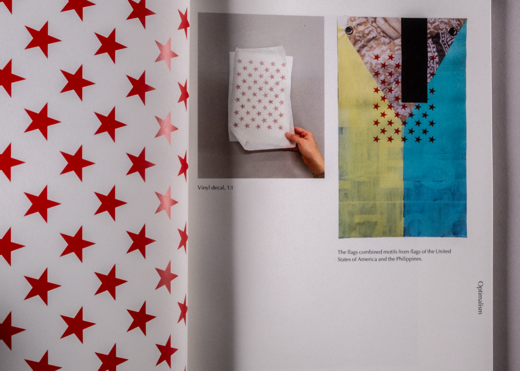
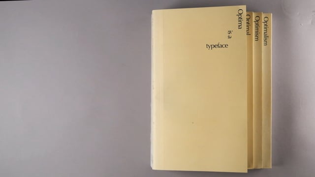
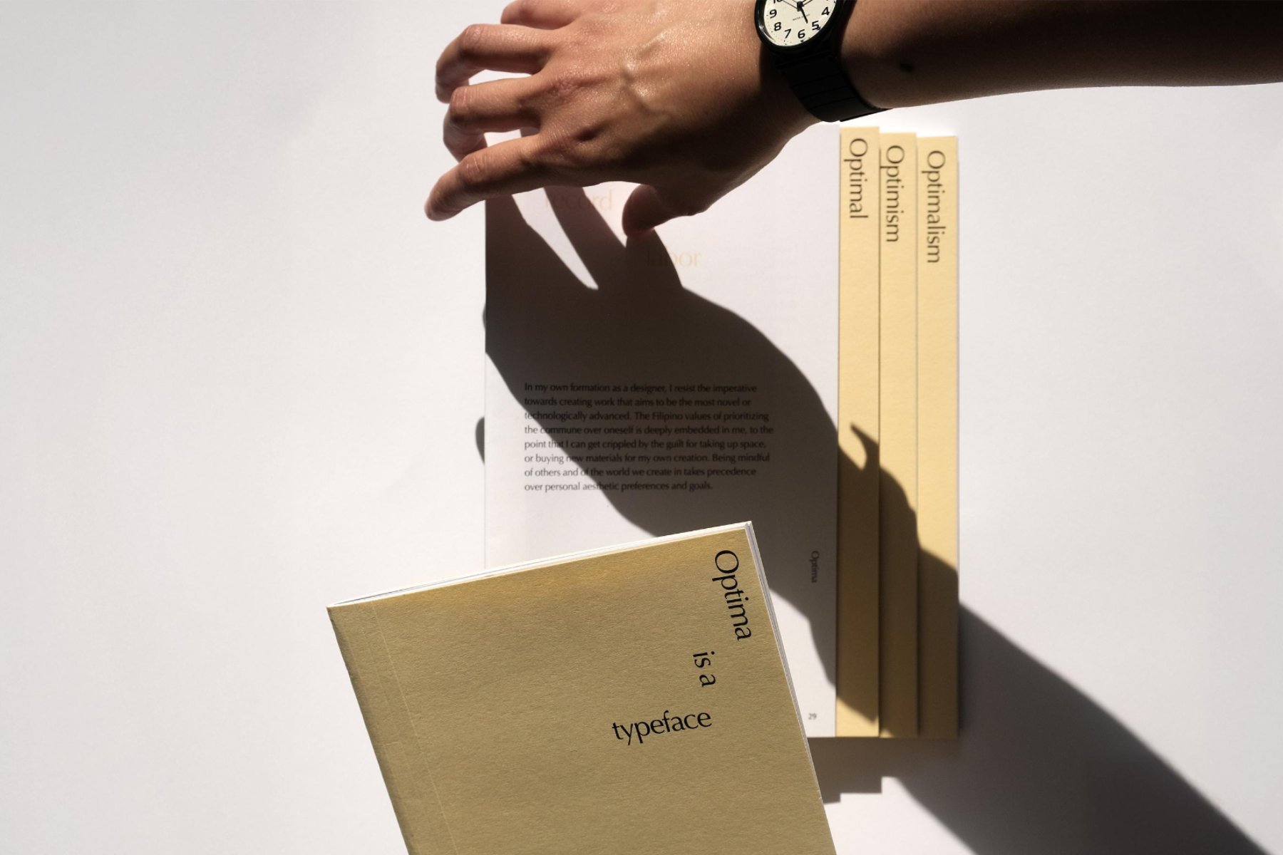
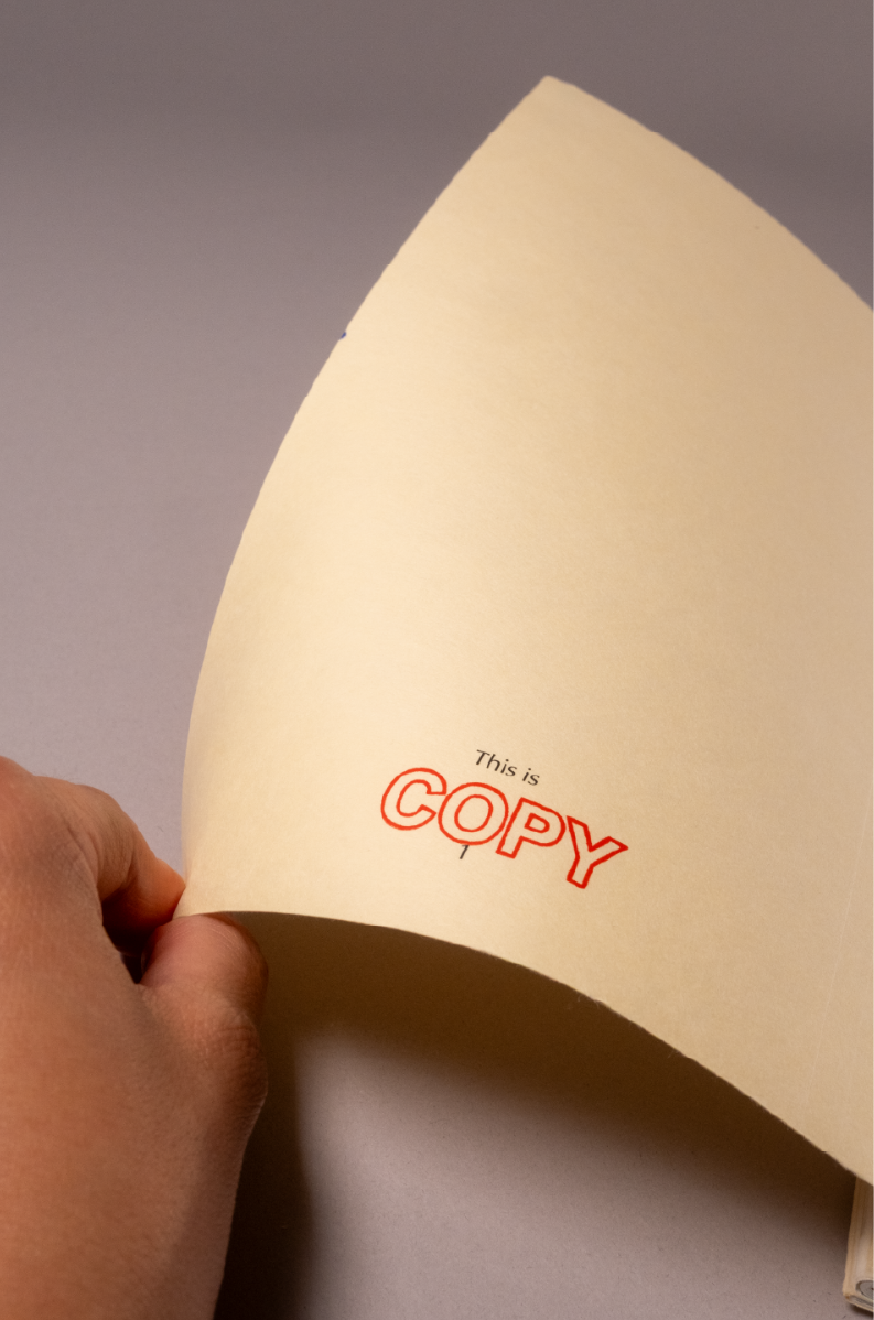
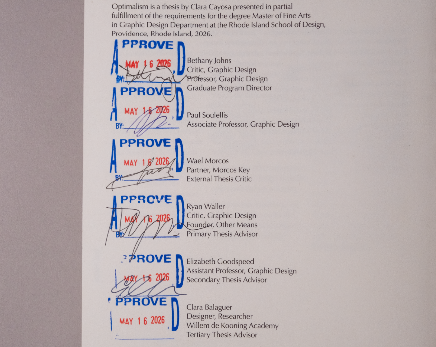
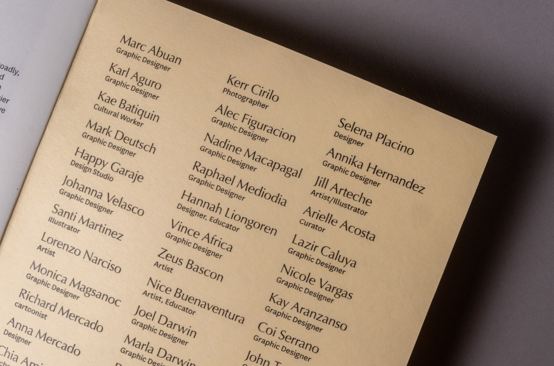
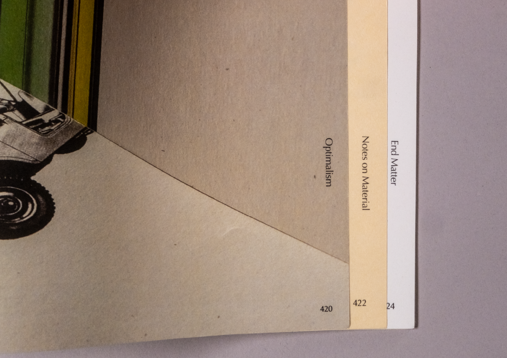
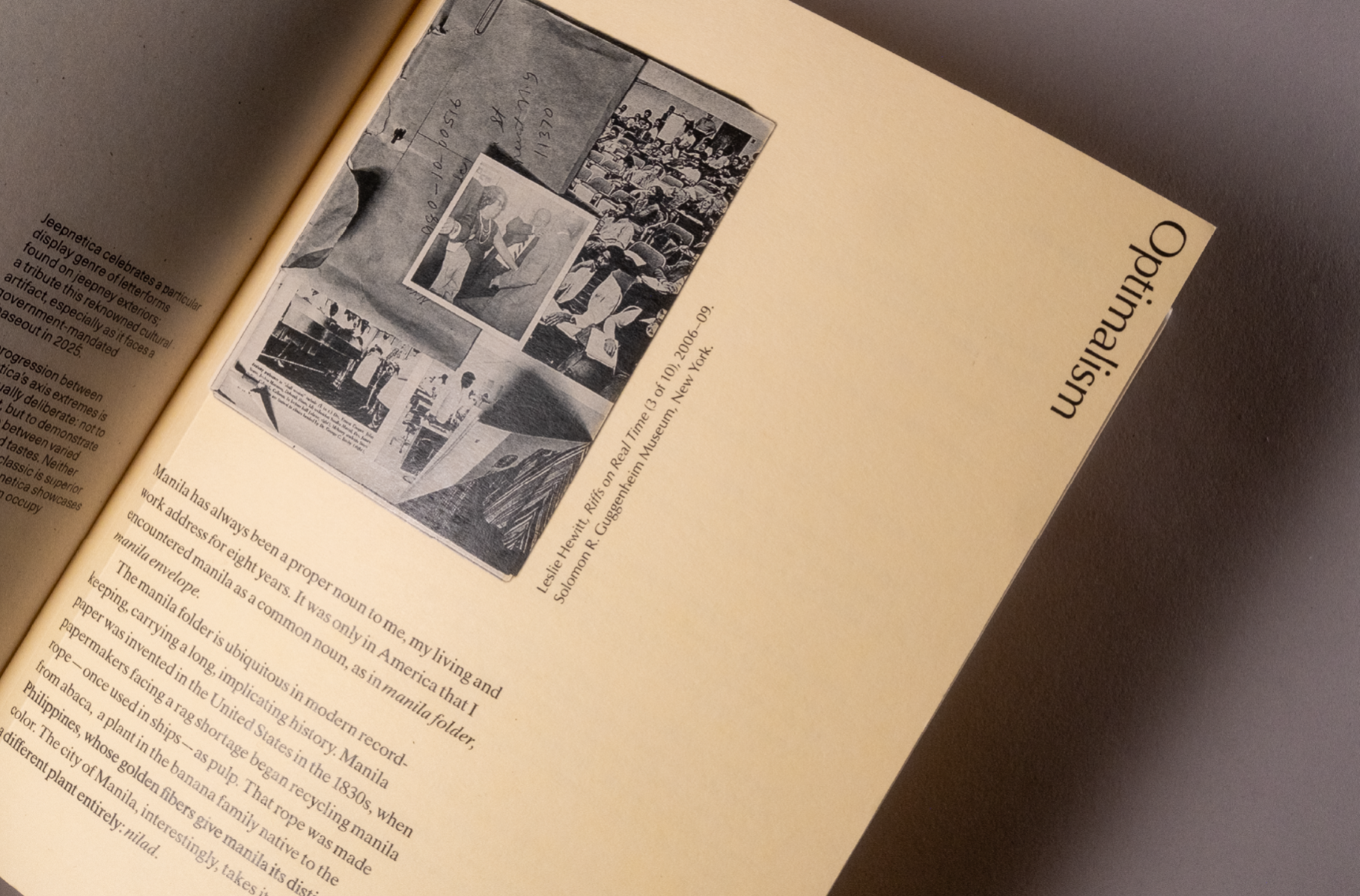
Optima is a humanist typeface created by designer Hermann Zapf (German, male). Optimal is what design—and life—in 2026 wants to be: maximum productivity, maximum output. But optimal for whom, and by whose measure? Optimism is what you find in jeepney decalomania, or sari-sari store signage in the Philippines. It is the joy of everyday making, an assemblage of color and humble material. In Clara Balaguer’s words: of turning shit into gold. Optimalism is my (Filipino, female) thesis; an accumulation of what I've learned trying to persist in graphic design. This is its progression: a mastery of craft, that caring about a letterform is not precious but ethical, a practice of attention that extends to everything; a critique of a design culture increasingly shaped by artificial intelligence and the logic of optimization, where speed and maximum profit have replaced discernment and authorship; and a turn toward critical optimism grounded in Filipino collectivity — the relational labor of making together — and, following curator Patrick Flores, a constellation rather than a canon: authorship as proximity and co-presence, not hierarchy; and resilience — remaining steadfast amidst forces beyond our control. Between the perfectionism that optimization demands and the pessimism it produces, there is another way of working. The thesis book has section dividers made from actual manila folders—a by-product of abaca rope waste, tying the book's material back to the same vernacular resourcefulness the Optimalism argues for. The concept of progression is seen throughout the book design: each of the four sections adds a column, a typeface, and a color, so the book's layout grows more complex as the reader goes through its contents.
Competitions
Global Creative Graduate Showcase 2026
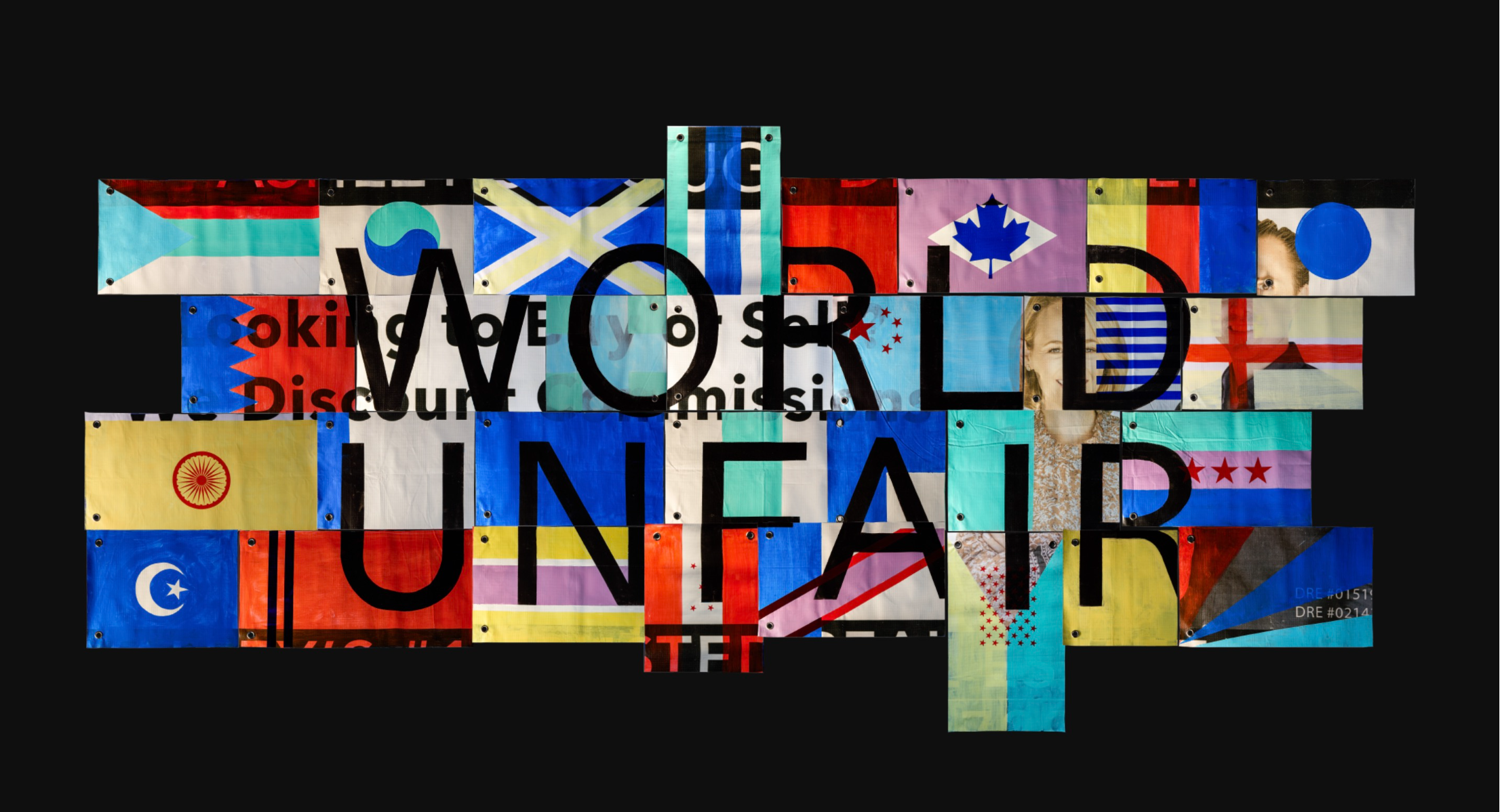
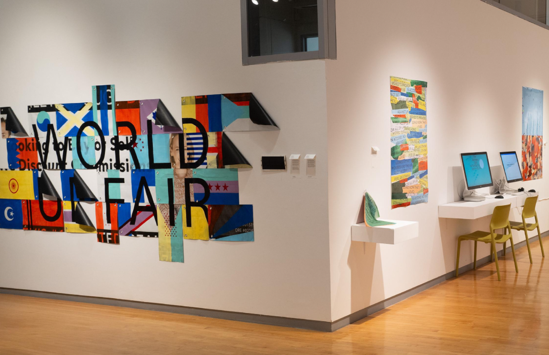
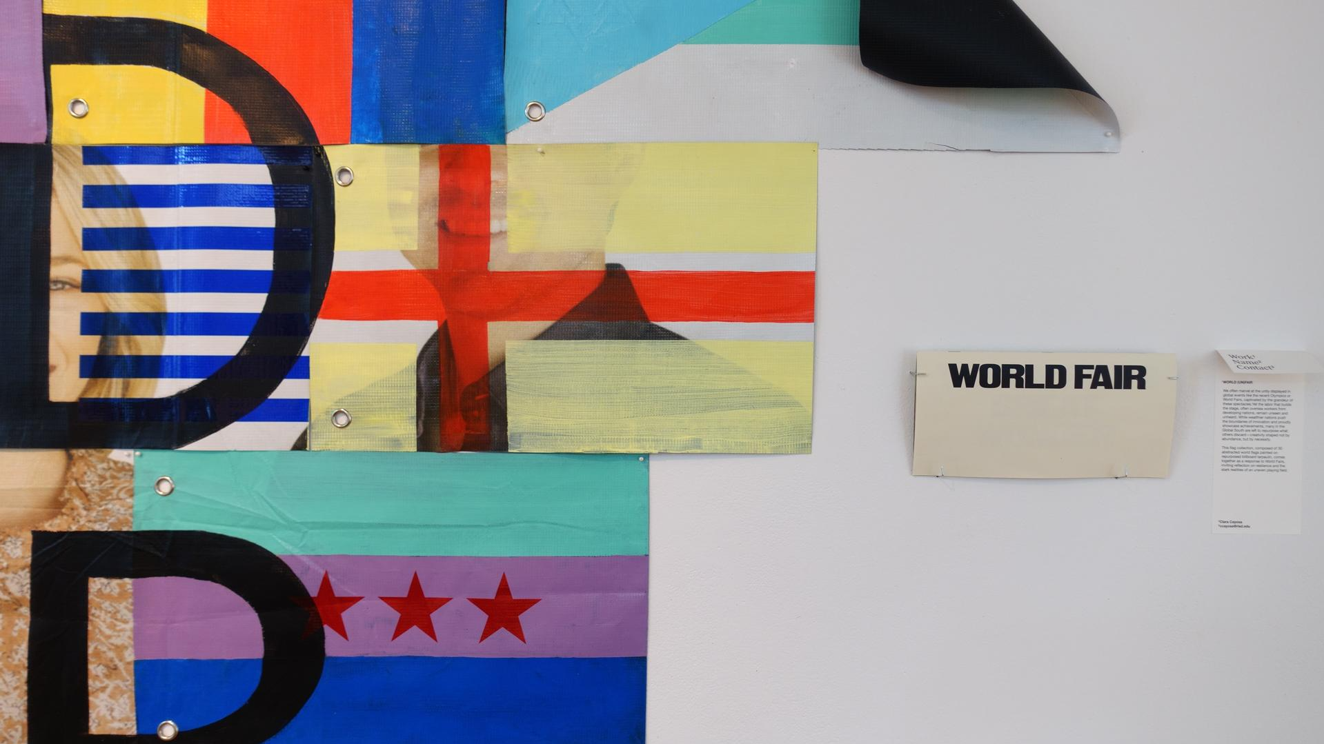
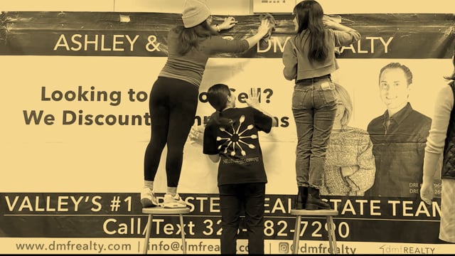
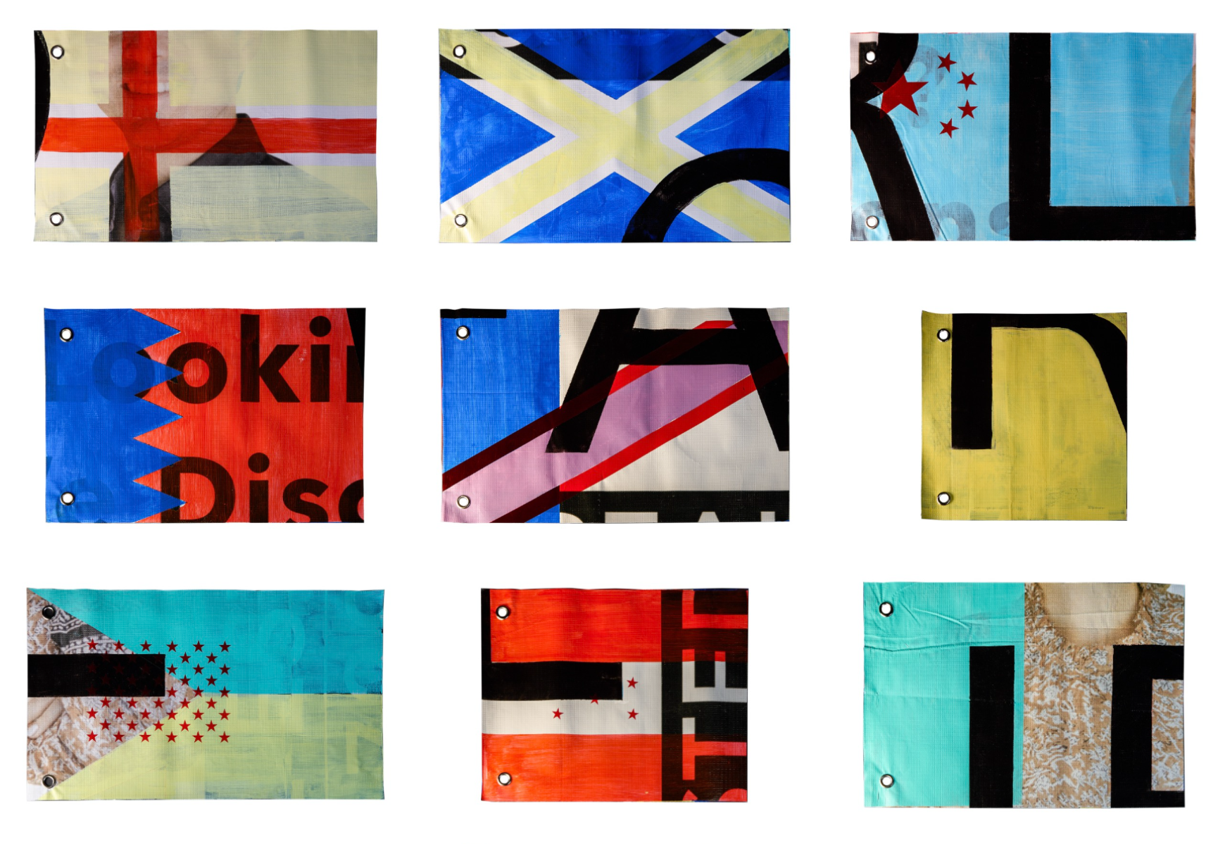
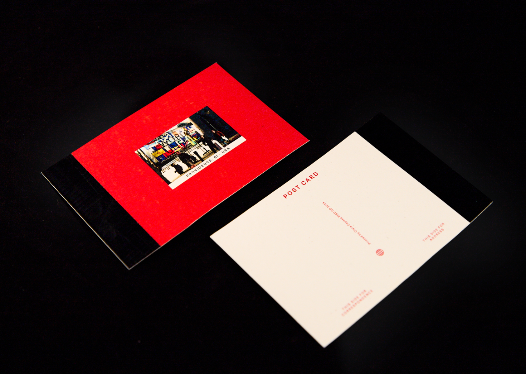
WORLD UNFAIR interrogates the uneven terrain of global visibility, using contemporary spectacles like the 2024 Paris Olympics as a lens onto who gets to innovate and be seen doing so. A postcolonial and economic condition, where wealthier nations perform progress through display, while those of the Global south is positioned within a longer history of extraction — its resources, labor, and materials drawn on to build others' futures, its own left to work with whatever remains. The process of creating this installation performs the same logic in miniature: a discarded billboard, itself a residue of consumption elsewhere, becomes the ground on which the world's flags are redrawn.
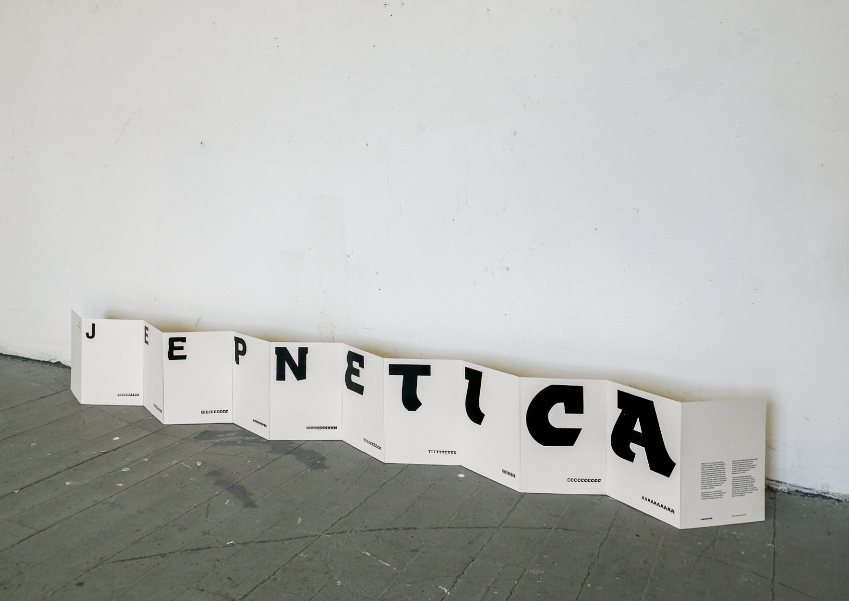
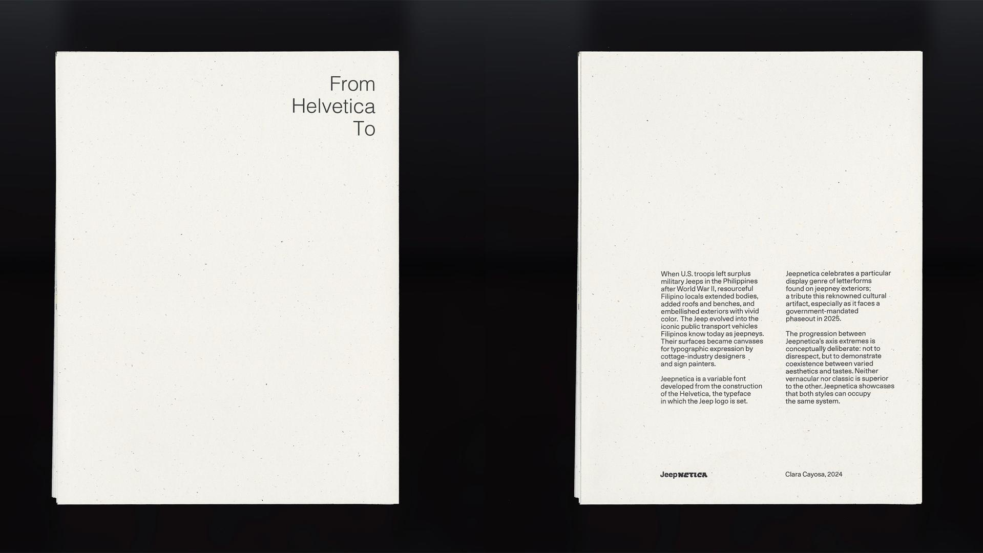
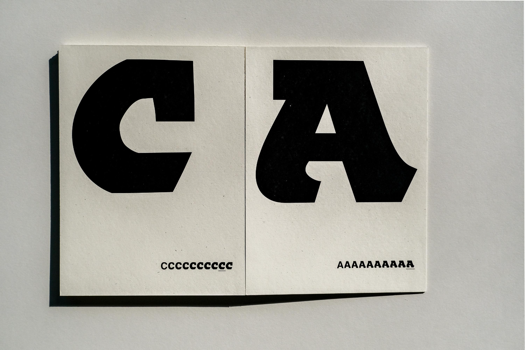
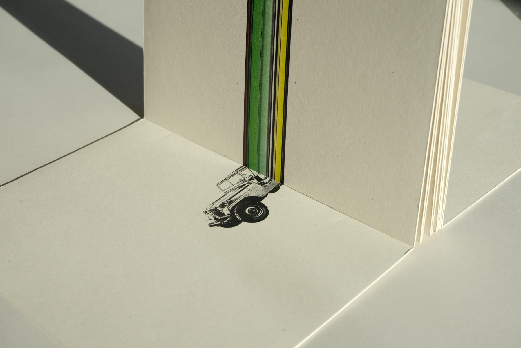
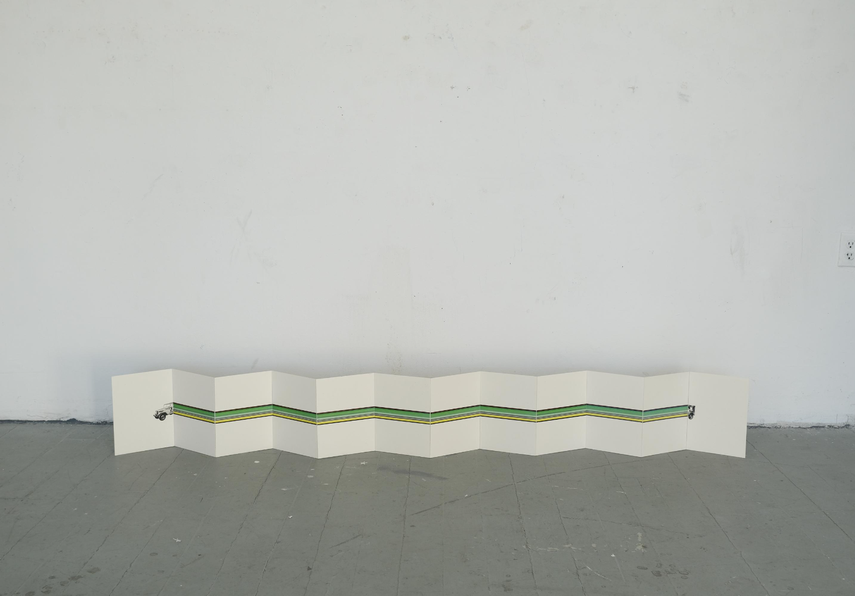
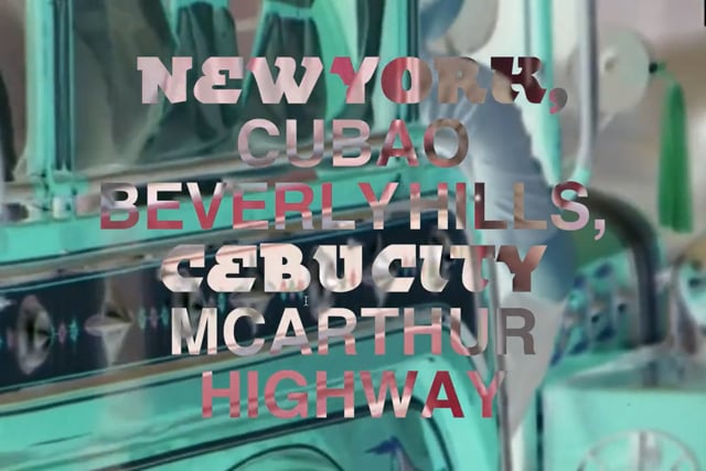
Jeepnetica is a variable font developed from the points of the classic Helvetica into to a heavy display typeface inspired by the type genre of jeepneys in the Philippines. Jeepnetica’s type specimen draws inspiration from the elongated jeepneys. Helvetica was used as the starting point as they typeface for American car brand Jeep’s wordmark. The type specimen is a six-page double sided accordion book that features the progression of the variable type on one side, and an expansive illustration on the other.