Sophie Struthers
Graphic design
Winchester school of art, university of southampton
Graduates: 2025
Specialisms: Graphic Design / Typography
My location: London, United Kingdom


Sophie Struthers
First Name: Sophie
Last Name: Struthers
University / College: Winchester school of art, university of southampton
Course / Program: Graphic design
Graduates: 2025
Specialisms: Graphic Design / Typography
My Location: London, United Kingdom
About
A Graphic Arts graduate, specialising in Graphic Design. I am a type-based designer with a particular interest in creating engaging designs to bring awareness to important social issues and use typography to encourage conversation.
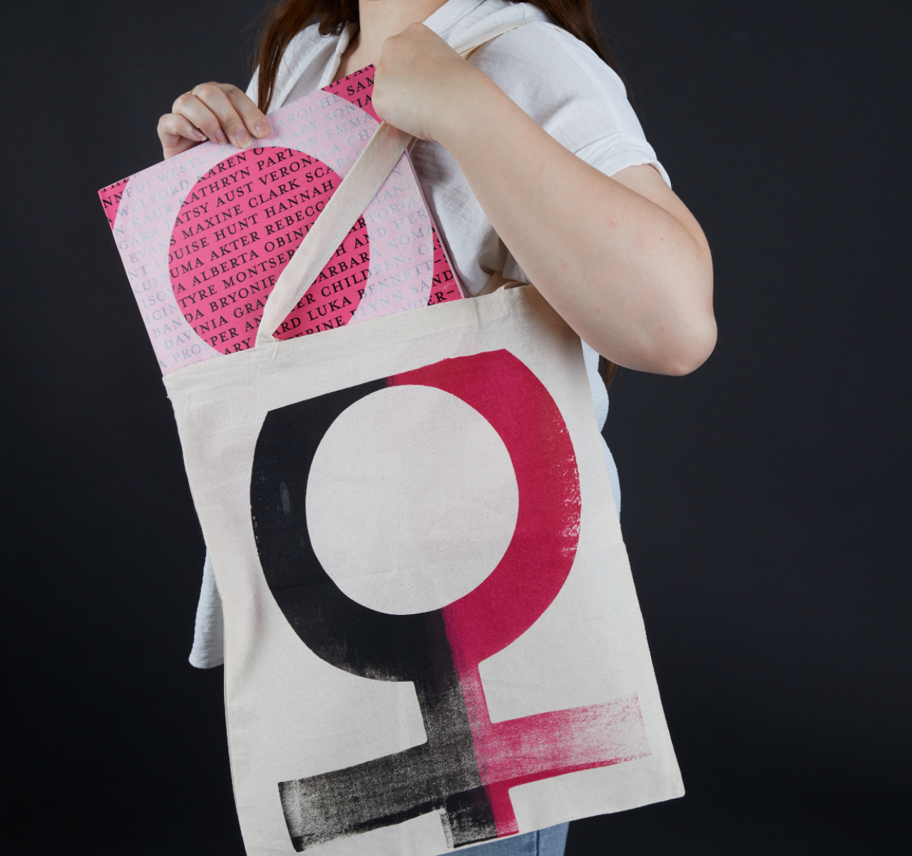
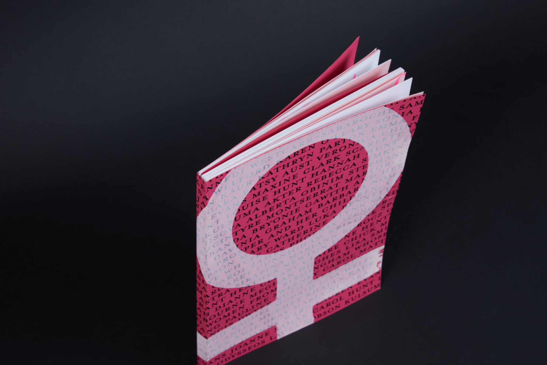
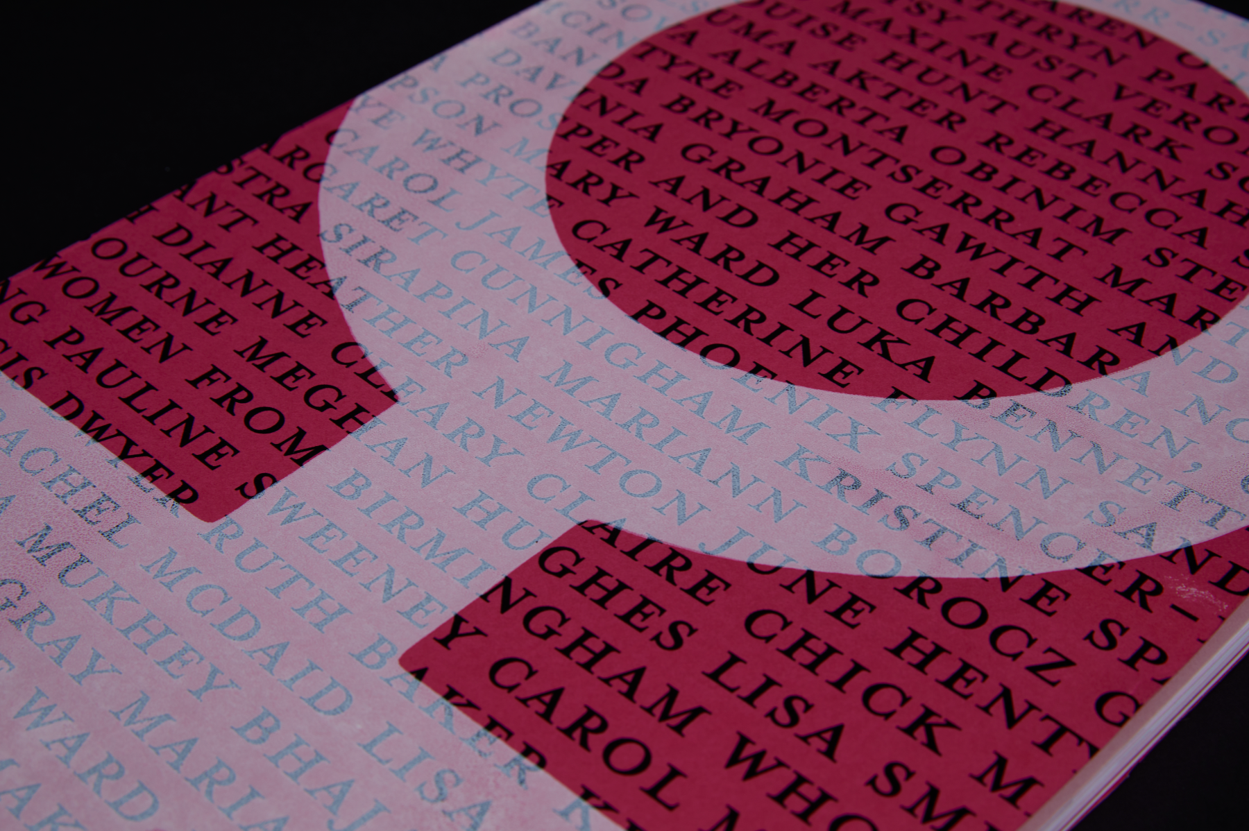
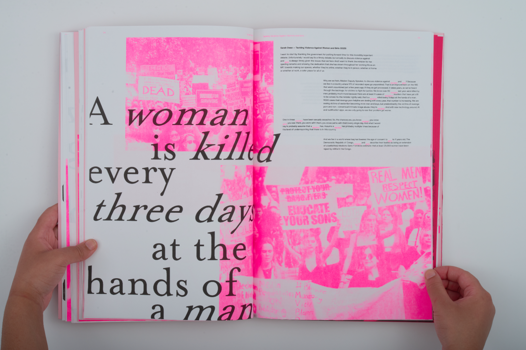
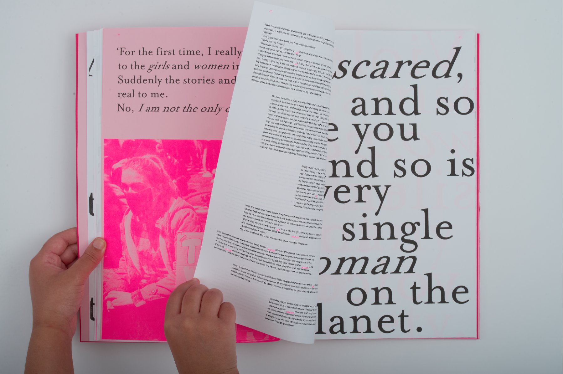
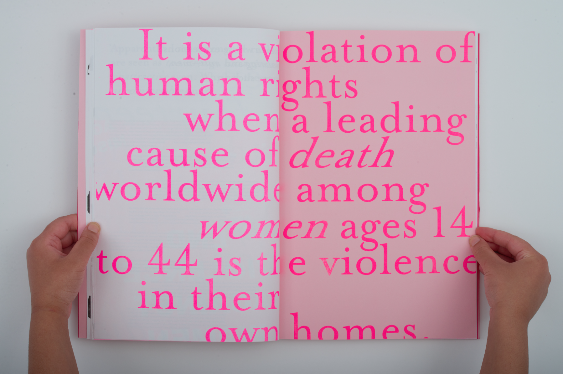
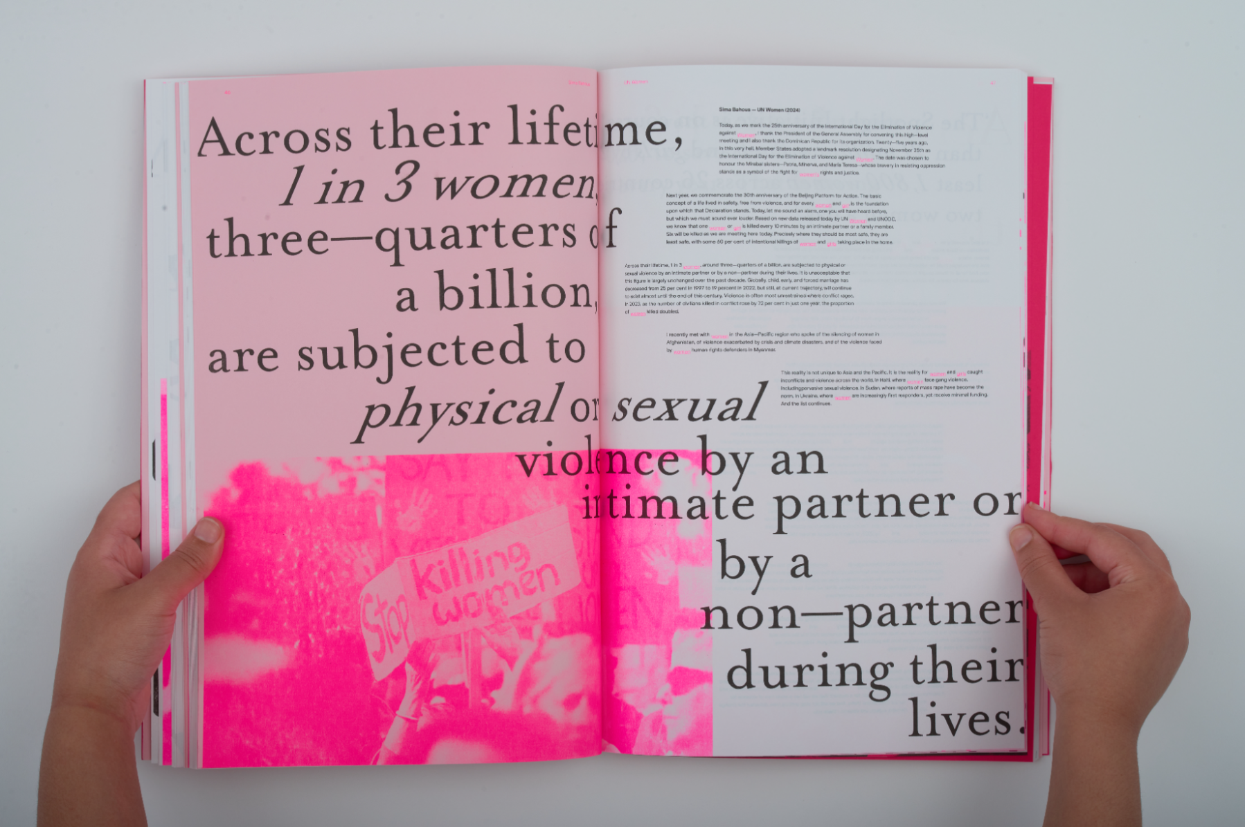
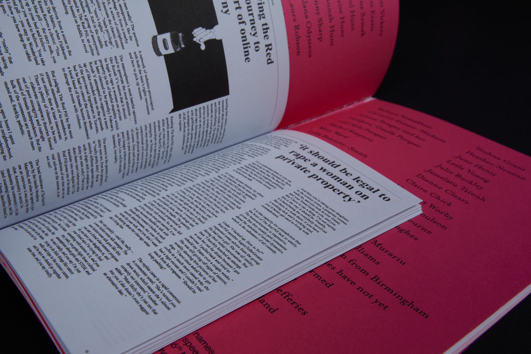
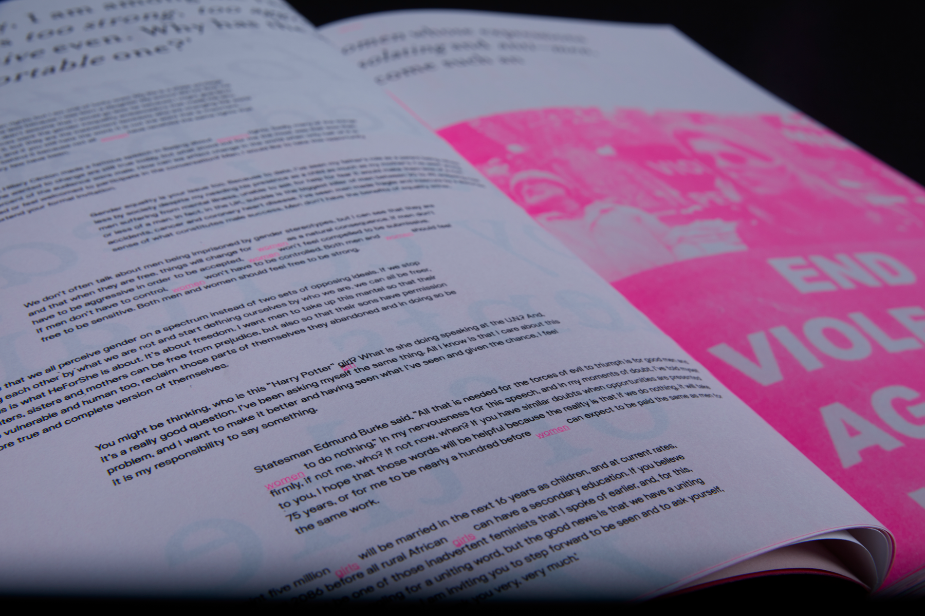
Violence against women and girls (VAWG) is a high-profile social issue affecting one in three women; it was recently described as an ‘endemic problem’ (Warren, 2025). Sexual harassment is disproportionately experienced by younger age groups. Younger audiences’ accessibility to social media means they can be bombarded with videos of misogynistic male influencers sharing hateful and harmful ideas and attitudes towards females. My publication explores the messages these influencers share with their audiences, alongside speeches by influential women highlighting its prevalence and importance of society addressing VAWG. Aim: To bring attention to both the role that social media plays in the increase of misogynistic and harmful behaviour towards women with the rise in popularity of misogynistic male influencers, while celebrating influential women in the space bringing awareness to and challenging the societal issue. Inspiration: Solitude of Self’ by Selina Kehuan Wu was the main source of inspiration for the piece, as the focus of my publication is the effect of social media on the issue. Wu’s typography spans the double-page spreads and is partially cut off by the edge of the page creating the illusion of scrolling. Design: The female voices are presented on A3 paper and two relevant words printed using luminous pink Riso ink to highlight their significance and communicate their powerful tone of voice. The male perspective is presented in a traditional newspaper format only using black Riso ink to visually communicate the outdated views being shared.
Competitions
